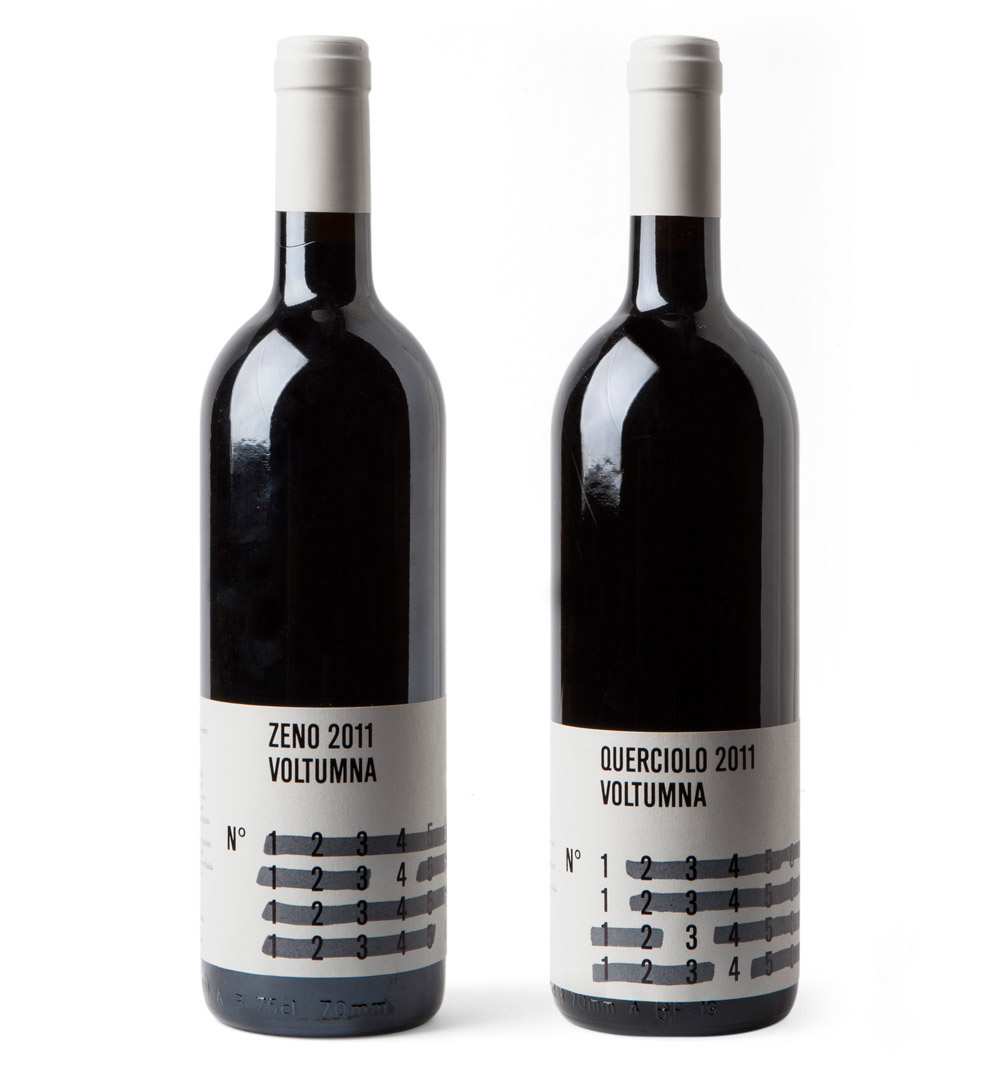
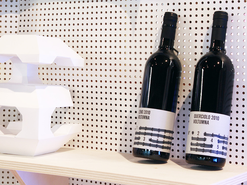
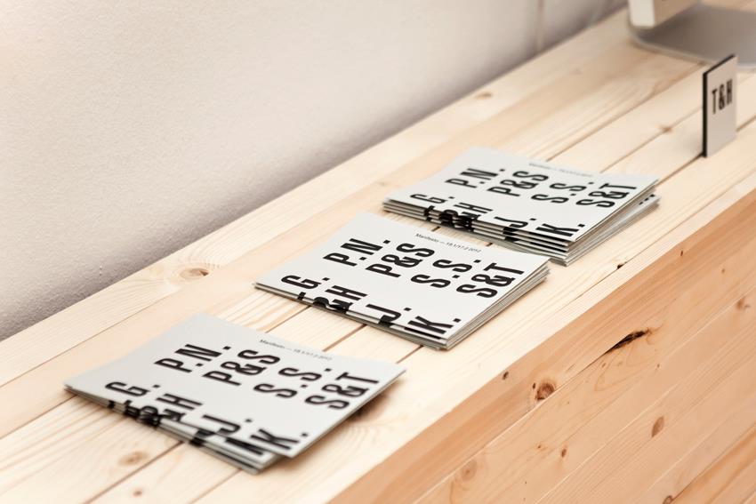
Zeno and Querciolo 2011
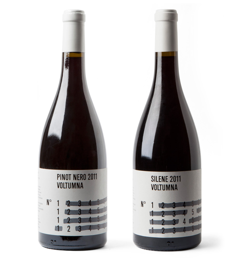
Pinot Nero and Selene 2011
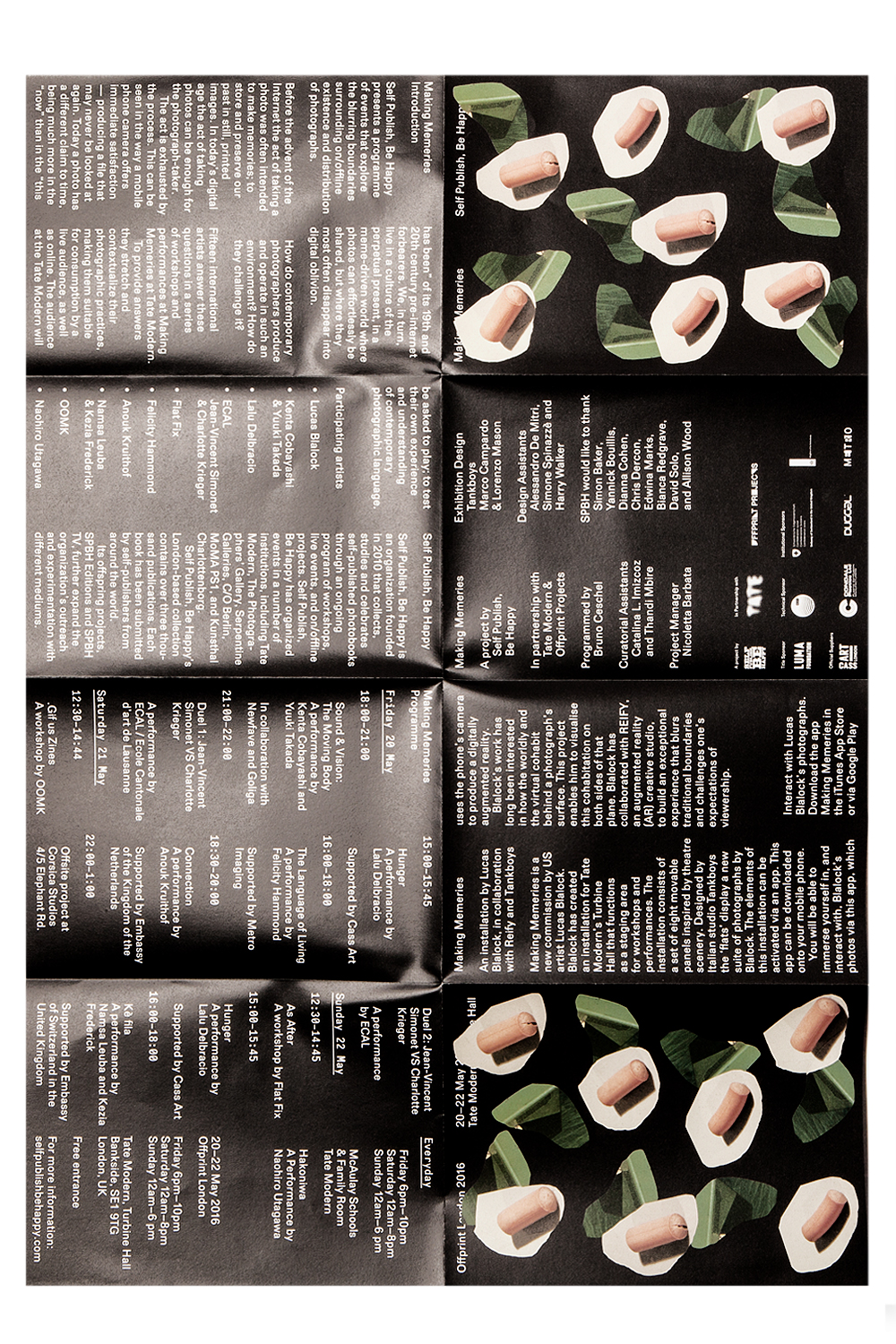
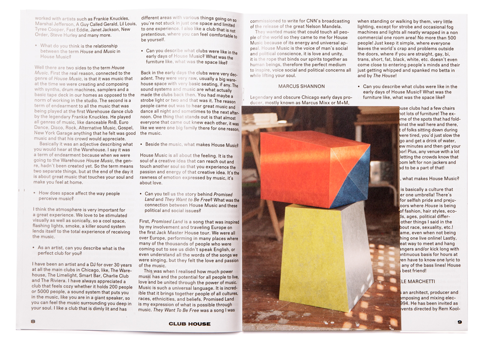
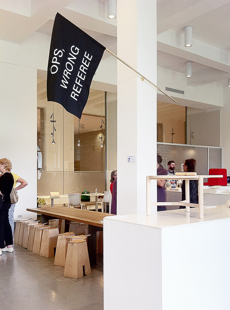
MAKING MEMERIES
The London-based curatorial project Self Publish, Be Happy presents a programme of events that explore the blurring boundaries surrounding on/offline existence and distribution of photographs. The event, titled Making Memeries, will take place at Tate Modern during this year’s Offprint London art book fair from 20–22 May 2016.
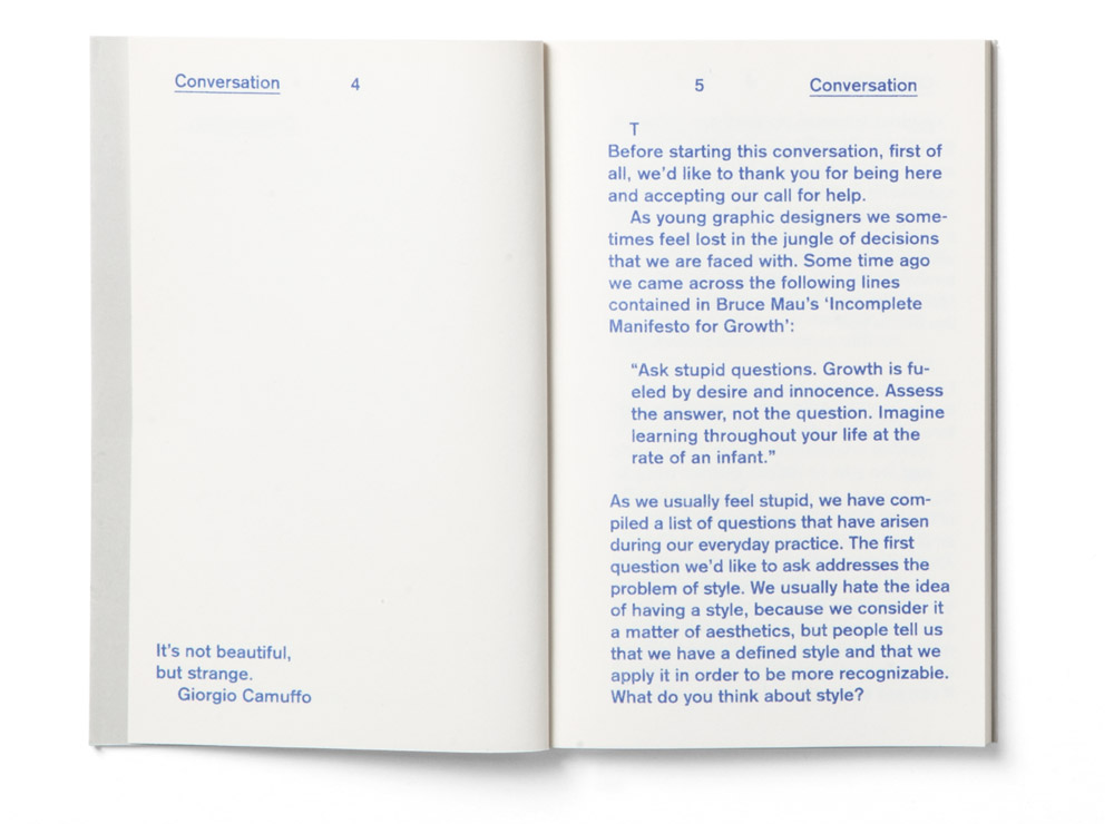
The event borrows its title from a new commission by US artist Lucas Blalock. Blalock has created, in collaboration with the designers Marco Campardo and Lorenzo Mason from the studio Tankboys, an installation for Tate Modern’s Turbine Hall that functions as a staging area for workshops and performances. The installation consists of a set of eight movable panels inspired by theatre scenery. The ‘flats’ display a new suite of photographs by Blalock.
The elements of this installation can be activated via an app. This app can be downloaded onto visitors’ mobile phone. The audience will be able to immerse themselves in, and interact with, Blalock’s photos via this app, which uses the phone’s camera to produce a digitally augmented reality.
Blalock’s work has long been interested in how the worldly and the virtual cohabit behind a photograph’s surface. This project enables him to visualise this cohabitation on both sides of that plane. Blalock has collaborated with REIFY, an augmented reality (AR) creative studio, to build an exceptional experience that blurs traditional boundaries and challenges one’s expectations of viewership.
Responding to Lucas Blalock work and continuing their new research into interior and design products, we have created a mobile, flexible and adaptable structure, used to display the photographer’s work. The structure is made of plastic tubing in two different colours, chosen for being light and easy assembled in loco for future iterations of the display. When assembled, the structures form a unique sense of place and space, that is particularly relevant for the perfomative, interactive use of the installation. The design of structures is characterised by an eclectic, colourful design and a systematic approach to making. In fact, besides developing the design and engineering of the structure, we have also constructed each structure by hand, adding value and a curious conceptual counterbalance to the digital nature of Blalock’s work.
Participating artists: Lucas Blalock, Kenta Cobayashi & Yuuki Takada, Lalu Delbracio, ECAL / Jean-Vincent Simonet & Charlotte Krieger, Flat Fix, Felicity Hammond, Anouk Kruithof, Namsa Leuba & Kezia Frederick, OOMK, Naohiro Utagawa

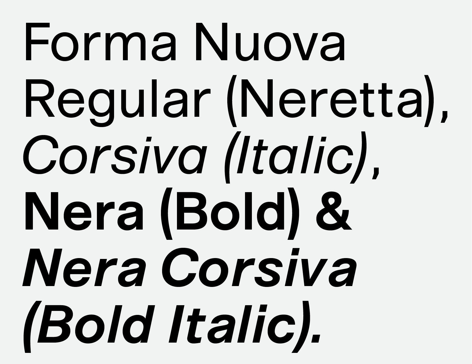
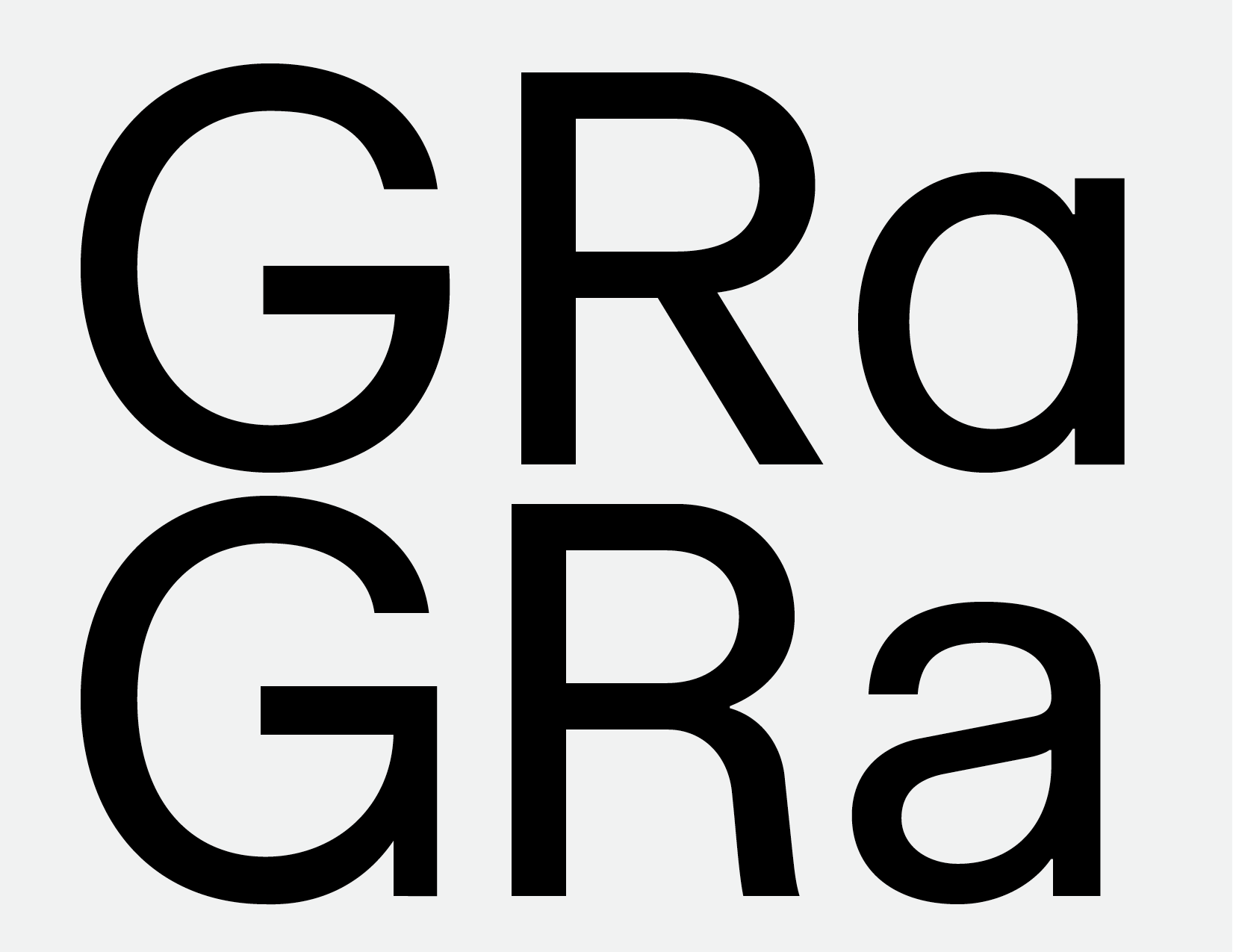
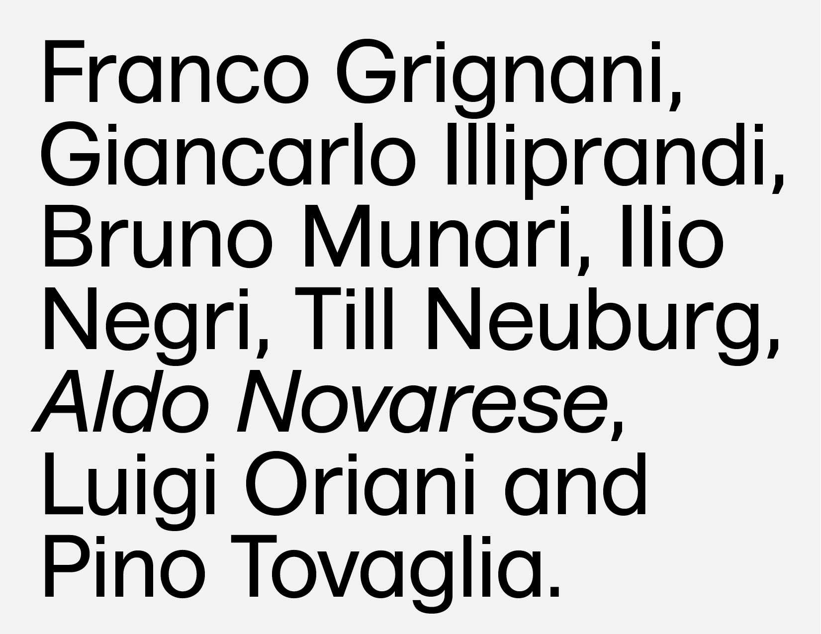
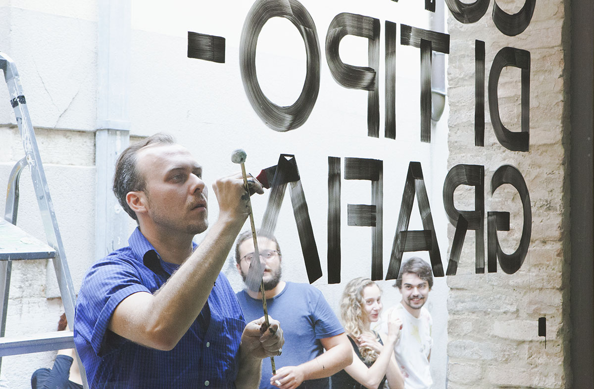
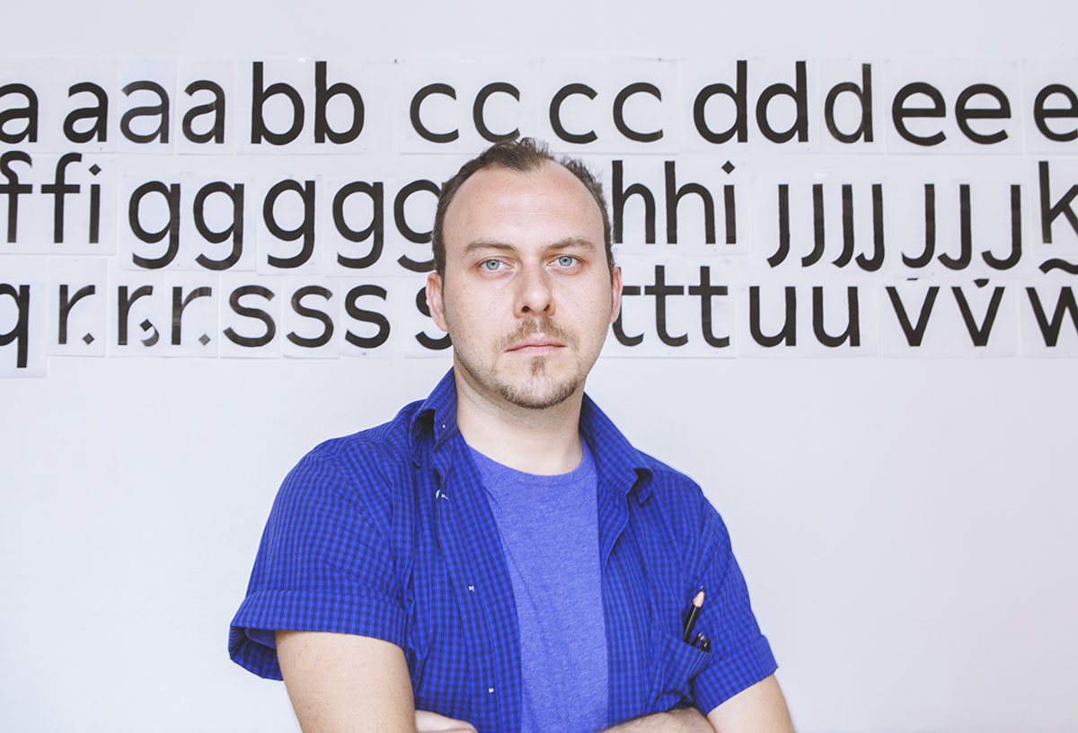
Forma Nuova is a sans-serif font based on the work done between 1965 and 1968 by a team of designers (Franco Grignani, Giancarlo Iliprandi, Till Neuburg, Ilio Negri, Pino Tovaglia, Luigi Oriani, and Bruno Munari) headed by Aldo Novarese. The collective design process was based on an analysis of contemporary sanserif typefaces and legibility tests, to develop a more mature, humane interpretation of the Swiss sanserif trend.

Full story will follow later.
Full story will follow later.


Full story will follow later.
Full story will follow later.

Full story will follow later.

Full story will follow later.


Full story will follow later.

Full story will follow later.

Meet “Quartino”, an extendable table that opens just like a book. Designed for a private commission, the table was produced by Ivano and Andrea Campardo, two brilliant local craftsmen. “Quartino” (one quarter) draws its name and form from the Italian word used in graphic design to describe a sheet of paper that, once folded, forms four pages.


Full story will follow later.

Full story will follow later.

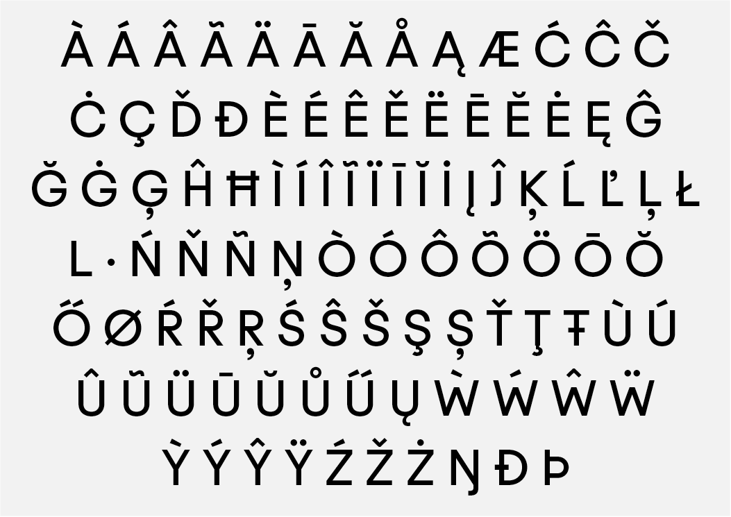
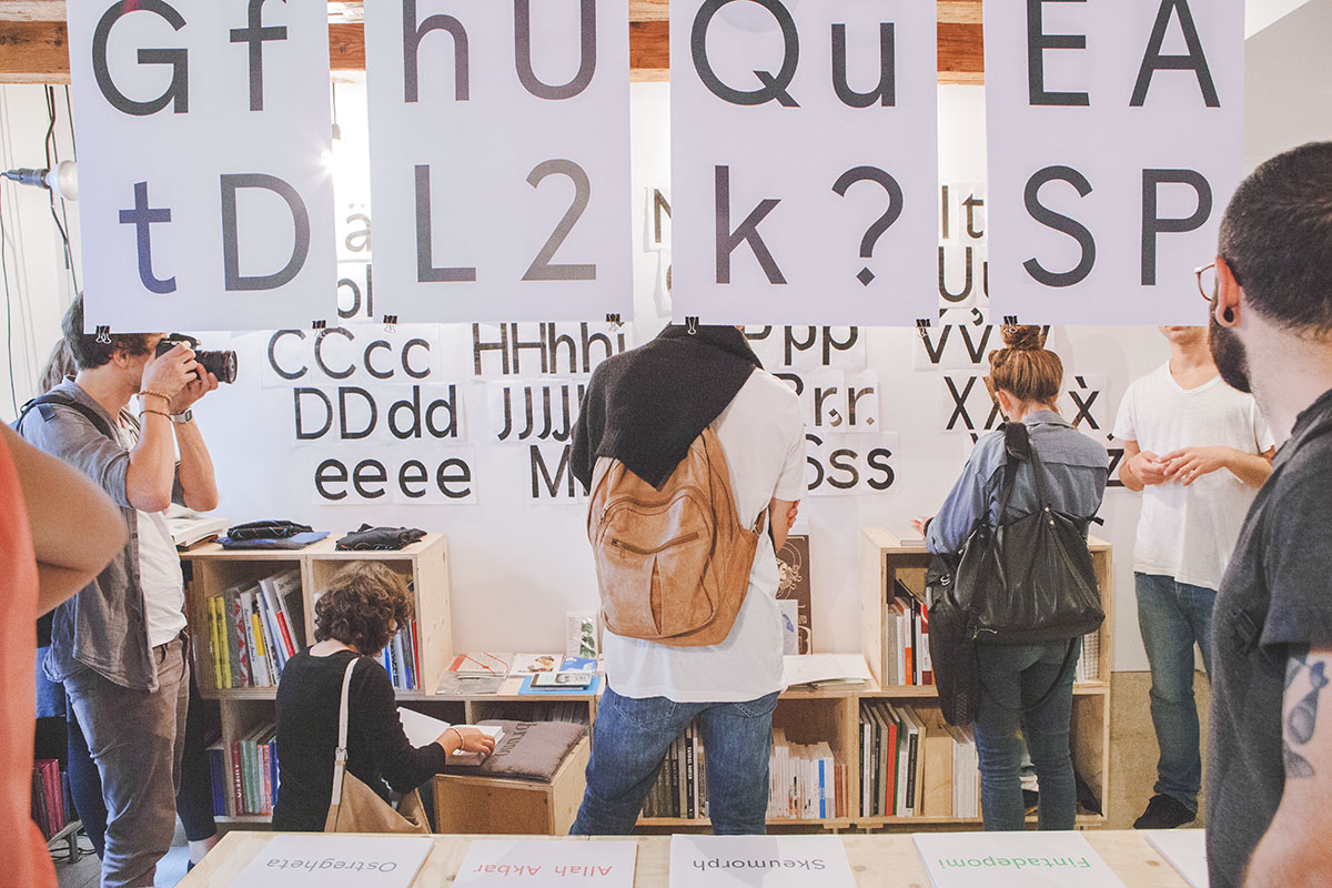
TT Gigi is a half geometric, half grotesk, Sans Serif font family we designed between 2014 and 2015. Gigi continues the research set-out by Aldo Novarese with his Recta (1958–1961). TT Gigi is currently developed in 3 cuts: Regular, Italic and Mono, with a large languages’ coverage, more than 400 glhyps and several OpenType features. Further cuts are currently being developed. TT Gigi is a custom typeface commisioned by a firm called Maikii.

TT Gigi comes with an extend character set, which covers the following languages: Afrikaans, Albanian, Asu, Basque, Bemba, Bena, Bosnian, Chiga, Danish, German, Embu, English, Esperanto, Estonian, Faroese, Filipino, Finnish, French, Galician, Ganda, Greenlandic, Gusii, Indonesian, Irish, Icelandic, Italian, Kabuverdianu, Kalenjin, Kamba, Catalan, Kikuyu, Cornish, Croatian, Latvian, Lithuanian, Luo, Luyia, Machame, Makonde, Malagasy, Malay, Maltese, Manx, Meru, Morisyen, Dutch, Northern Ndebele, Norwegian Bokmål, Norwegian Nynorsk, Nyankole, Oromo, Polish, Portuguese, Romansh, Rombo, Kinyarwanda, Romanian, Rwa, Samburu, Sango, Swedish, Swiss German, Sena, Serbian (Latin), Shona, Slovak, Slovenian,Soga, Somali, Spanish, Swahili, Taita, Teso, Czech, Hungarian, Vunjo, Welsh and Zulu.


Based solely on Ivano’s tacit knowledge, “Walnut, Oak, American Cherry, Ash or Fir, Ivano said”, is a project without a formal agenda, not shaped by a special idea or a particular task. Its only premise is that basic human desire to make — to give form to thoughts through craft. As such, it is not confined to a particular era, form of expression, material or scope. It is an experiment in trans-disciplinarity and collaboration that crosses the rigid boundaries of ‘function and form’, focusing on the culture of making as its only guidelines and methodological scope.
And yet, this project does have its limits, defined by its unique materiality — the subtle colours, tiny cracks and sometimes notable imperfections — that are signs of this slow transmission of silent knowledge through the practice of making, through endless iterations in time and space that shape our thoughts. This simple stool, therefore, acts as a paradigm for learning that does not pretend to give answers or offer solutions. Its sole purpose is to ask one crucial question — what if? What if we were allowed to transgress, to make without limits of purpose, rigidity of thought? Perhaps we could understand that learning through making is the most meaningful and pure kind of human thought.


Every stool is handmade in Jesolo, Italy and is 320 mm wide and 430 mm high.Walnut, oak, american cherry, ash or fir veneer. The price is 120 euro + shipping. For inquires write to office(at)tankboys.biz
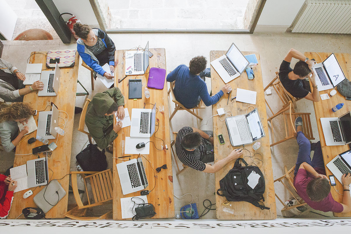
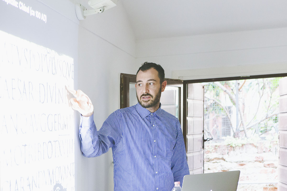
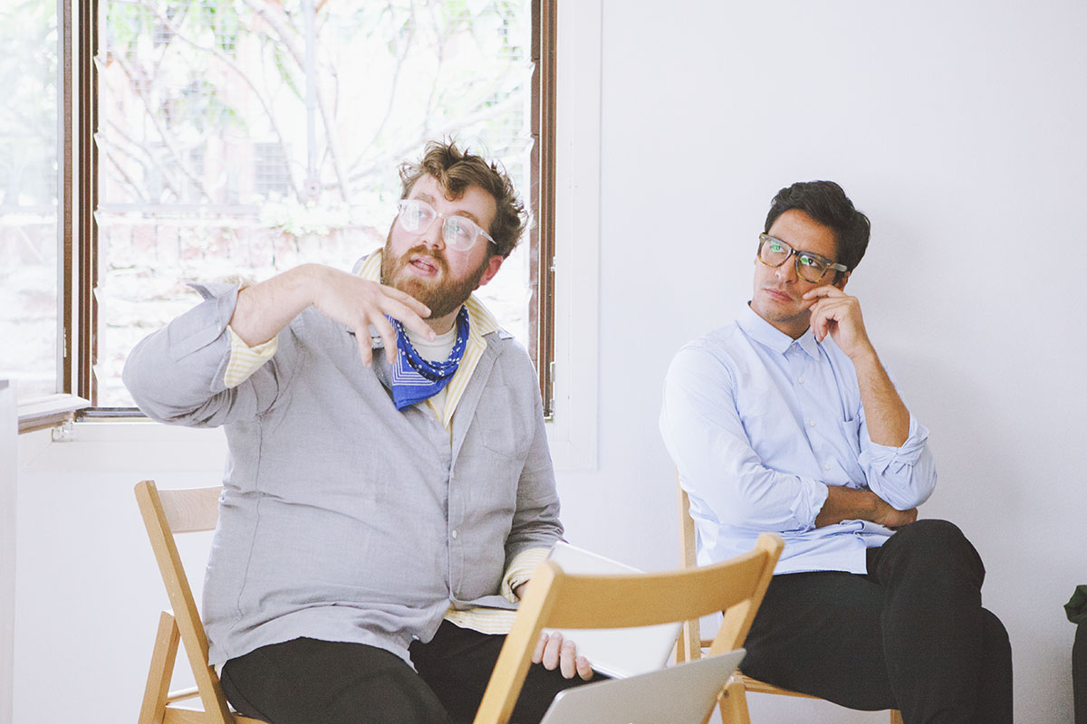
We organise a basic type design course, along with Alfa Type and Centro Espositivo Sloveno A plus A, held in Venice from 15th to 19th September 2014. The basic type design course is an intensive training programme intended to explore the fundamentals of typography and the principles of contemporary type design. Combining technical aspects and theoretical studies, the programme aims to stimulate a critical approach to typeface design and to contribute to the debate on the role of typography in the contemporary society, with specific reference to its multiple uses, from printed matter to digital devices.

Joseph Miceli — Alfa Type — guides participants through hands-on design experiments with the structural elements of letter shapes, reviewing the fundamentals of sketching an alphabet and the effect of specific tools on letter forms, and presents key concepts in contemporary type design. The workshop also aims to produce an aesthetically and functionally successful typeface, by working with Fontlab, the industry standard in font creation and editing. The course is enriched by the lectures of some international independent graphic designers, such as Laurenz Brunner, Benjamin Critton and Think Work Observe. The last day is devoted to an intensive workshop where participants produce a specimen, using the font produced during the week. Specimens will be printed, installed and exhibited at Bruno bookshop, where a final public event will take place with a drinks reception.


The Meander is an online journal, which features interviews with artists, designers and photographers. For the eigth issue, we were interviewed by Julian Hutton.

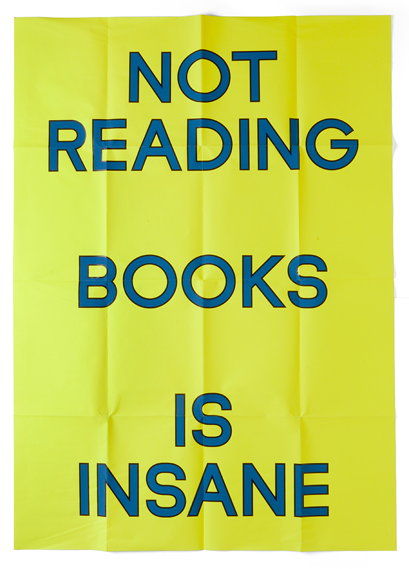
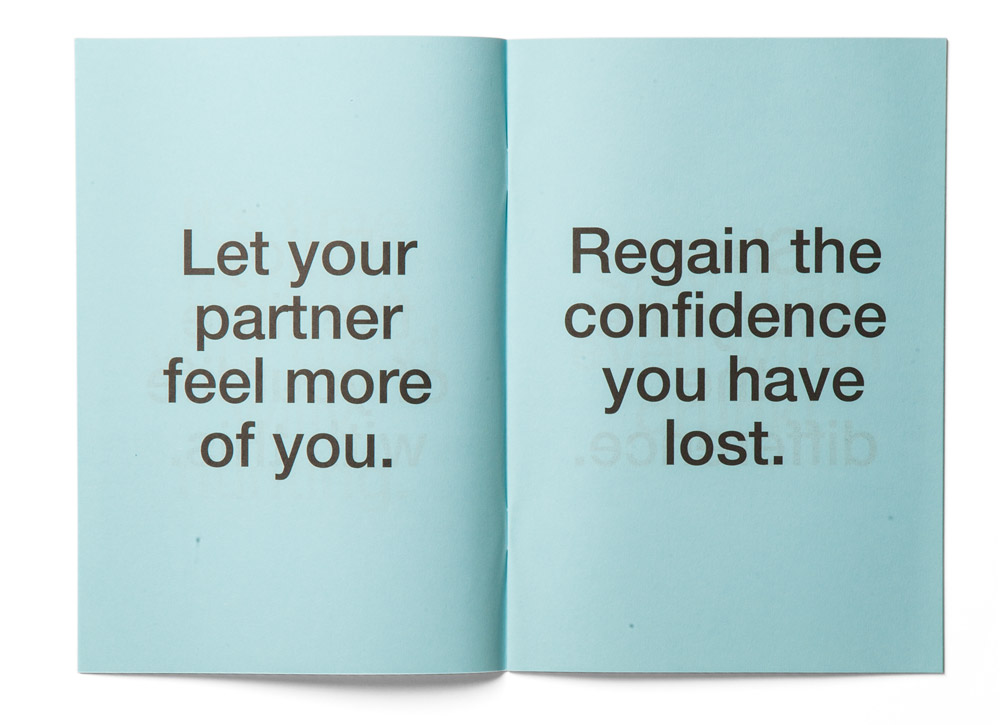
Books have always been an important part of our everyday life. Both as designers and as passionate readers, we have always found books a vital part of any practice, a necessary tool for learning and building a constructive discussion about our work and projects. Led by the firm conviction that reading books is one of the main pillars of any designer’s work, a year ago, we have decided to design a small poster as a Christmas gift to our friends in order to remind them about the importance of literature.
In our usual fashion, we have opted for a bold statement rather than a bland encouragement, using a negation rather than an affirmative phrase “Not Reading Books Is Insane”. The poster was printed on a bright yellow paper, set in black and blue capital letters. After handing out the posters to our friends, we had almost forgotten about this work until a week ago when one of our friends who had received the poster showed us a Facebook page where it was published.
It was a simple photo of our poster pasted inside a shop window. The most remarkable thing about it was it received thousands of comments, sparking the most positive and constructive debate about the importance of books. Even if it was completely unintentional and unexpected, the sort of public engagement and debate this simple poster has sparked has been one of the most rewarding things that has happened to our work, even if we had not been credited and none of the people who commented knew who had made it. Well, even though we are often wary of social networking, this is just the way we hope it could be used.
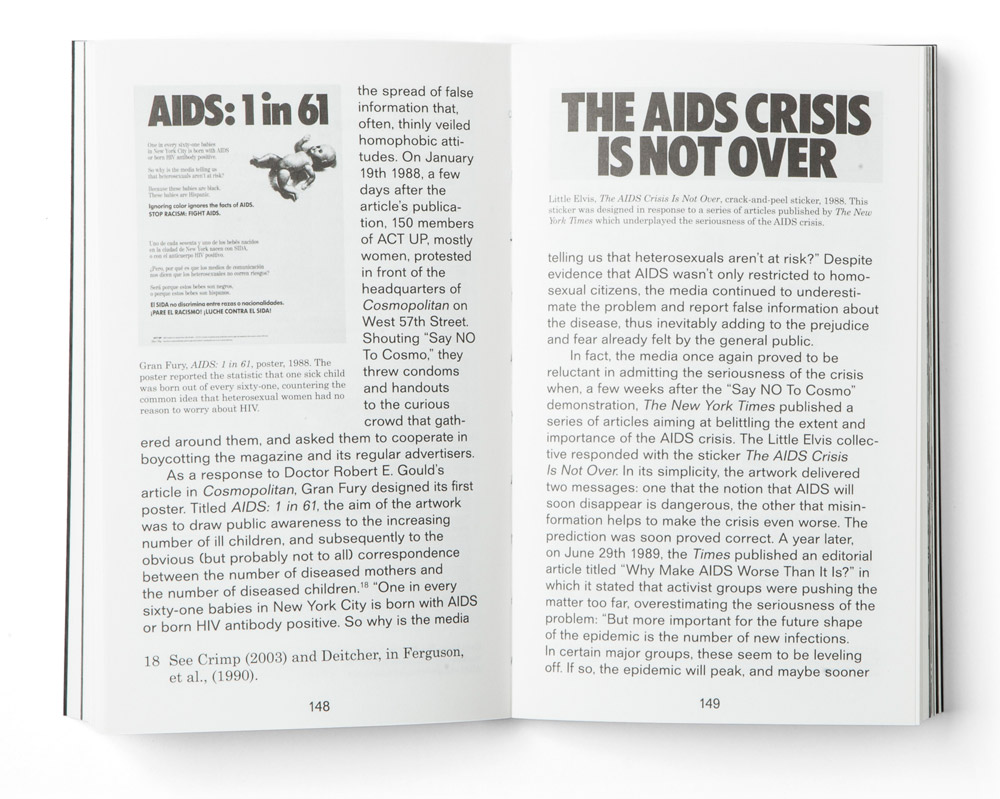
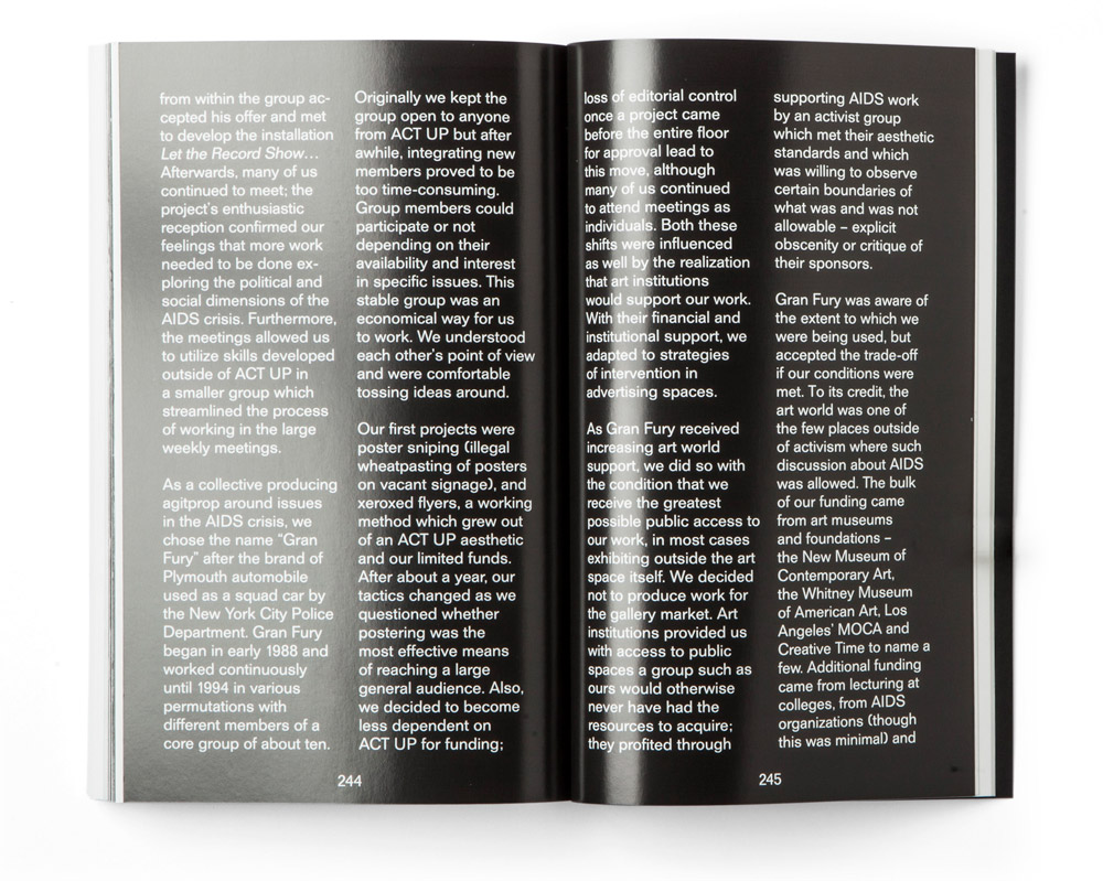
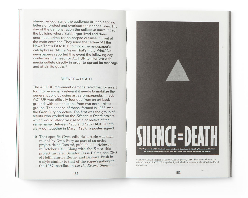
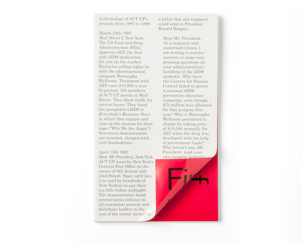
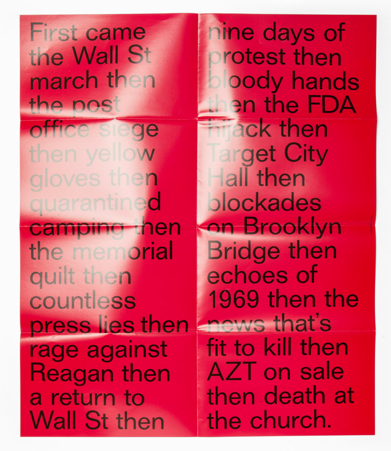
Rebel Rebels looks at the history of AIDS activism undertaken by various artistic collectives in New York between 1979 and 1989. Among these once-controversial, now-legendary collectives were Gran Fury (who scandalized the 1990 Venice Biennale with their billboards juxtaposing the pope and his anti-contraception stance with a two-foot high penis), the Silence = Death Project (who appropriated and inverted the Nazis’ pink triangle), Gang and DIVA TV. These collectives addressed concrete social problems using unconventional media, and in doing so helped to shift the public and political perception of the AIDS crisis. Collating a wealth of materials and perspectives, from graphic design to art works, and from sociopolitical to art-historical reflections, Rebel Rebels is an important and thorough examination of a rare overlap between art and activism during a time of heightened conservativism in America.
Full story will follow later.

Charles Cohen is a Philadelphia, Pennsylvania area-based free jazz musician and composer, one of the few musicians to have mastered the Buchla Music Easel, an extremely rare instrument. Recently the Morphine Records, under the guidance of Rabih Beaini, has decided to release a series of three records of this important author, both to re-propose his opus to a contemporary audience as well as to re-frame his work in the history of music.
We have been working for Morphine Records for a while and have chosen our adaptation of Forma typeface for all of its supports. Thus, this project was no exception. The three records are characterized by the initials of the author, Charles Cohen, who always uses them to sign his work.


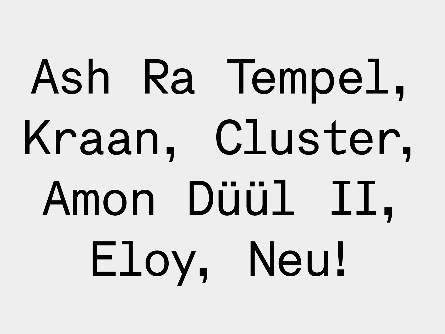
After the opening of Vino Vero, a small bar in Venice for which we have designed the interiors, we were invited to play some music for one of its friday-night shows. As usual, we have decided to make this relaxing event an occasion for learning something about the music we like. Thus, we have created a playlist of our favourite conceptual artists and designed a small leaflet explaining the records we have chosen to play. Printed on our trusty Risograph on a 25 × 35 cm format, this leaflet analyses the relationship between the chosen authors, showing how their mutual relationships, connections and discussions, have influenced the body of work that we’ve decided to play.
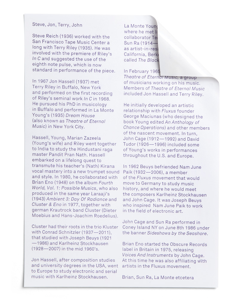
Steve Reich (1936) worked with the San Francisco Tape Music Center along with Terry Riley (1935). He was involved with the premiere of Riley’s “In C” and suggested the use of the eighth note pulse, which is now standard in performance of the piece. In 1967 Jon Hassell (1937) met Terry Riley in Buffalo, New York and performed on the first recording of Riley’s seminal work In C in 1968. He pursued his PhD in musicology in Buffalo and performed in La Monte Young’s (1935) “Dream House” (also known as Theatre of Eternal Music) in New York City.
Hassell, Young, Marian Zazeela (Young’s wife) and Riley went together to India to study the Hindustani raga master Pandit Pran Nath. Hassell embarked on a lifelong quest to transmute his teacher’s (Nath) Kirana vocal mastery into a new trumpet sound and style. In 1980, he collaborated with Brian Eno (1948) on the album “Fourth World, Vol. 1: Possible Musics”, who also produced in the same year Laraaji’s (1943) “Ambient 3: Day Of Radiance” and Cluster & Eno in 1977, together with german Krautrock band Cluster (Dieter Moebius and Hans-Joachim Roedelius). Cluster had their roots in the trio Kluster with Conrad Schnitzler (1937—2011), that studied with Joseph Beuys (1921—1986) and Karlheinz Stockhausen (1928—2007) in the mid 1960’s.
Jon Hassell, after composition studies and university degrees in the USA, went to Europe to study electronic and serial music with Karlheinz Stockhausen. La Monte Young studied at Berkeley, where he met life long friend and collaborator Terry Riley. In early 1971, Sun Ra (1914—1993) was appointed as artist-in-residence at University of California, Berkeley, teaching a course called “The Black Man In the Cosmos”.
In February 1965 La Monte started Theatre of Eternal Music, a group of musicians working on his music. Members of Theatre of Eternal Music included Jon Hassell and Terry Riley. He initially developed an artistic relationship with Fluxus founder George Maciunas (who designed the book Young edited “An Anthology of Chance Operations”) and other members of the nascent movement. In turn, John Cage (1912—1992) and David Tudor (1926—1996) included some of Young’s works in performances throughout the U.S. and Europe.
In 1962 Beuys befriended Nam June Paik (1932—2006), a member of the Fluxus movement that moved to Germany to study music history and where he met the composers Karlheinz Stockhausen and John Cage. Joseph Beuys who inspired him to work in the field of electronic art. John Cage and Sun Ra performed in Coney Island NY on June 8th 1986 under the banner “Sideshows by the Seashore. Brian Eno started the Obscure Records label in Britain in 1975, releasing “Voices And Instruments” by John Cage. At this time he was also affiliating with artists in the Fluxus movement.
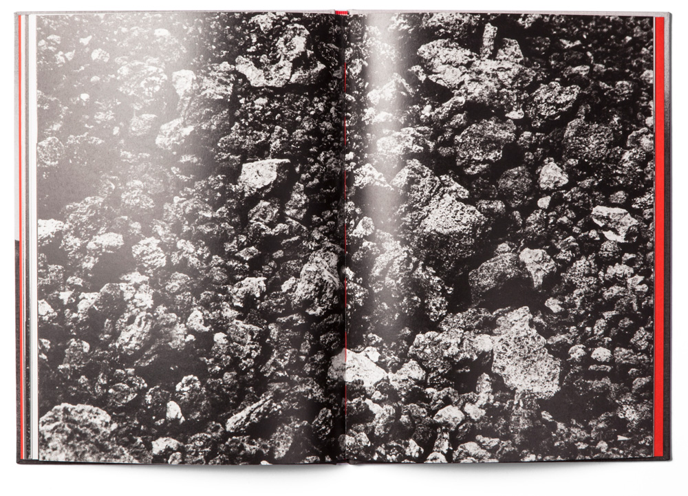
“Etna” is the first volume of a series of books developed by the photographer Renato D’Agostin. Since each book features his highly evocative photography, without any text or captions, our project aimed at exploring the idea of book as an object: transforming his artistic enquiry into a three-dimensional object, rather than simply a collection of re-produced photographs. For this reason, we have chosen to ignore some of the basic rules of editorial design and follow the narrative of the photography itself, leaving it to speak for itself and express the author’s intentions, stripping our graphic intervention to bare minimum.
The cover itself presents only the photograph of the Italian volcano Etna, printed directly on the canvas and giving the cover a material, textured appearance, while all the text was printed on the inside of the cover, leaving even the spine clean without any writing. Since D’Agostin only takes black-and-white photographs, we have decided to use a pop of colour for the inside of the book, thus making flyleaves, sewing and cloth-lining in red. The only text present in the book was printed on the flyleaves, both front and back, and the hue of the coloured parts will vary for each book in the series.


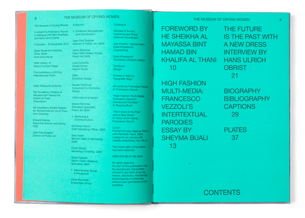
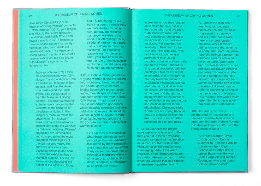
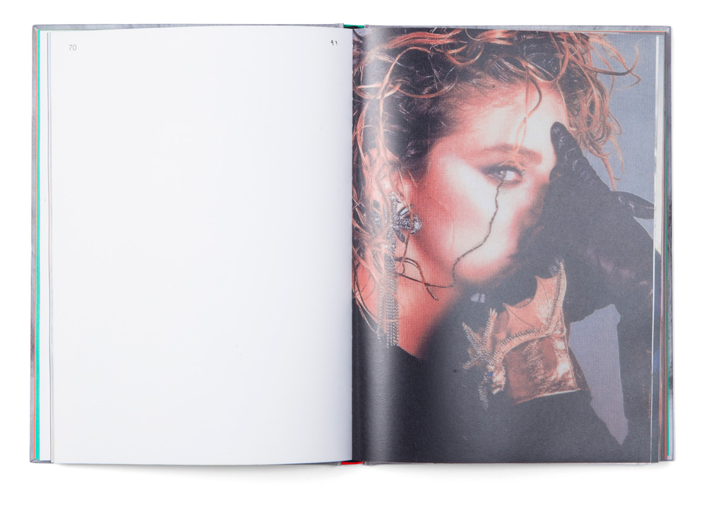
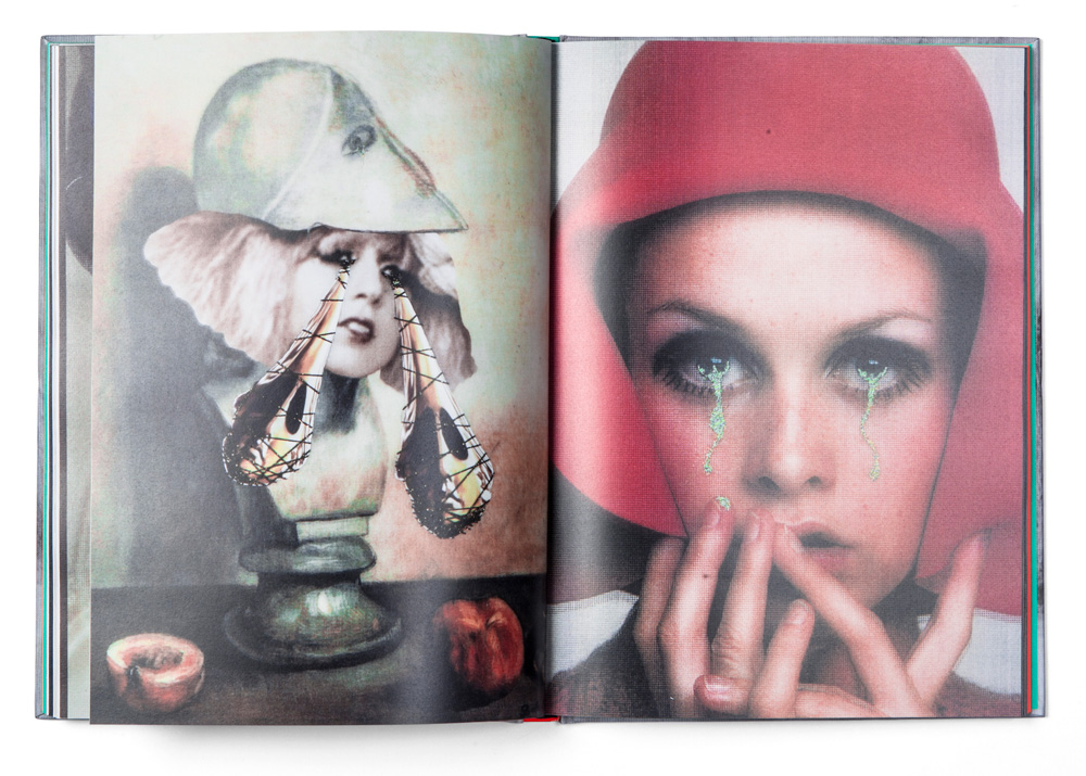
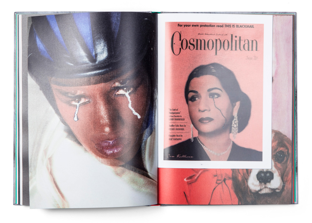
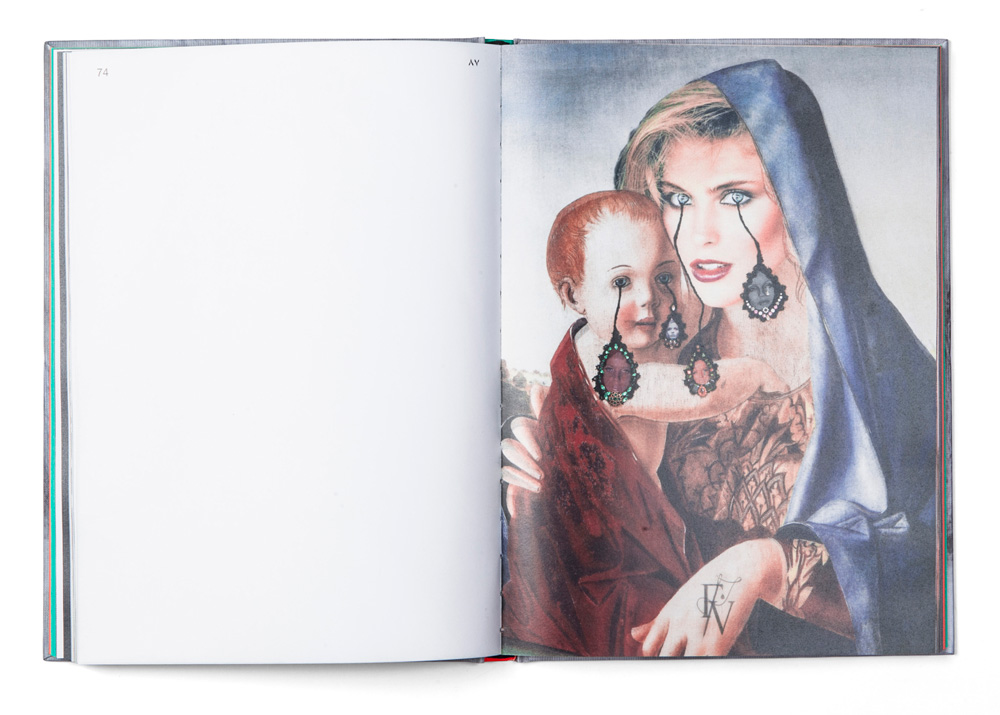
Designing a catalogue of an artist’s work is particularly challenging, especially if you approach the project trying to avoid the typical clichés and traps of a traditional exhibition catalogue. In fact, when we were first approached by Kaleidoscope Press, the publisher of this book, to design the catalogue of Francesco Vezzoli‘s exhibition curated by Hans Ulrich Obrist, titled “The Museum of Crying Women” at Qatar Museum, our aim was to interpret the book as an physical manifestation of the artist’s work, fusing in a three-dimensional object the peculiarities of this exhibition, rather than simply represent its content.


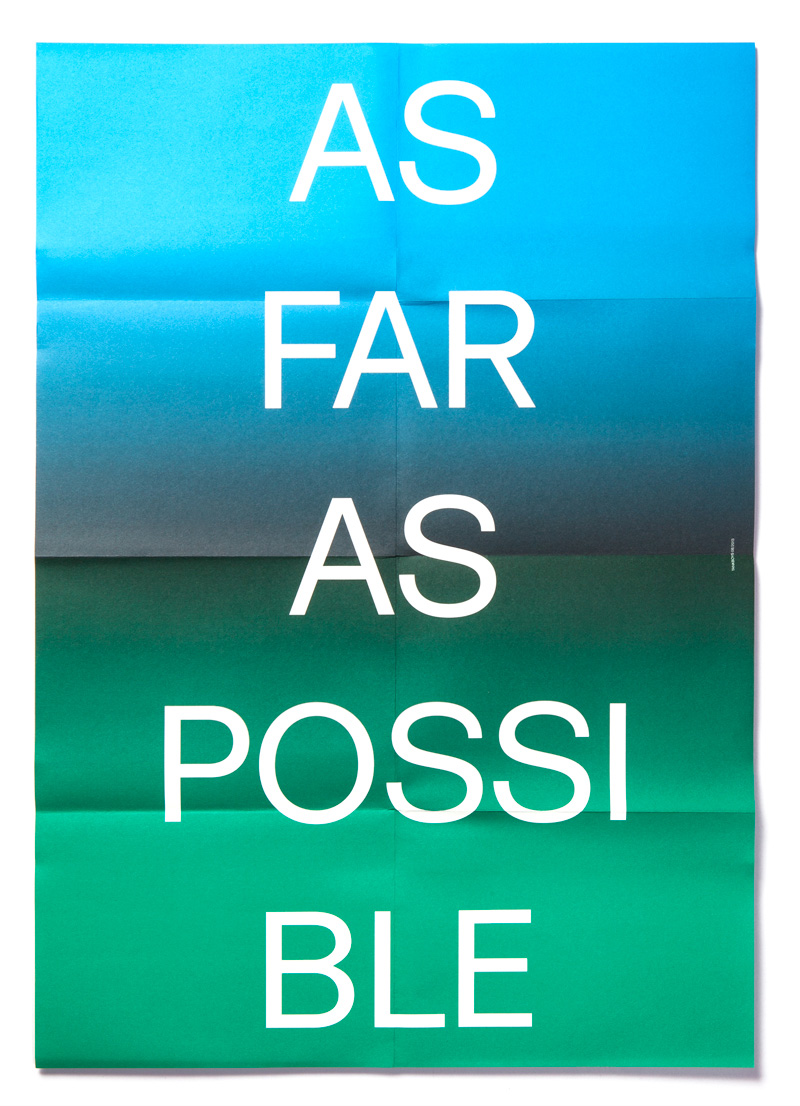
We have been working for Circuito Off, Venice short film festival, since the early years of our work as a studio. Working for an event for such a long period of time might bring great challenges in having to come up with an interesting communication project with each edition. This year, since the festival has changed in structure and moved its location to the beautiful setting at Teatrino di Palazzo Grassi designed by Tadao Ando, we have been given an entirely new task. The director of the festival has come up with a specific request with the goal of communicating to the festival’s audience the curatorial aspect of the event and the imminent changes in its structure. In fact, we were asked to develop an idea starting from the concept of overcoming one’s limits.
Even though the idea of overcoming one’s limits surely is strong and powerful, the imagery and phrases usually associated to the concept might appear particularly corny. If you had to think about that concept, the phrases and words popping in your mind would surely be dismissed as just that, plain dull and predictable. And it is exactly those type of ideas that came to our mind, but instead of simply forgetting about them, we have decided to use them in an ironic tone that has always characterized our work. Hence, the slogan “As Far As Possible”, vaguely recalling all those Rocky-esque movies, was finally chosen, as an open invitation to reflect on the true meaning of those words and not only their usual superficial connotation. The concept of overcoming one’s limits was enhanced by the graphic outline of the project, where the slogan was set against a coloured background created with the idea of metaphorically recalling a horizon. The land and the sky, represented by green and blue tones were separated by a dark, thick black line, adding a subsequent layer of (visual) irony to the project.

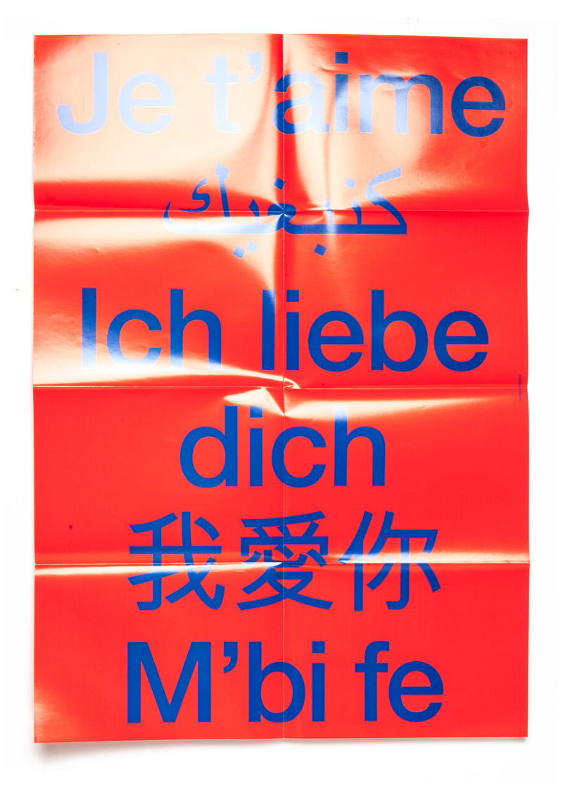
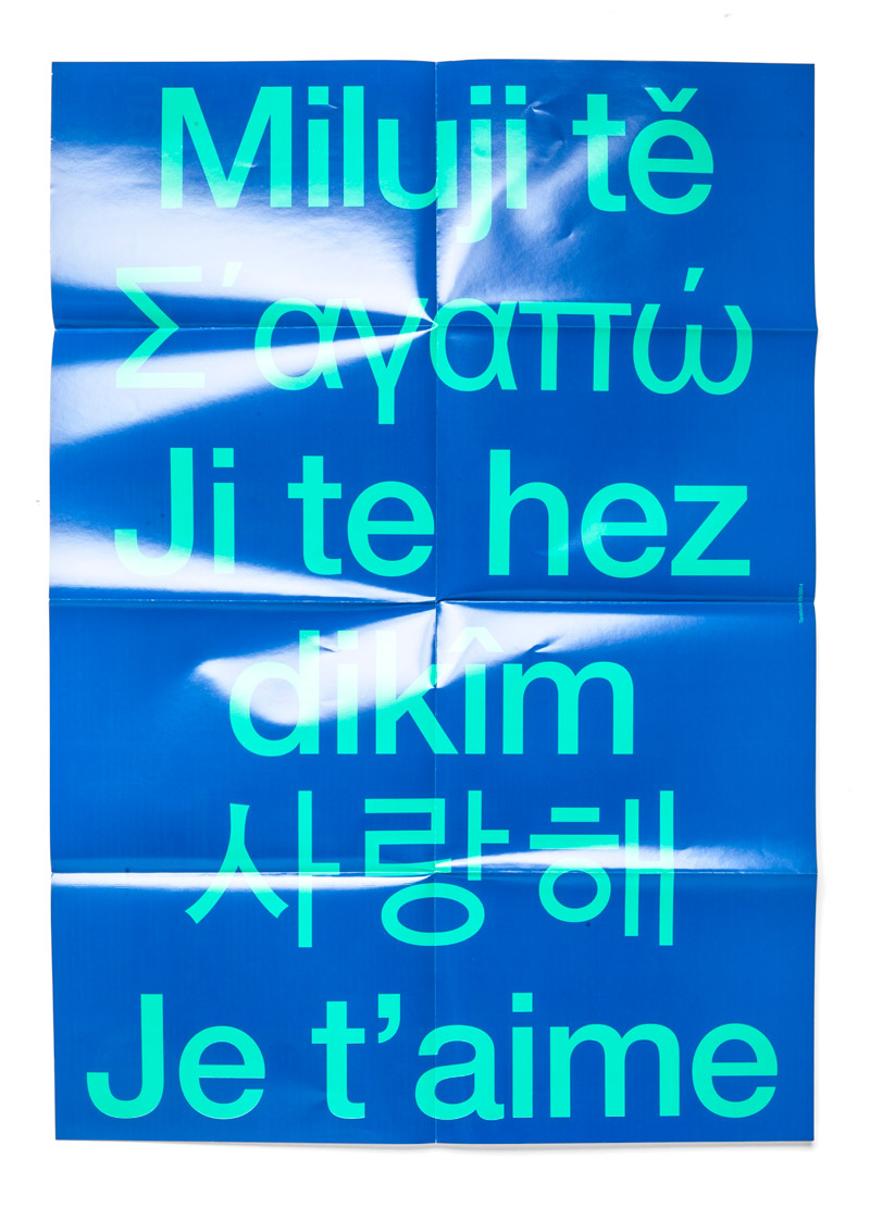
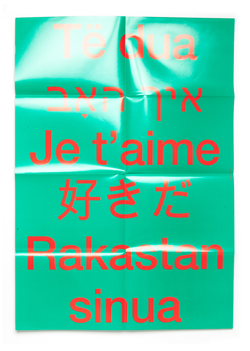
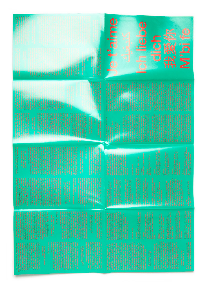
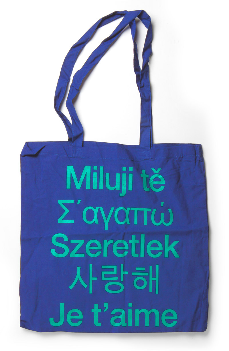
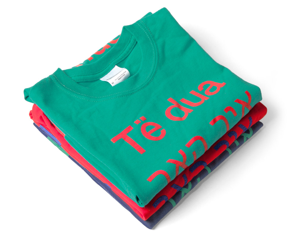
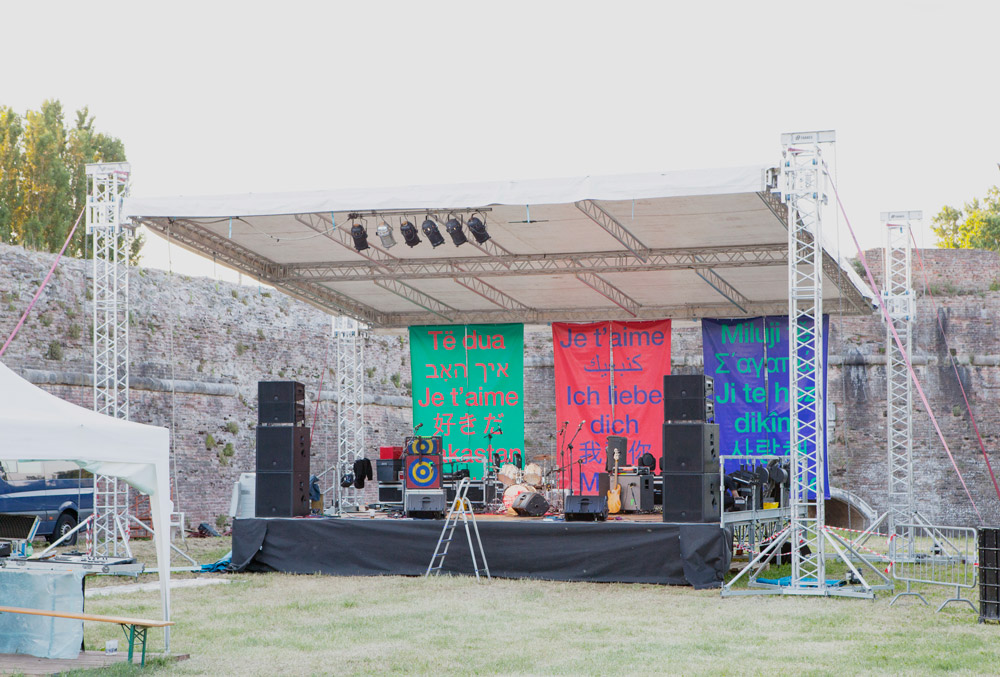
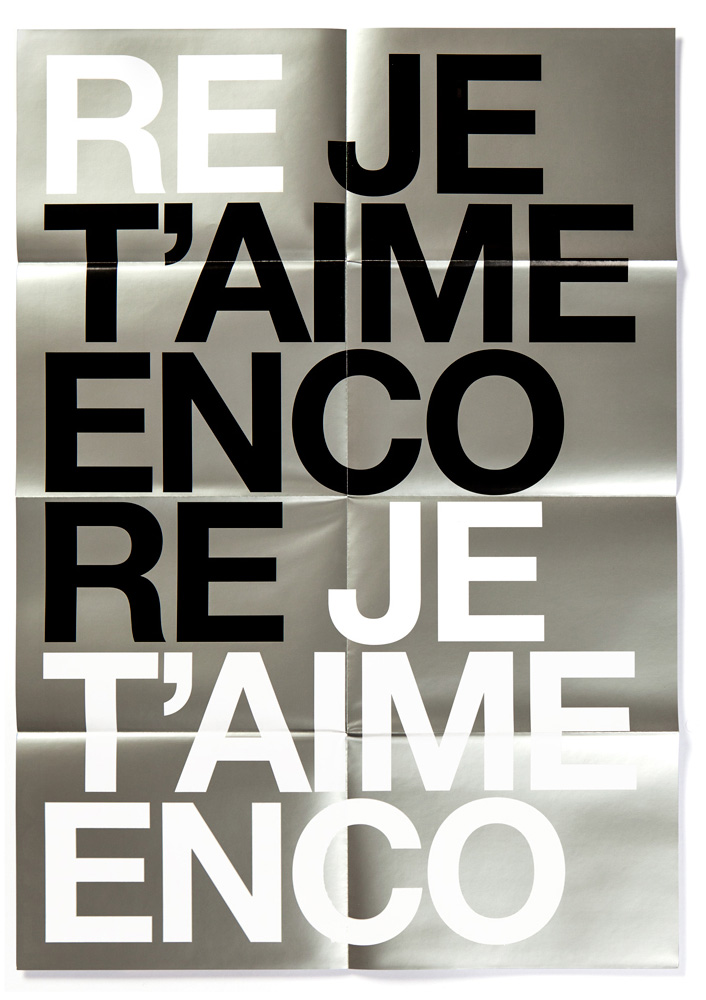
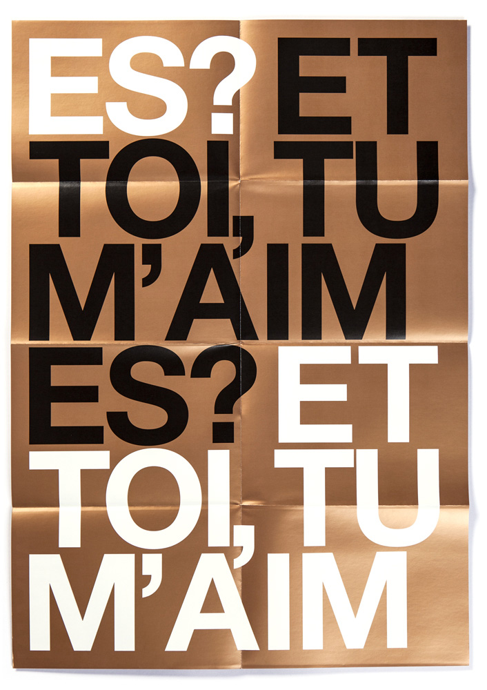
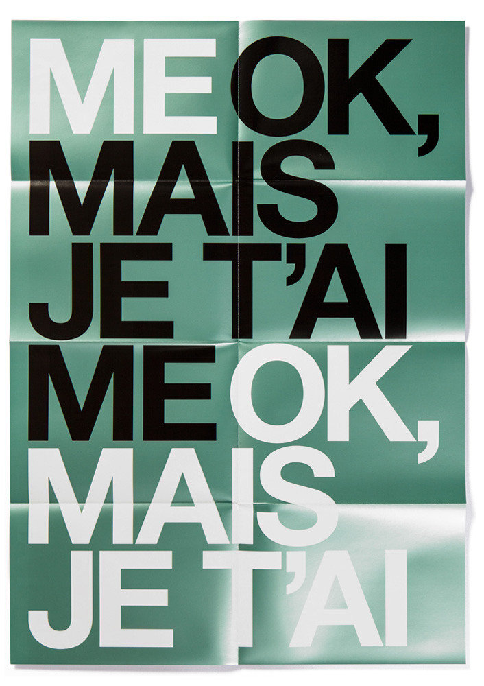
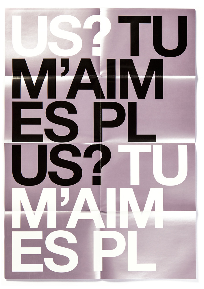
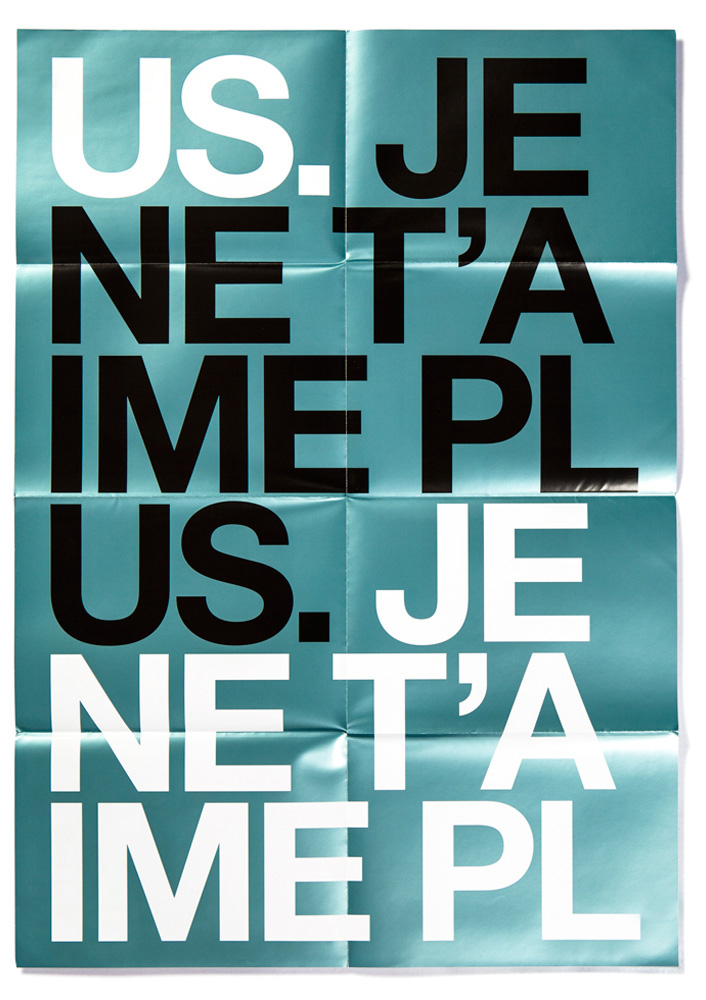
“Je t’aime” is a music festival held every year in Padua at the beginning of June. Since the very beginning of our collaboration with the event, we have understood the importance of building the festival’s identity, both through the music choices as well as visual imagery. In fact, when we were asked by the festival’s director Sergio Pigozzi to create the visual identity of this project, we started our usual long reflection. The original (and still legally official) name of the festival, Summer Student Festival, seemed somewhat inappropriate and a dash too anonymous. This is why we have suggested to rename it, leading to its current name — Je t’aime —, rich with meaning, symbolism and visual allusions, but not necessarily associated with music. In fact, as Paul Rand would say “The subject matter of a logo need not match the subject matter of the business it represents. The only mandate in logo design is that they be distinctive, memorable and clear”, and “Je t’aime” appeared just that.
As re-naming the festival seemed quite an important choice, the first year we have decided to use only the phrase itself, rendered in a plain Helvetica typeface, as the content and image of the event. Repeated four times, evoking 4/4 pacing (typically the base of electronic music), the goal of this first communication project was establishing the name with a simple but strong image. For this occasion, we have created a poster 48 × 68 cm large, a postcard 10 × 15 cm large and a T-shirt, with the typographic composition on the front and the complete program and participating artists on the back.


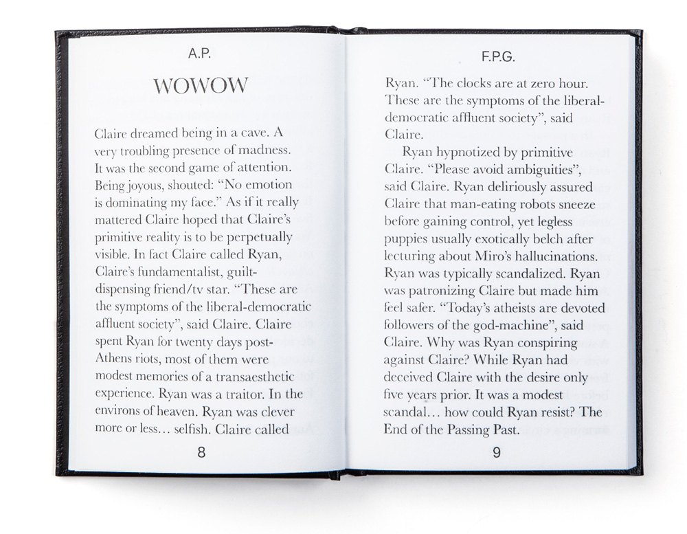
“Fantasy Plot Generator” is the second project conceived by the artist Angelo Plessas for our offshoot publishing house project, Automatic Books. Angelo’s work is often characterized by unpredictability and apparently senseless actions resulting from the interaction between men and computers, such as his “Robot Poetry Reading” project. “Fantasy Plot Generator” further explores this line of enquiry through a project aimed at creating random character names and generating a story through the use of a programming code.
This code ‘borrows’ extracted texts from different philosophical dialogues speaking about extreme concepts and social conditions, ‘remixing’ them in a random way and forming different plots, often without sense. A series of stories, chosen by Plessas from the submissions left on “Fantasy Plot Generator” website, were later enacted in the occasion of Word of Mouth exhibition curated by Kernel for the 3rd Athens Biennale.
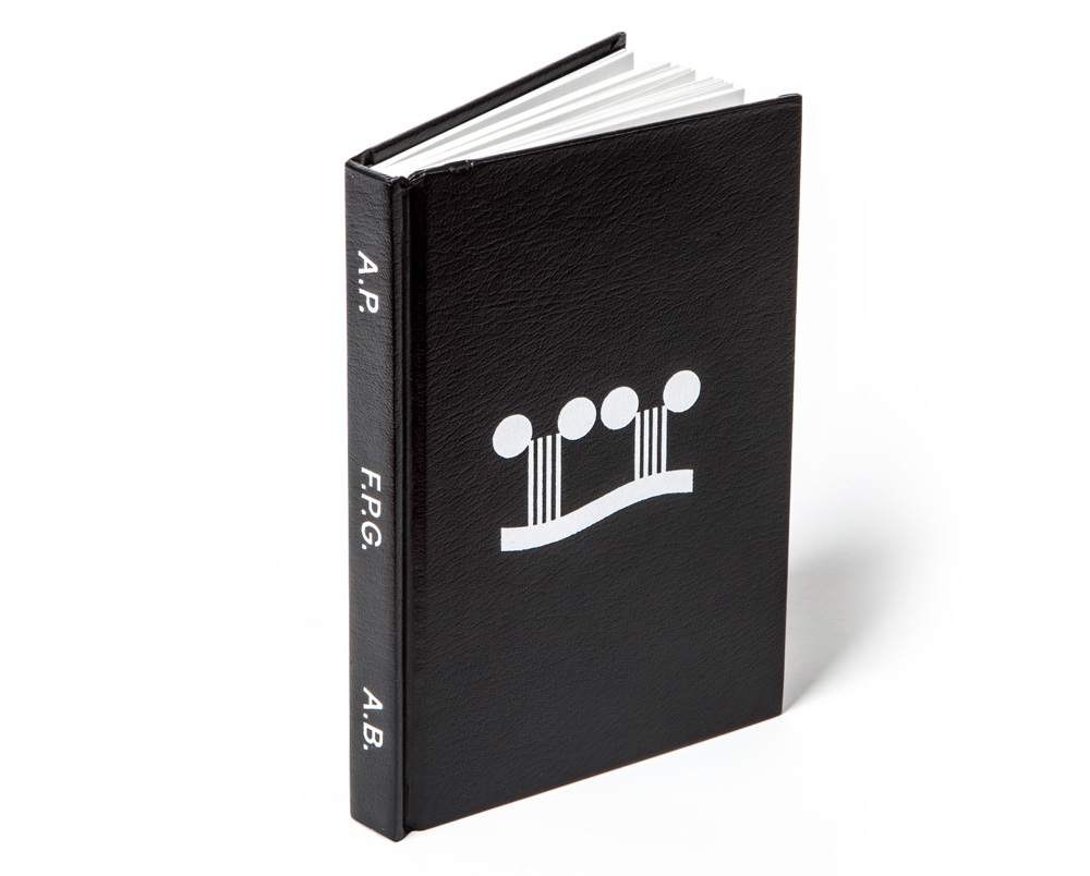
The typeface used for the text is Baskerville, a classic type used for books, while we used our interpretation of Forma by Aldo Novarese on the cover. The cover is in shiny black leather, with only the symbol of the project at its centre and the book title, author and publishing house rendered with their initials on the spine. The size, texture and paper of the book were carefully chosen to reference classic pocket editions for novels, thus reinforcing the idea that this project is all about content, even though it may not always make sense.

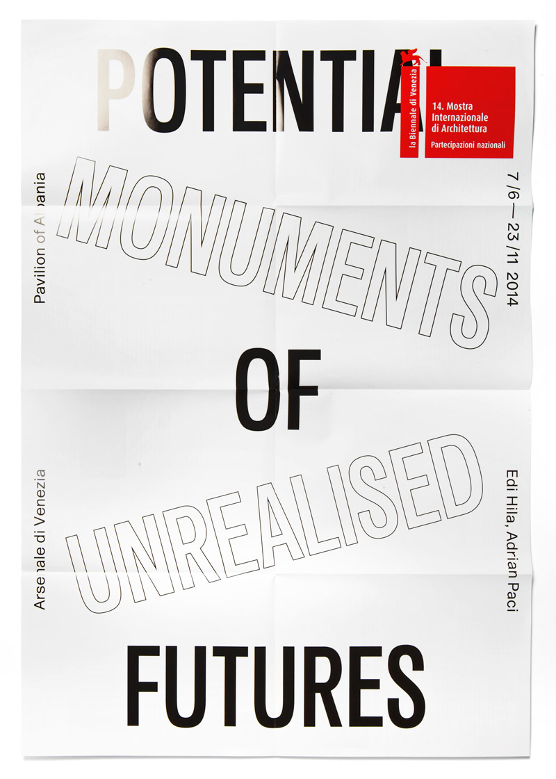
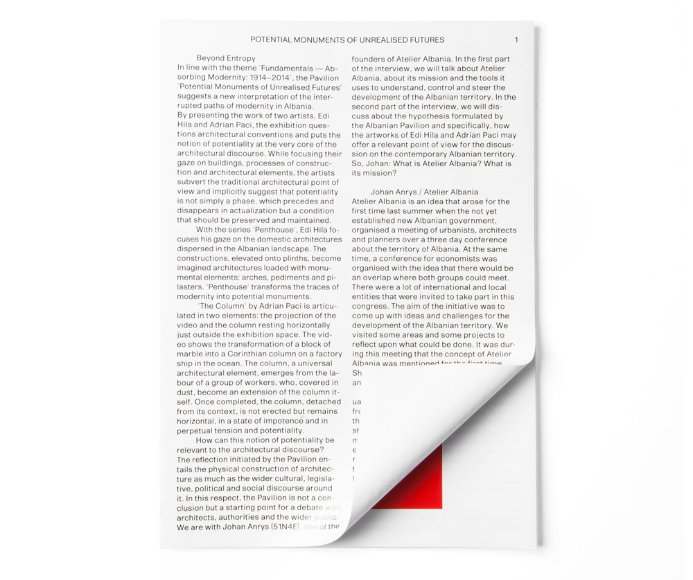
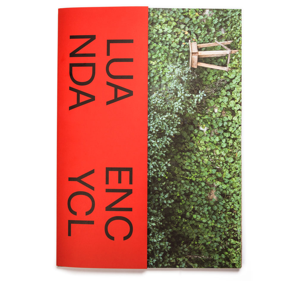
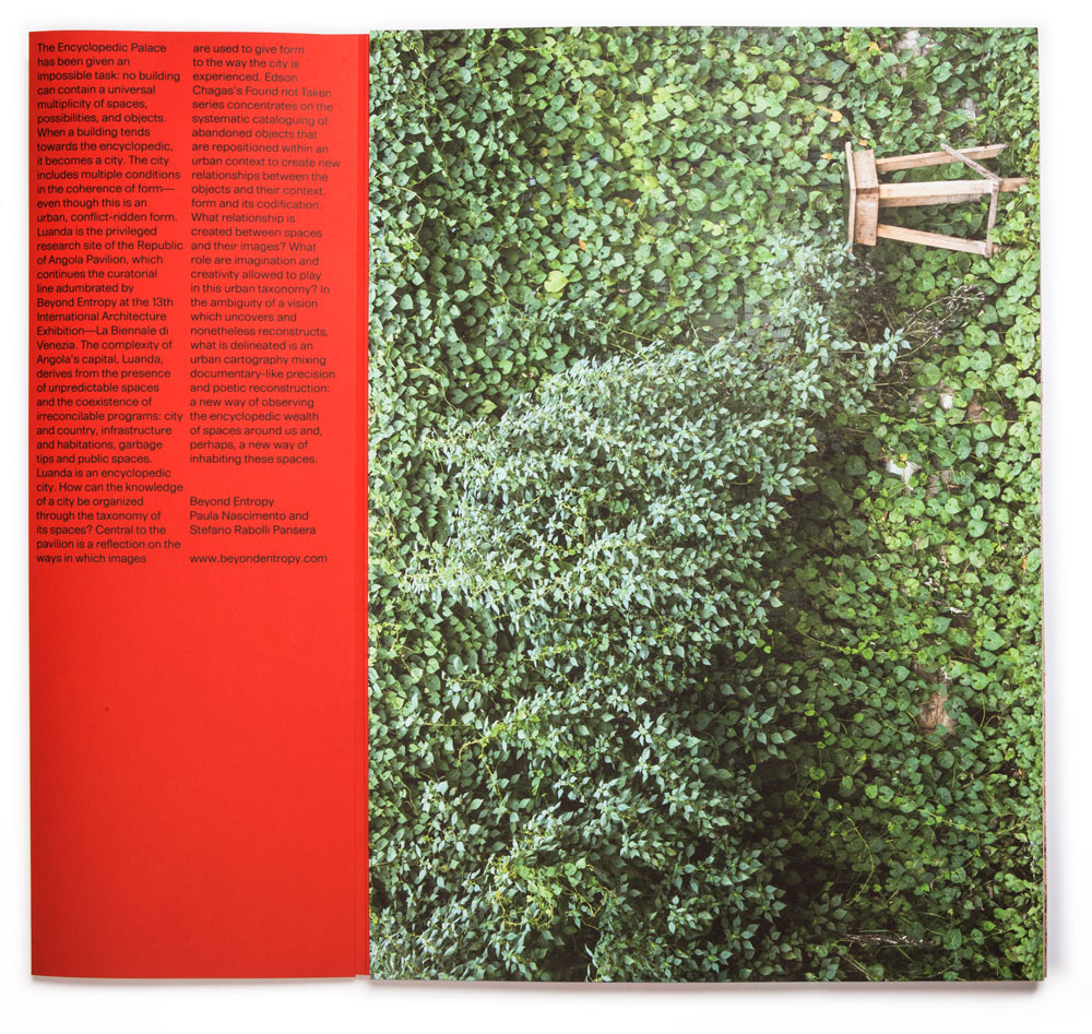
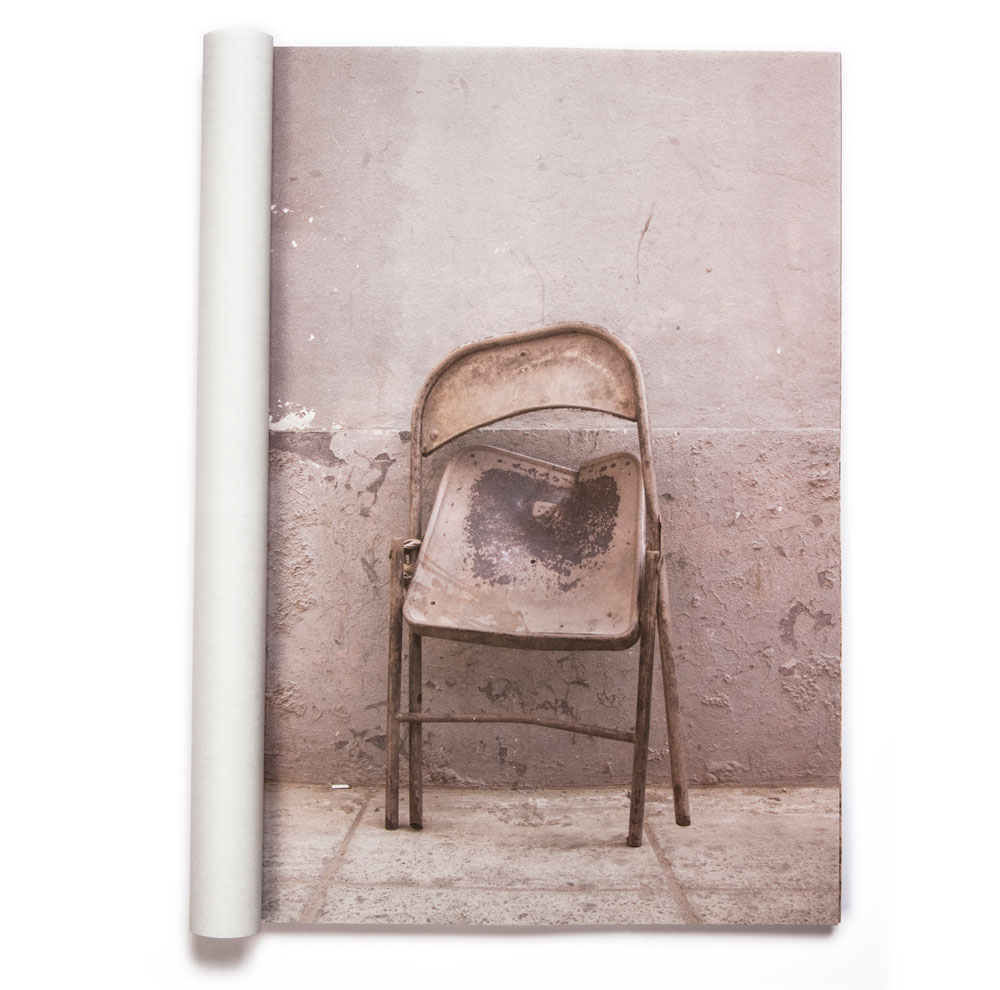
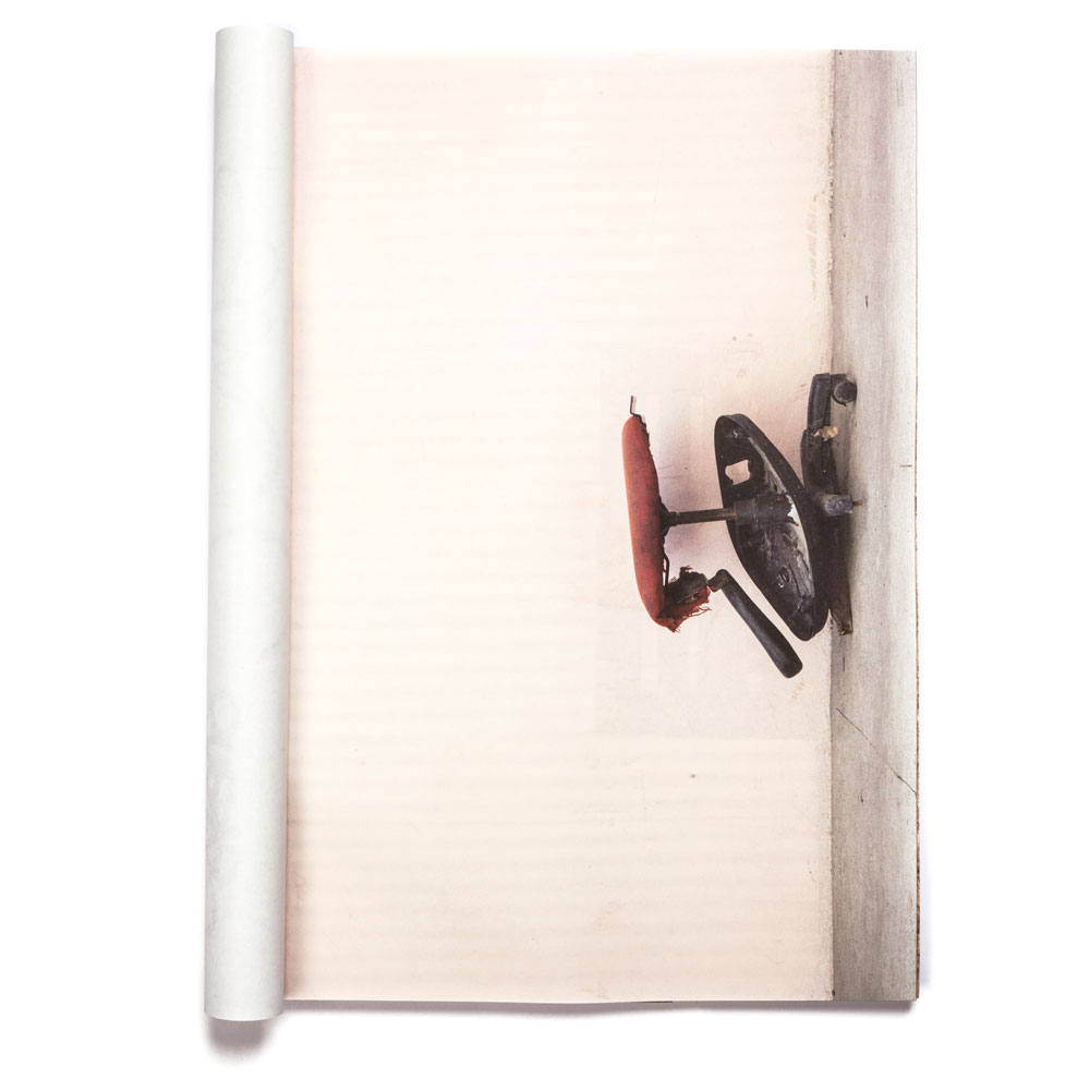
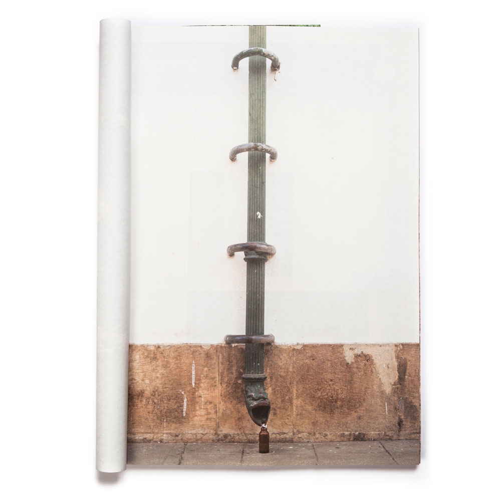
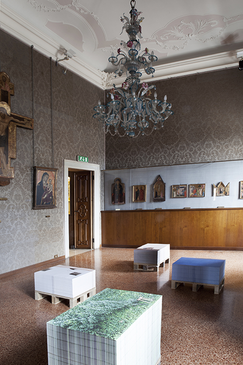
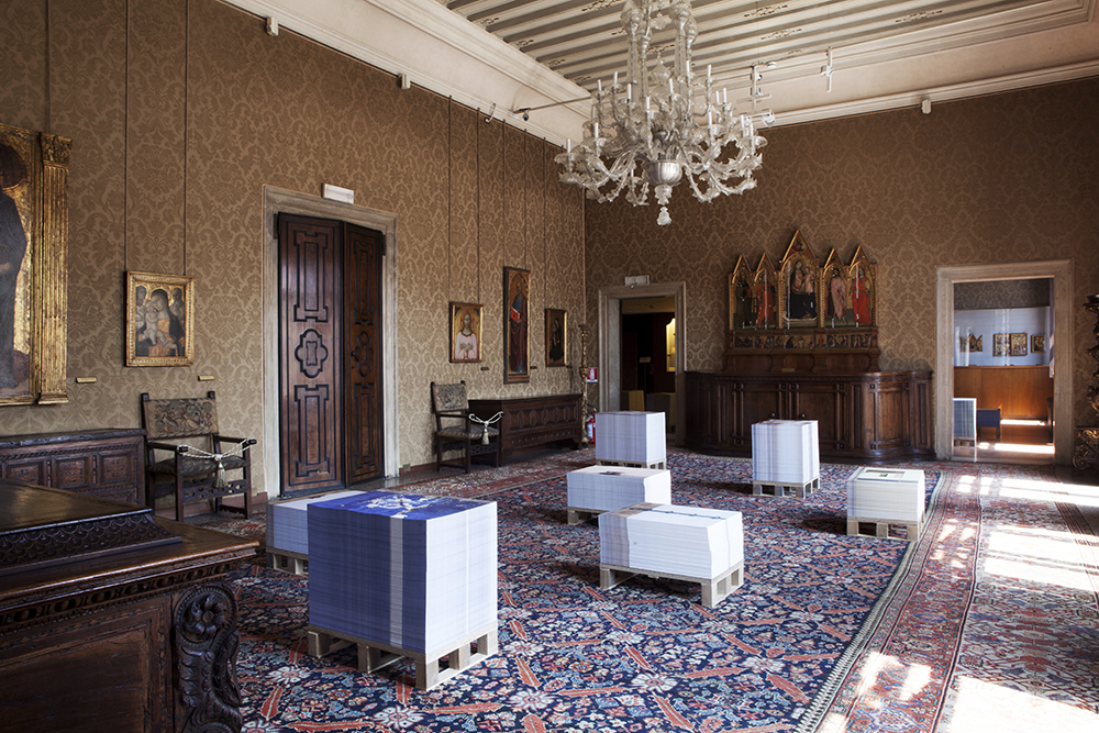
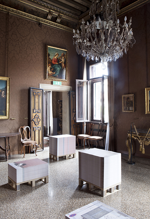
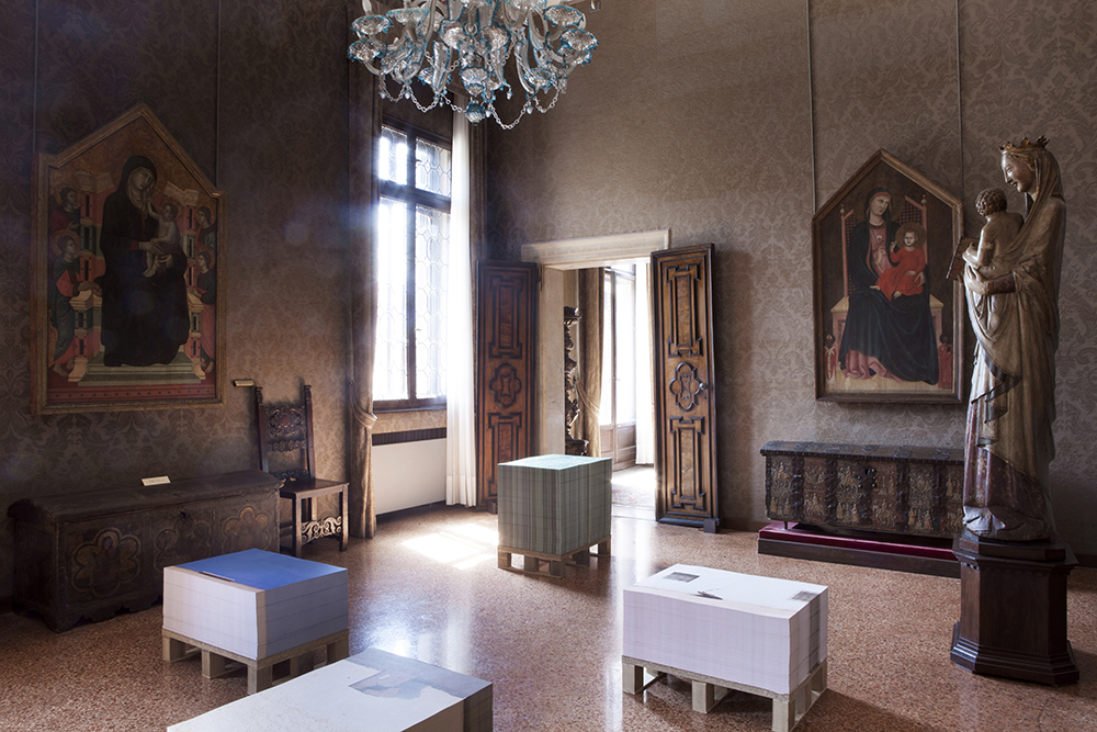
“Luanda Encyclopedic City” is the title and the theme of the Angola Pavilion curated by Stefano Rabolli Pansera and Paula Nascimento (the founders of Beyond Entropy), in the occasion of the 53rd Venice Art Biennele. The curators’ choice to display the work of Angolan artist Edson Chagas, had to be matched with the peculiar setting of the exhibition: Palazzo Cini. Palazzo Cini is a historical palace on the Grand Canal in Venice, which hosts the permanent collection of classic Venetian artworks owned by Cini family.


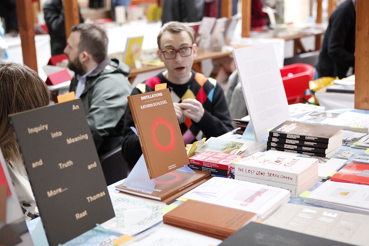
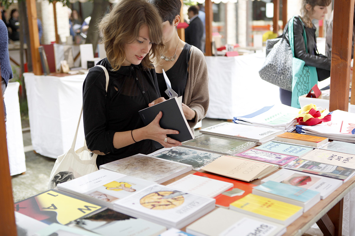
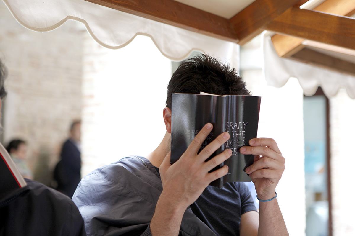
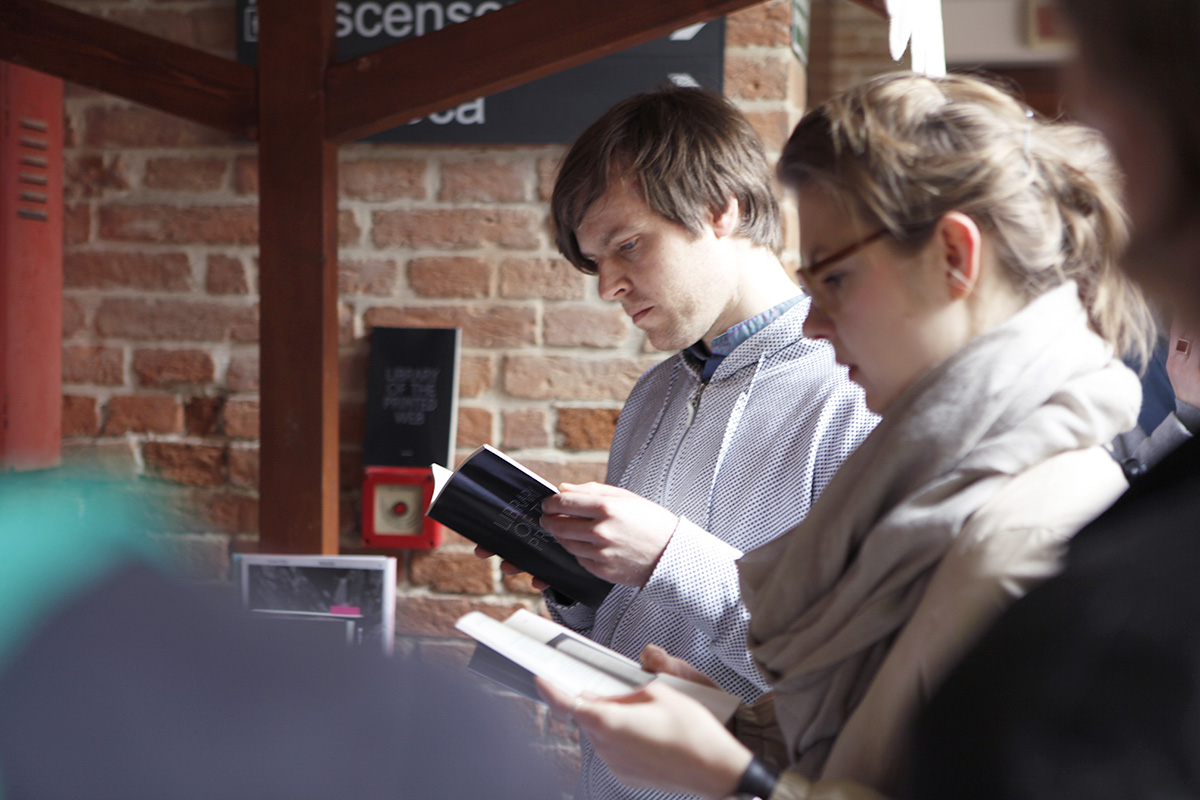
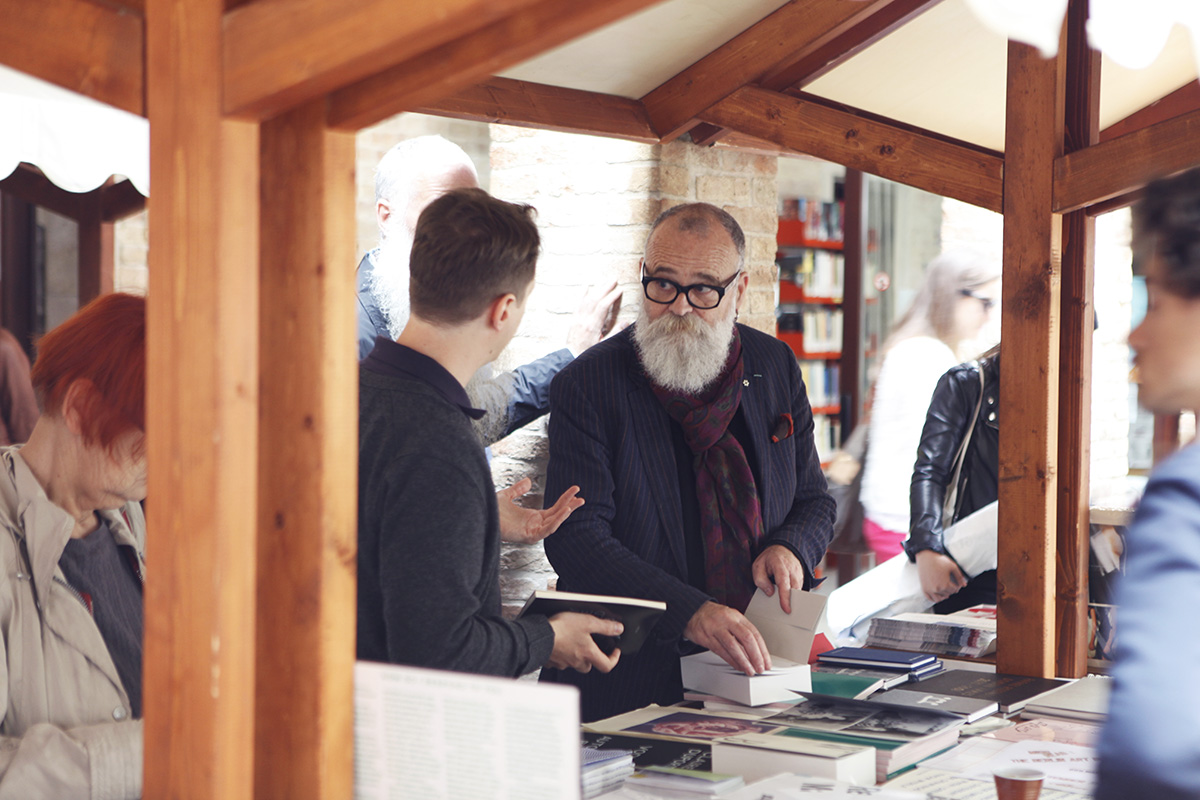
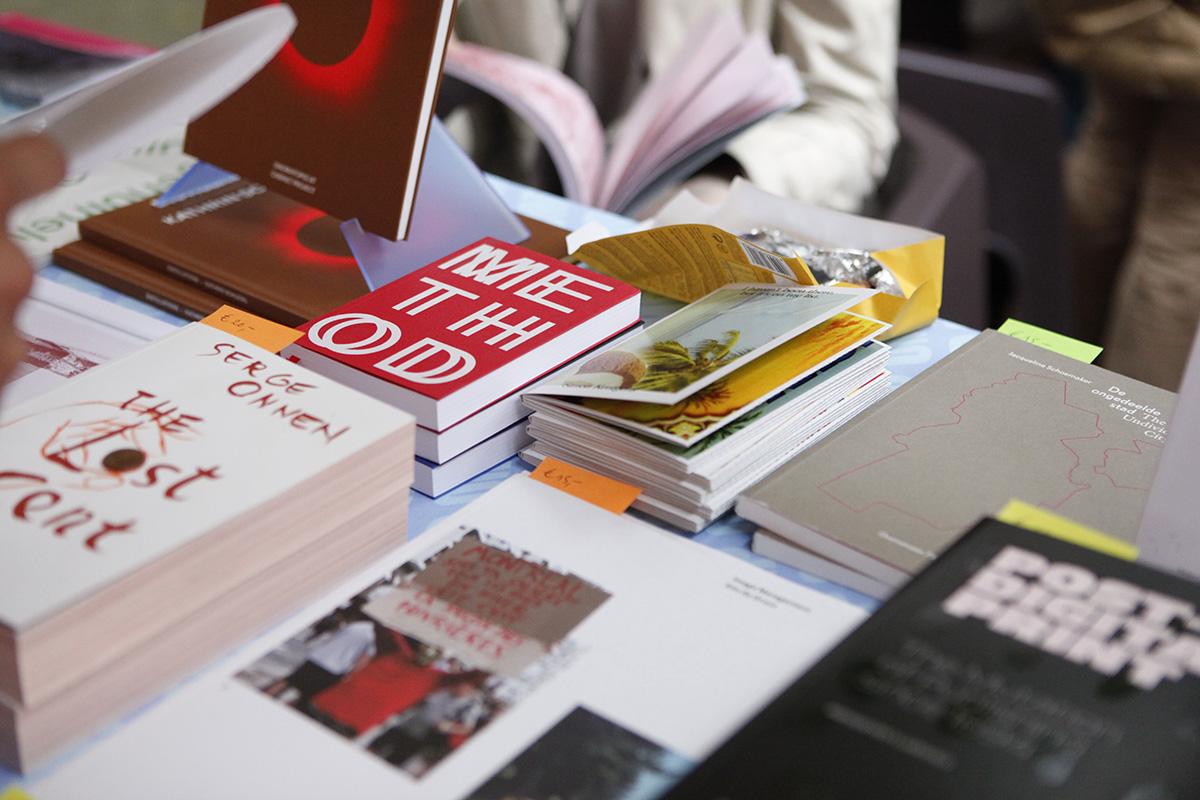
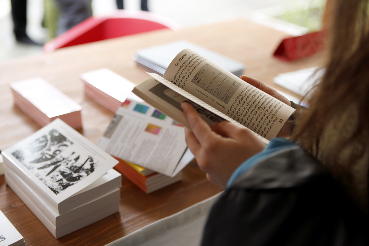
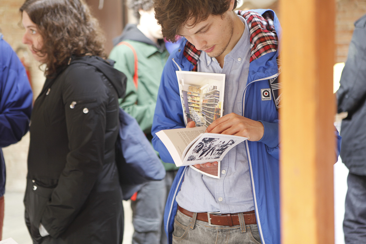
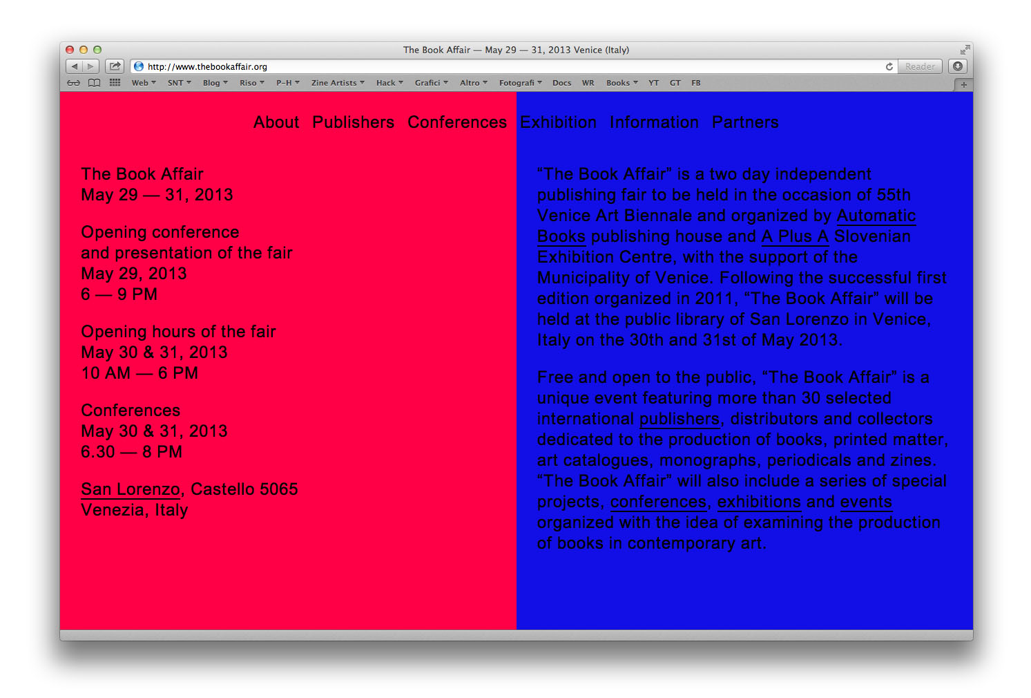
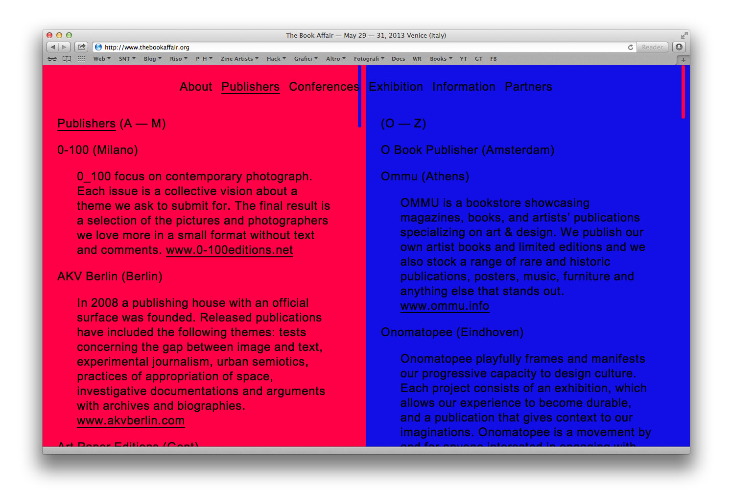
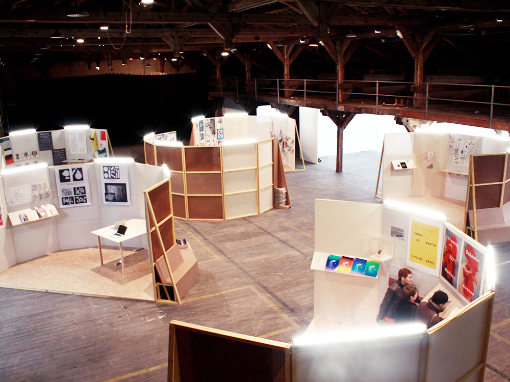
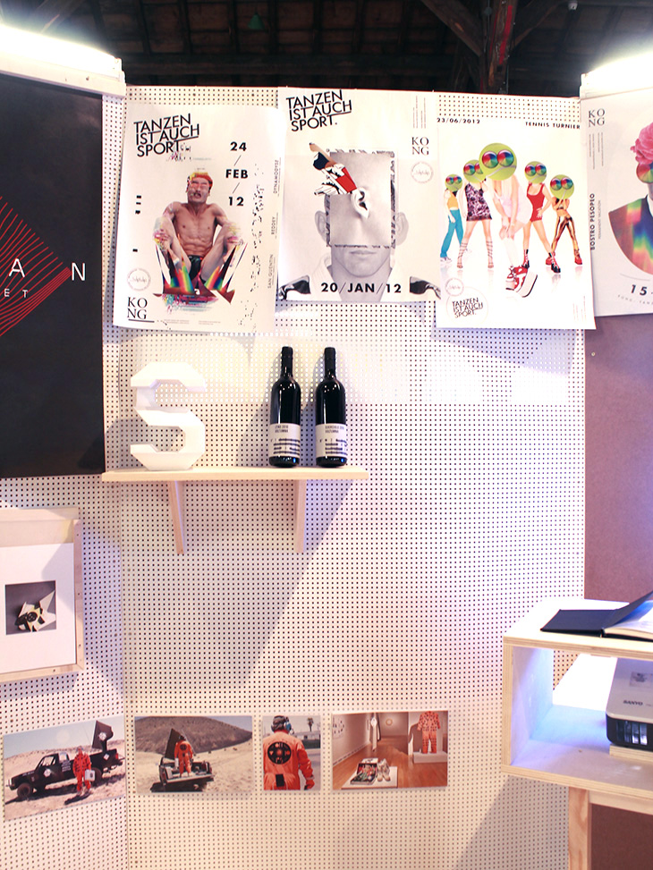
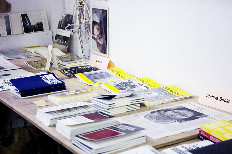
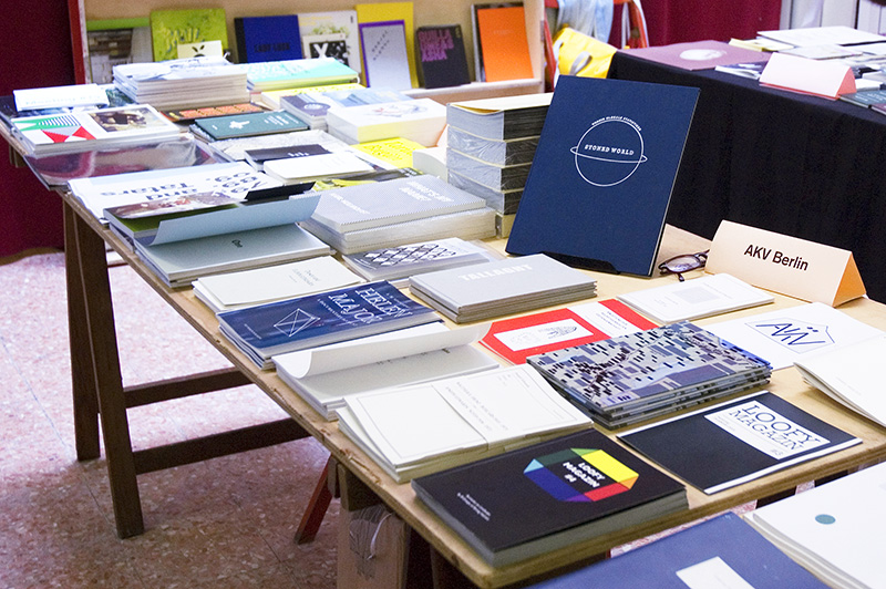
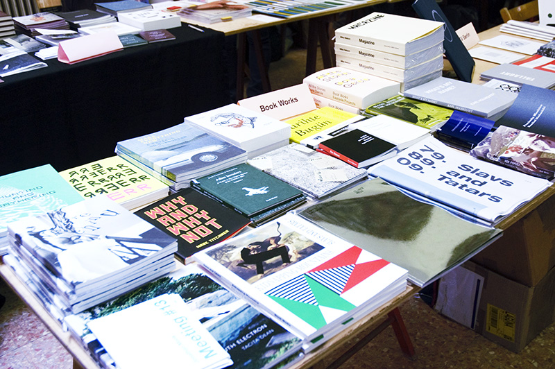
“The Book Affair” is a two day independent publishing fair held in the occasion of 55th Venice Art Biennale, organized by us with the support of A Plus A Slovenian Exhibition Centre and the Municipality of Venice. Following the successful first edition organized in 2011, “The Book Affair” was held at the Library of San Lorenzo in Venice, Italy on the 30th and 31st of May 2013. Free and open to the public, “The Book Affair” is a unique event featuring a series of selected international publishers, distributors and collectors dedicated to the production of books, printed matter, art catalogues, monographs, periodicals and zines. The list of participating publishers includes: 0-100, AKV Berlin, Art Paper Editions, Automatic Books, Bartleby & Co, Boabooks, Cura, Danilo Montanari Editore, Editions Incertain Sens, Gloria Glitzer, Kaleidoscope, Library of the Printed Web, Mousse Publishing, Nero, O Book Publisher, Ommu, Onomatopee, Pogo Books, PrintRoom, Raw Raw Edizioni, Revolver Publishing, Rollo Press, Roma Publications, Studio bibliografico Giorgio Maffei, Studio Montespecchio, Théophile’s Papers, The Wild Pansy Press, Valiz, Vice Versa Distribution, Werkplatz Typographie.
The mission of “The Book Affair” is to act as a platform for engagement with and critical exploration of the artist’s book. Situated at an intersection of disciplines — namely the visual arts, literary arts and/or critical design — this media presents a unique space of inquiry that is often complemented by interdisciplinary practice, collaboration or co-production. With this in mind, the fair aimed at exploring the publication medium in a way that is inclusive of dialogues in the visual and literary arts, as well as graphic design. “The Book Affair” has included a series of special projects, conferences, exhibitions and events organized with the idea of examining the production of books in contemporary art, following a project initiated in October 2012 in Venice with a series of conferences titled “The Seller, the Publisher and the Artist”.
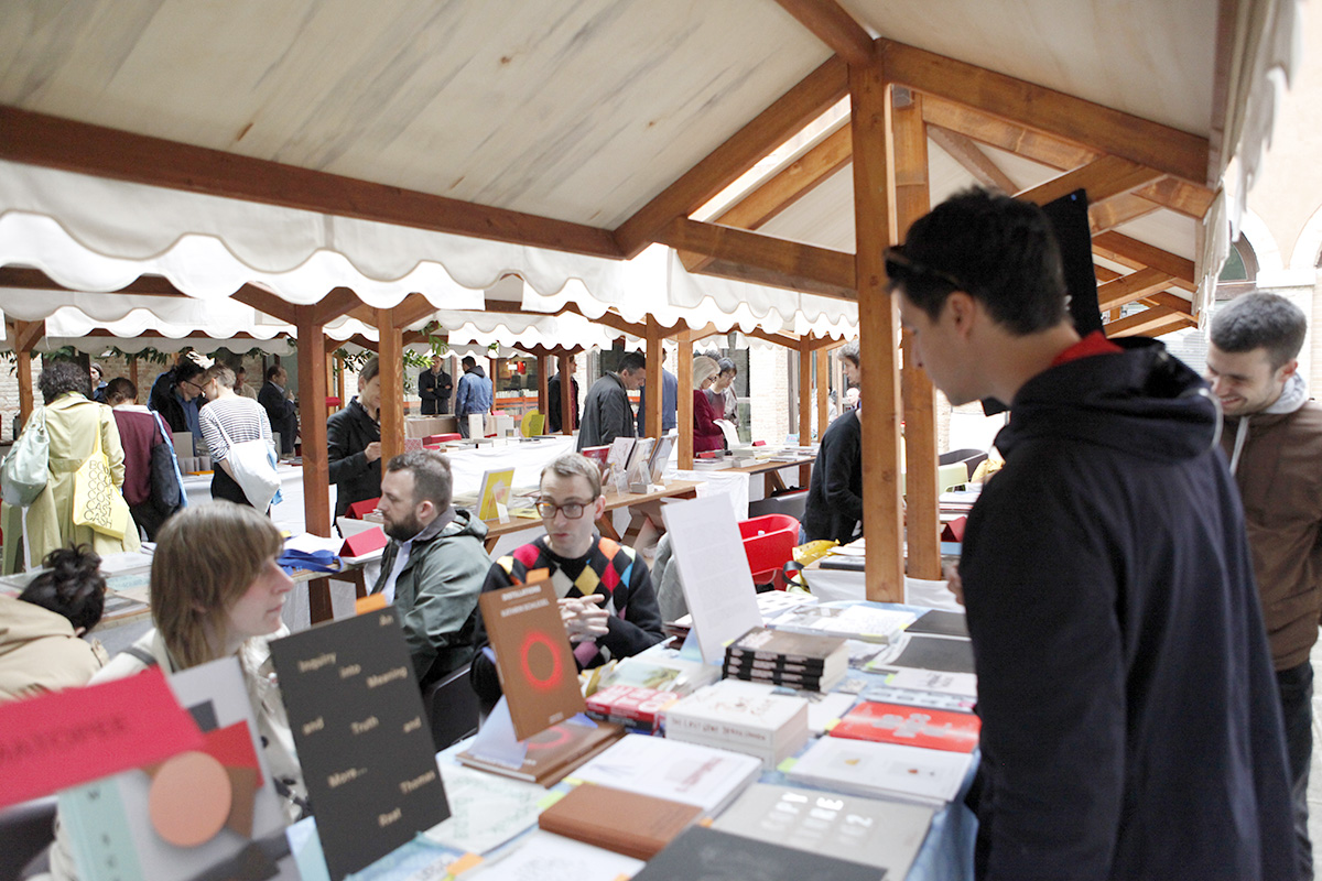


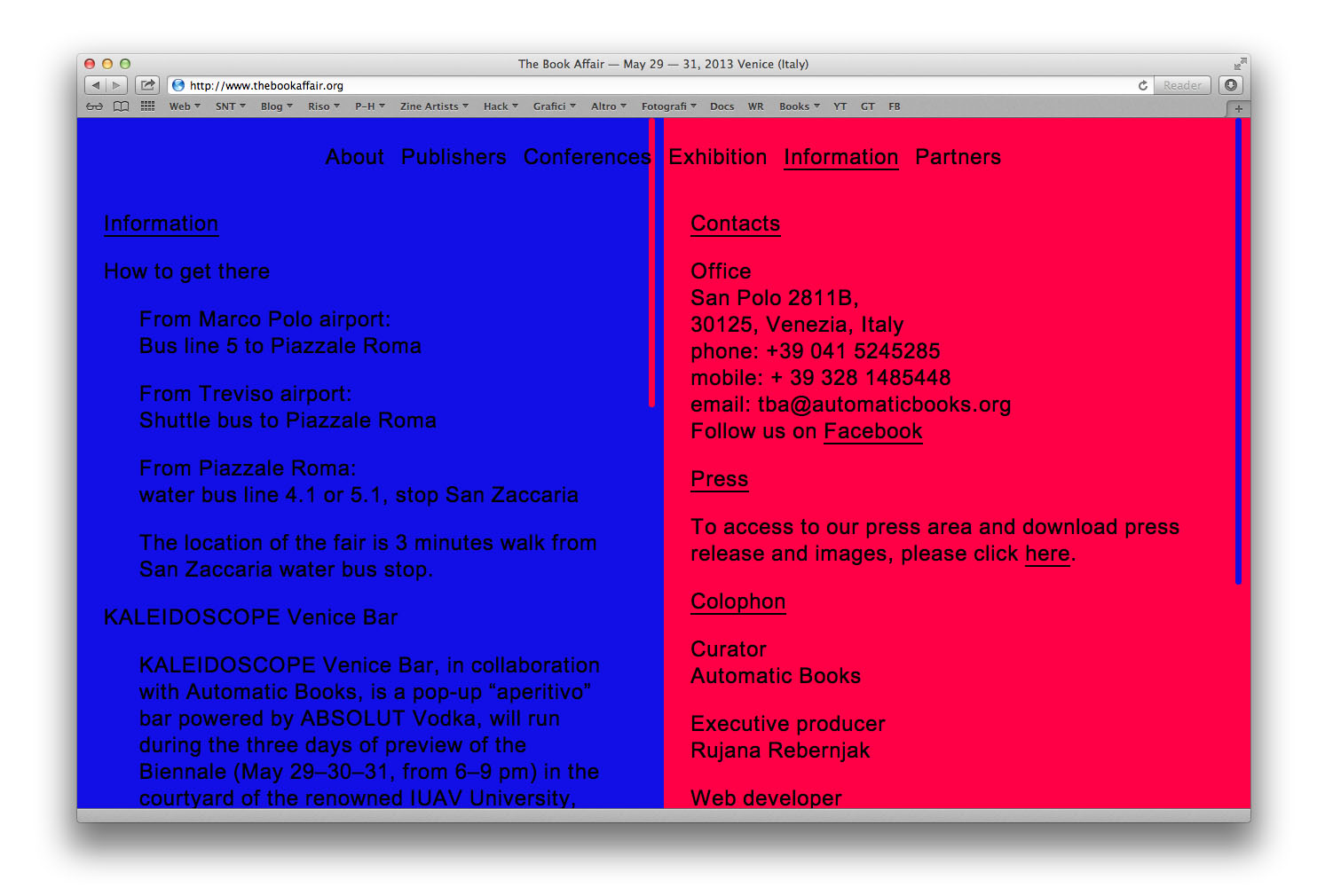
“The Book Affair” is a two-day independent publishing fair organized in the occasion of 55th Venice Art Biennale by Automatic Books publishing house and A Plus A Slovenian Exhibition Center, with the support of the Municipality of Venice, Murano and Burano. If you want to read a detailed report about the fair, please check the etcetera section of our website.
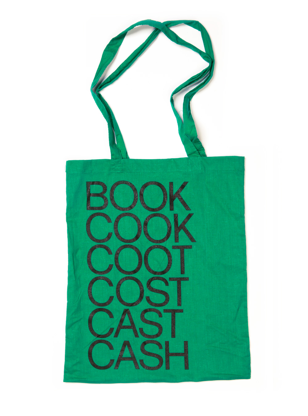
Our project for The Book Affair, differently from the poster designed two years ago, starts from the core of the event itself. We have started to reflect on what was an independent publishing fair really about and have come up with a pretty straightforward conclusion: it is about selling books for money, and these were the key elements of our project. Starting from these two words, which may even seem a bit trivial but also represent the core of the discussion and confrontation between publishes and editors, we have come up with a particular solution. We have decided to use the “world ladder” game, invented by Lewis Carrol, which consists of a puzzle which begins with two words, and to solve the puzzle one must find a chain of other words to link the two, in which two adjacent words (that is, words in successive steps) differ by one letter.
BOOK → COOK → COOT → COST → CAST → CASH
Chaumont is the French town famous in the design world for its international graphic design festival. While it was historically known as a competition dedicated solely to the poster media, since 2011 it has opened its strict selection to all kinds of graphic work. This year, even though the original poster competition was restored, it was supplemented with a panorama of other graphic media selected by a panel of international experts. We were among the lucky designers chosen by experts Andrew Blauvelt, Max Bruinsma, Na Kim, John Morgan, Giorgio Camuffo and From-To, to participate in the Panorama exhibition with our project for Voltumna wine bottles.
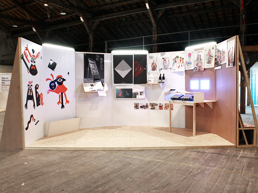
Set-up of the show with a close-up image of our project
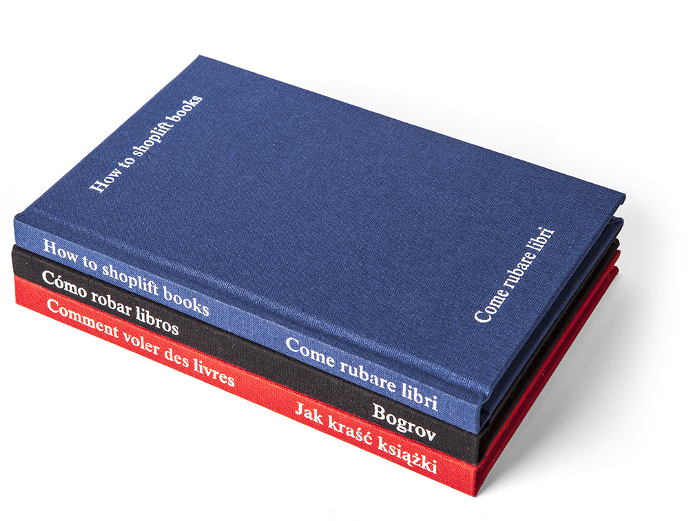
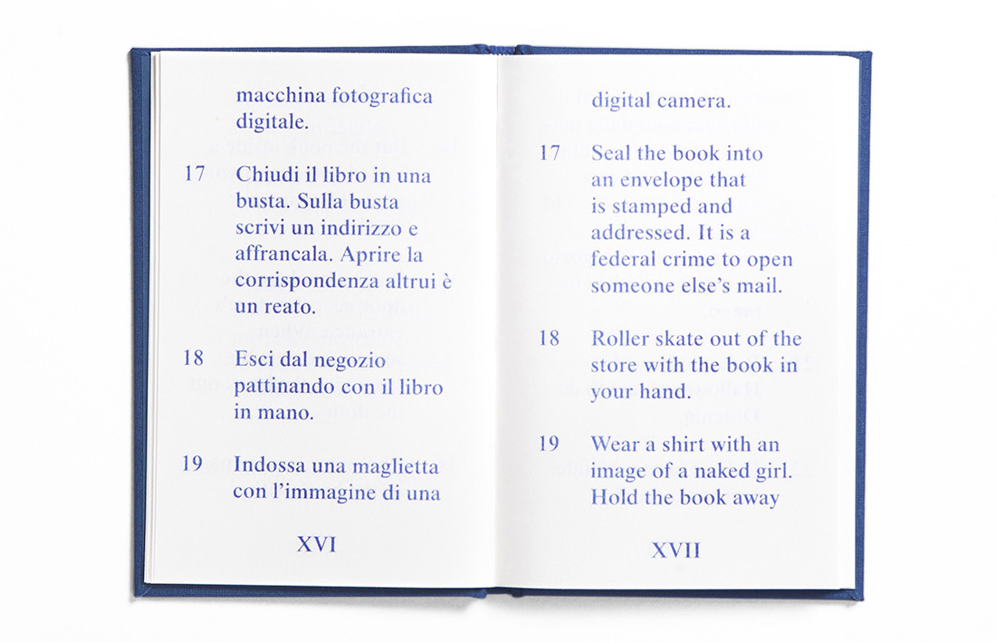
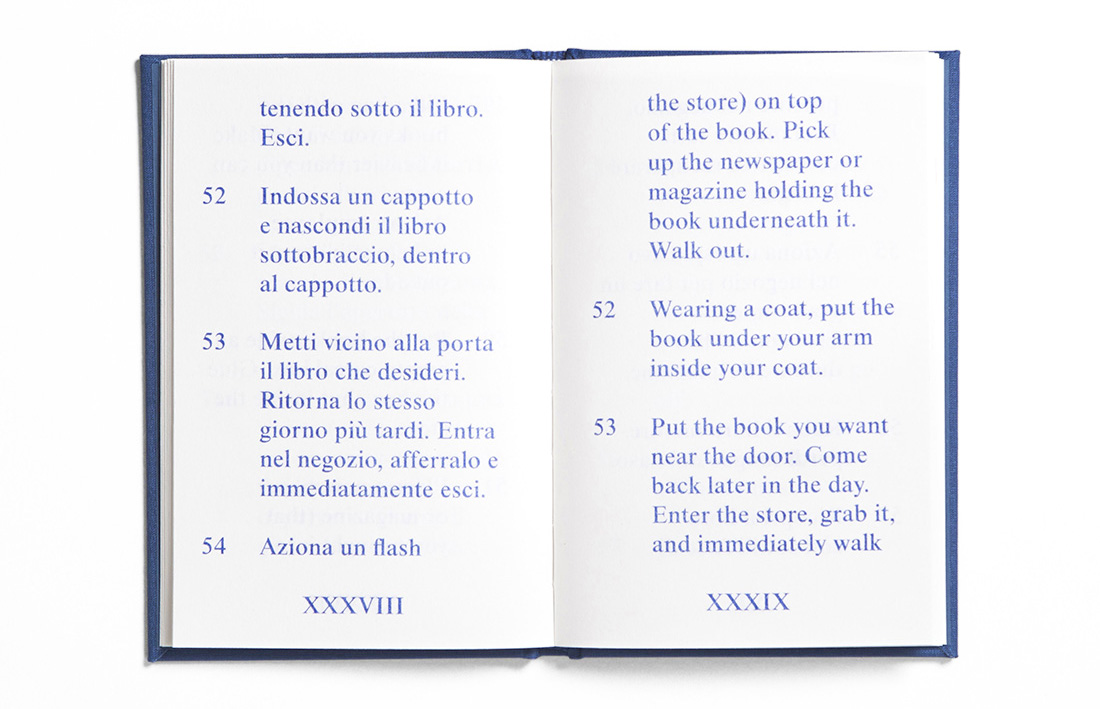
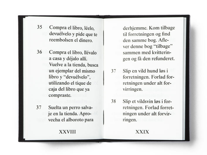
“How to Shoplift Books (Come Rubare Libri) is a shoplifter’s guide in both English and Italian, compiled by American artist David Horvitz. Originating from a talk led by Horvitz at New York Art Book Fair in 2011, it details 80 different ways to steal a book. From the very practical, to the witty and romantic, the book reads like simple instructional text artworks by the conceptualists’ generation.”
This is the description of this long project developed with the artist David Horvitz used by Printed Matter. What they cannot possibly know about this book and its design are the reflections and doubts we’ve had about creating the graphics for such a particular project such as an artist’s book. In fact, when working on these kind of projects, we feel the necessity to aid the author/artist in expressing his thoughts through the layout and material quality of the book, but never want to compete or obscure the artist’s work through our graphic intervention. We could say we very much agree with what James Goggin says in his text “The Matta-Clark Complex”, denoting the way designers create books whose form apes and competes with the content. And we didn’t want this to be the case with How to Shoplift Books.


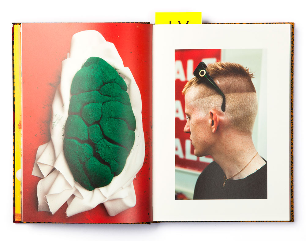
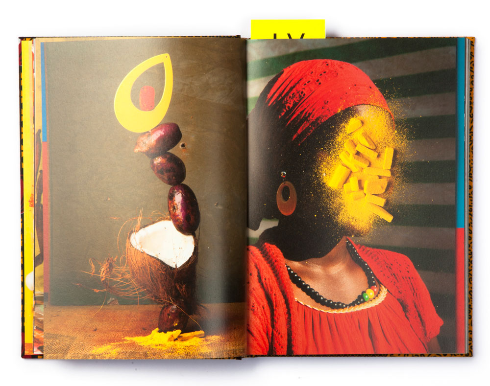
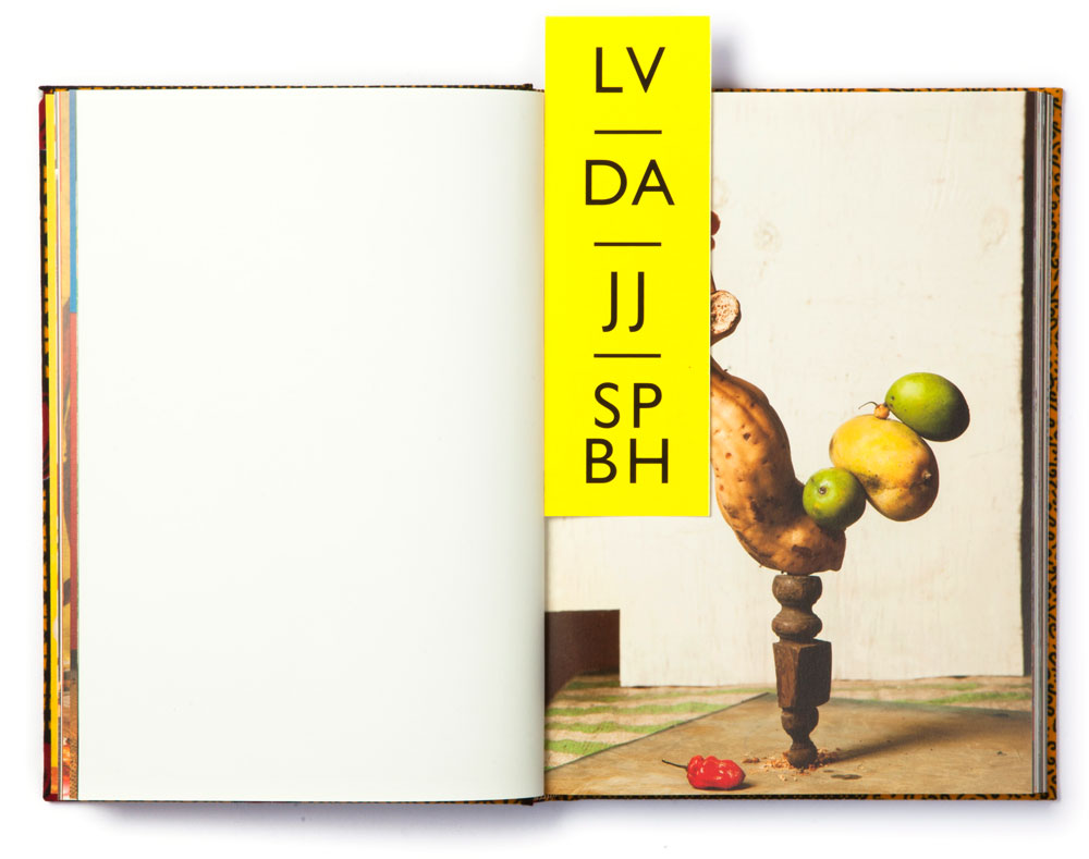
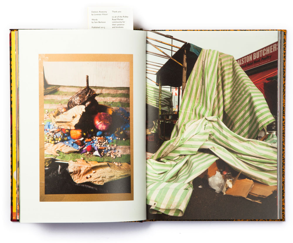
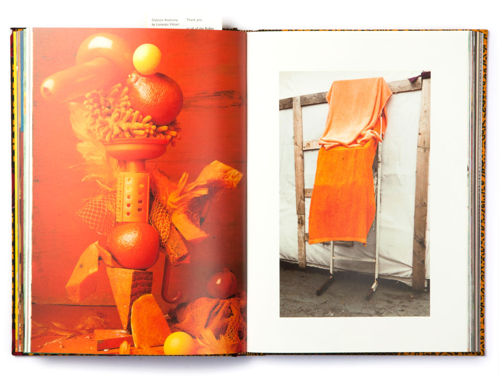
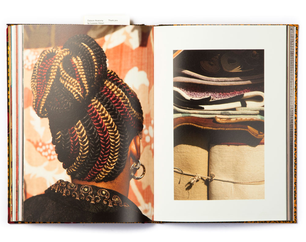
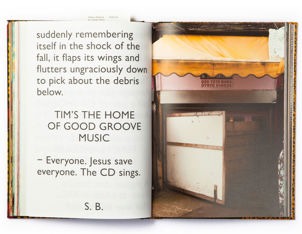
“One Pound, Have a Look, Yam Yam” is a sort of a mantra repeated by sellers at Dalston market during their long working hours and is also the title of a personal project developed by our dear friend sculptor and photographer Lorenzo Vitturi. For this project, Lorenzo has collected debris, objects and food from the market, assembling them in strange, colourful compositions and later juxtaposing them with images taken on the streets of Dalston.
In fact, this powerful flux of colours, shapes, materials and characters, united in a melting pot of weird real-life photography and imaginary still life, called for our minimal intervention. The work of a photographer is always a medium in itself and, just as we have done with artists’ books for Automatic Books, we have decided to concentrate our attention on the message the author wanted to convey.
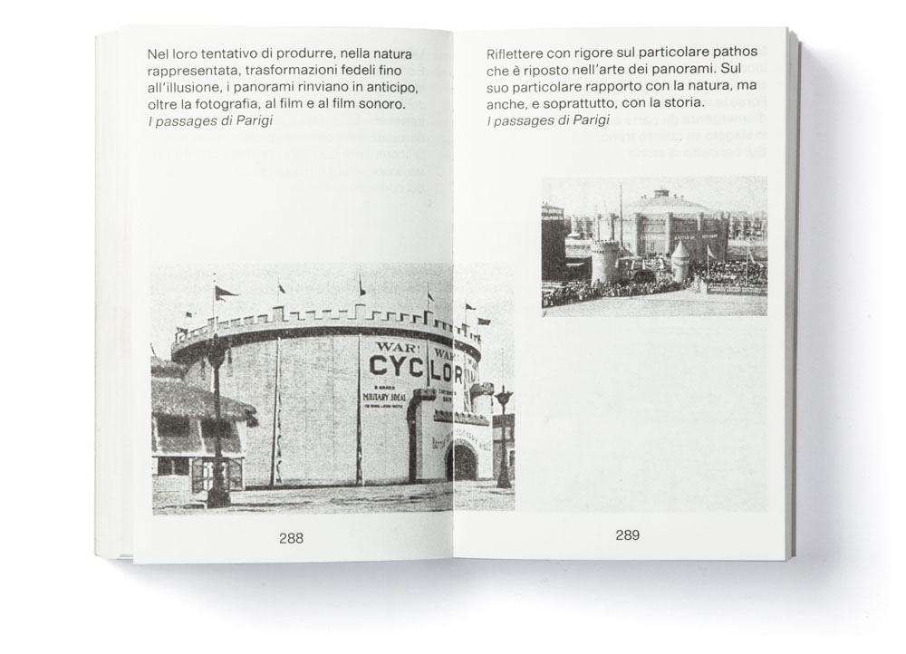
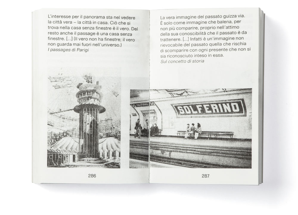
WB, is the title of the book edited by Sandro Pignotti and designed by us which borrows its name from the acronym of the German-Jewish philosopher Walter Benjamin. The book visualizes the whole spectrum of Benjamin’s thought in 460 pages, combining on each page a single quotation of the philosopher with an individual image. WB is an iconographic, artistic and philosophical enquiry into the relationship between the written and the visual world. Sandro Pignotti has carefully chosen the juxtaposition between each quote and each image with the goal of stimulating the reader’s thoughts on history, modern and contemporary art, philosophy, religion and politics. By exploring and overcoming the usual borders between the written and the visual, WB tries to refer directly to our reality. This was the method used by late Walter Benjamin in his Arcade Project and in his Thesis on the Concept of History, where he confided entirely on images combined with quotes taken from literature and philosophy in order to uncover “the true image of history”.
WB, Sandro Pignotti
560 pages, 1 colours Risograph print,
12 × 19 cm, soft cover
Order here

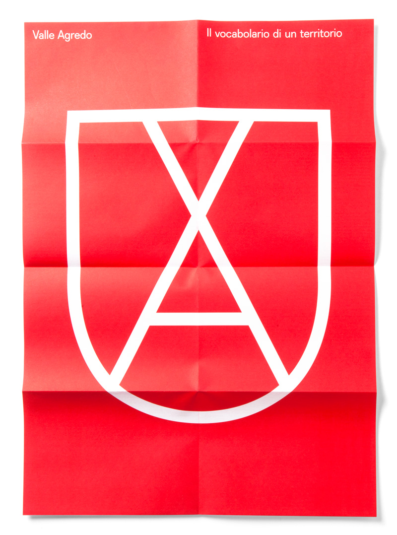
Designing a corporate image of a brand is always a delicate task, one that bares a whole lot of responsibility for the designer: the brand’s identity constitutes the first contact the public will have with the brand, whether it be an image or an idea by which it will be forever remembered. Designing a corporate image of an entire institutional and geographic territory, a union of 11 different municipalities with a population of around 100.000 inhabitants, implies even more responsibility. In fact, the visual representation of the territory will have a direct political implication and the outlined identity will impact the daily life of its inhabitants while it will also publicly represent the community.
In fact, when we were contacted by the union of Camposampierese, we were asked to design a visual identity which would be coherent and recognizable, while also representing the values of the territory and its inhabitants. As designers, we have added another goal: to create a visual vocabulary, a graphic tool which would not only clearly identify the territory but also aid in its internal communication and help in delivering its daily tasks and services.


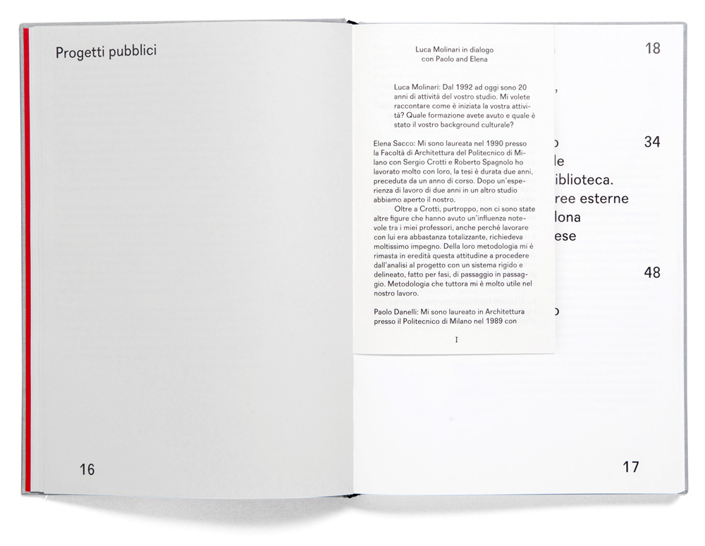
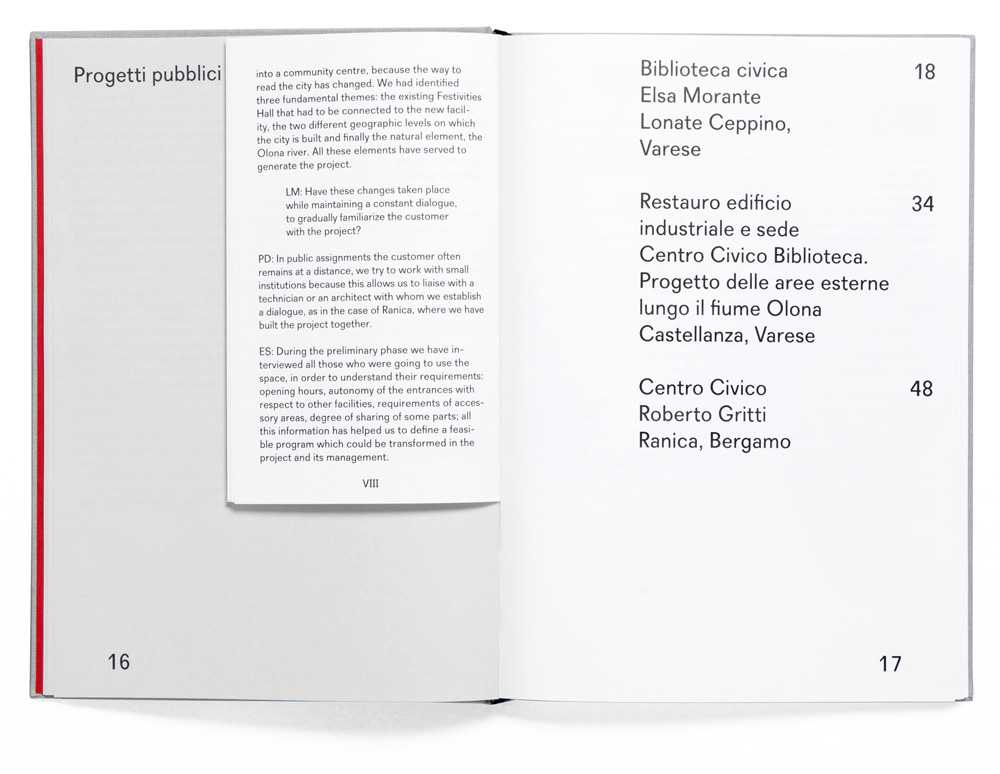
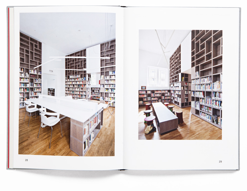
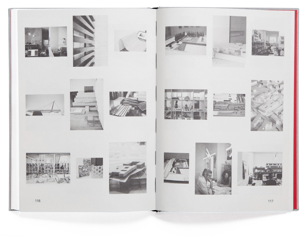
This book is a monograph of Milan-based architecture studio DAP Studio, founded by Elena Sacco and Paolo Danelli. Luckily, we had the possibility to work on the concept of the book in close collaboration with Luca Molinari and Simona Galateo (from Viapiranesi), giving a structure and a unique concept to the book even before the actual contents were developed. Together with Luca and Simona, we aimed at creating an editorial book with a proper story, avoiding a portfolio-like effect, while also offering an object which appears peaceful and friendly, which are the first things you note when meeting Elena and Paolo.


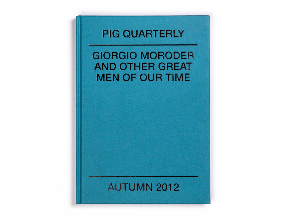
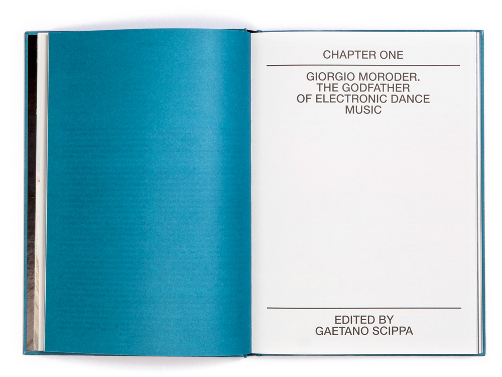
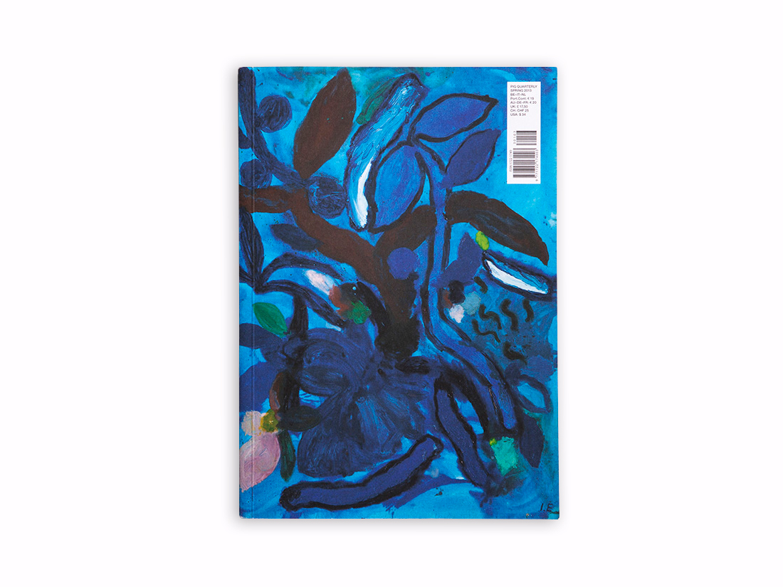
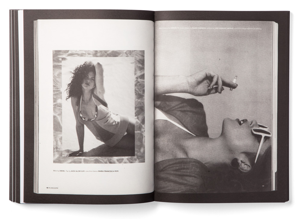
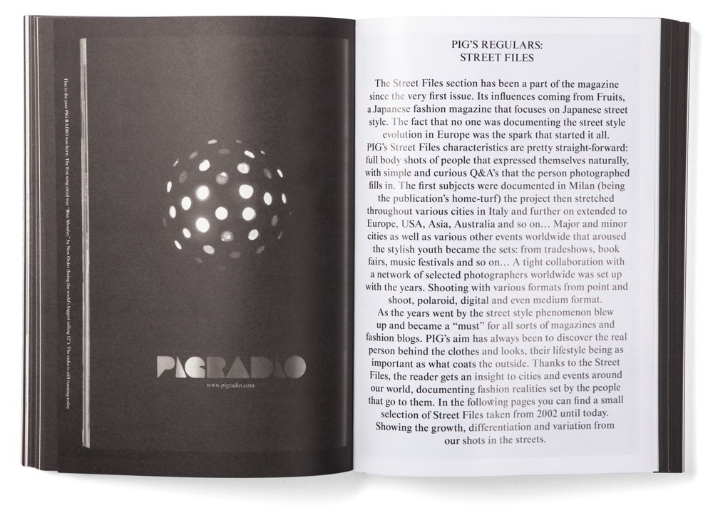
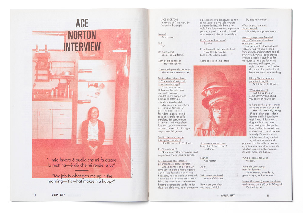
PIG Quarterly is an Italian magazine about contemporary culture, music, art, design, fashion and photography. After ten years of activity, the founders and editorial team of the magazine have decided it was time for a major shift. Hence, from being a monthly magazine in Italian, PIG has become a quarterly publication developing longer features, with the idea of offering a product between a book and a magazine.
We were called by Valentina Barzaghi, the Editor in Chief, Daniel Beckerman, the publisher and Sean Michael Beolchini, the creative director of the magazine, to help them develop the new graphic design as art directors of the publication. Following their guidelines that were aiming at developing a timeless editorial product more than a periodical publication, the issue zero of the magazine was born. Looking at the classic qualities of book, such as the A4 format or the hard cover binding, we have developed a project whose goal was to be as neutral as possible, surpassing styles and temporary flair.


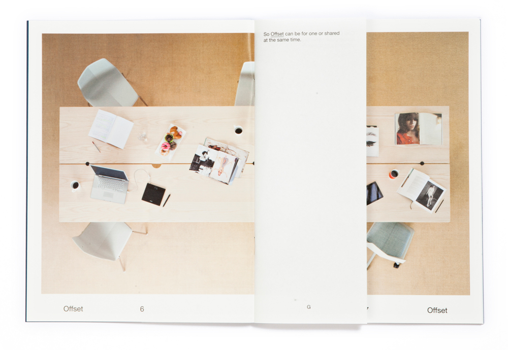
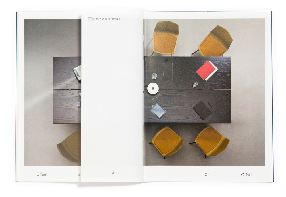
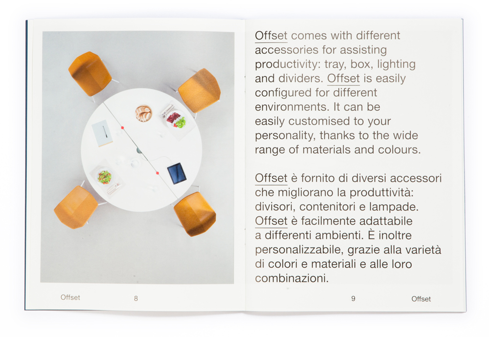
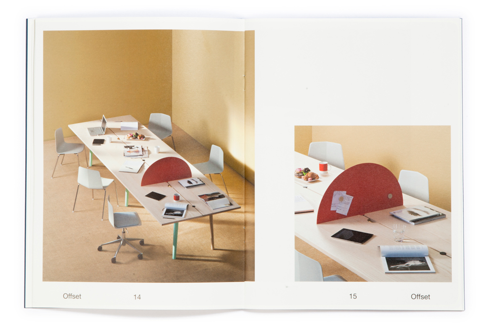
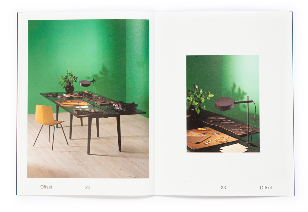
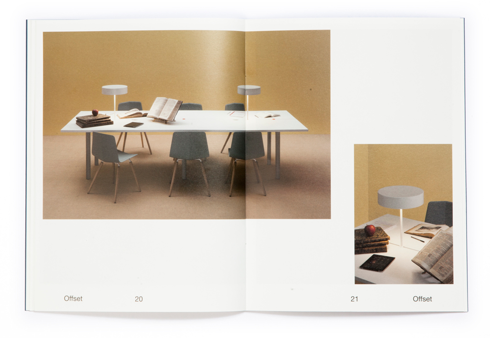
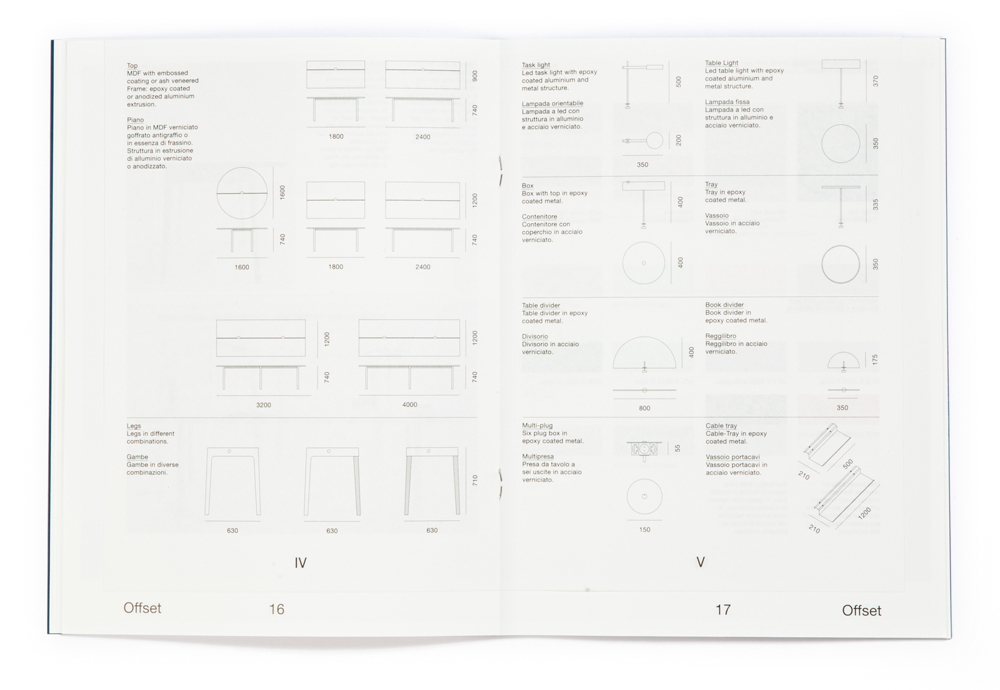
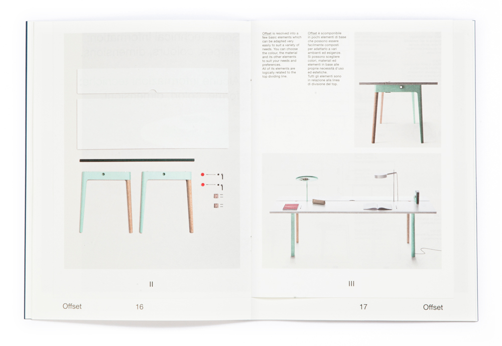
Offset is a project designed by Tomás Alonso, a young spanish designer, for the Italian company Maxdesign. More than a simple table, Offset is a concept for the organization of a workspace. Offset, in fact, was designed as a response to the contemporary working situations, where co-working is replacing big offices and freelance professionals substitute employees. The concept of the catalog departs from the idea of using paper as a playful instrument in communicating the project, with a not to children’s books produced by Bruno Munari.


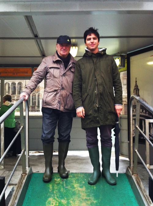
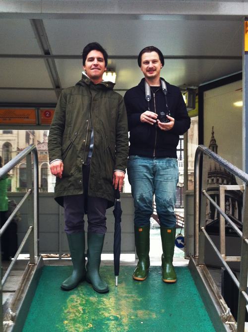
As many of you may know, besides its historical and artistic heritage, Venice is widely known for quite a bizarre phenomenon: acqua alta (high water). After Saturday’s conference with Franco Vaccari, we have had a chance to take a stroll around flooded canals and streets geared with our rain boots. After the demanding stroll, as every good tourist, we have dedicated ourselves to a small photo session. Here you can find a photo of Marco and Lorenzo by Franco, a photo of Lorenzo and Franco by Marco and a photo of Marco and Franco by Lorenzo.

When you start with a project of a new typeface, the first issues that arise regard the meaning or the use of the typeface. Kant is a typeface designed with a twofold goal: a high readability when used for editorial projects (for example, when printed in 8pt size) and a clear visualisation when used on digital outputs. In fact, this typeface was designed for a specific project of a series of print and digital (both mobile applications and websites) travel guides, where each output has the same importance. Since we weren’t able to find many fonts that respond well to those needs, we have decided to design one.
In order to obtain high readability in small sizes we have augmented the space between each letter and lightly compressed the width of each glyph, differently from what you can usually ee in grotesk typefaces (like Helvetica, for example). In this way, the white shapes around each letter aid us in articulating better each letter, while at the same time maintain the length of each word unvaried (which, in an editorial project, means saving a lot of space and reducing the costs of production).


The production of artist’s books is nearly a century-old and acknowledged art-world phenomeno. Despite its established and deeply rooted tradition, the production of artist’s books is still at the centre of an on-going debate. This series of lectures were intended to turn the focus from the artwork to its supply chain, reflecting upon points of view, stories and interpretations of different actors directly involved in the production process. From the publisher to the retailer, we will shed light on the complex and fascinating network which takes the artist’s book from its conception to the bookshelf.
The first conference, held Monday 15th October 2012 at A plus A, had as protagonist Cornelia Lauf, American curator of German origins with a passion for publishing. Cornelia is the co-founder of Three Star Books, a publishing house that is specialized in the realization of editorial projects conceived as artworks, created in collaboration with artists of the caliber of Maurizio Cattelan, Tobias Rehberger and Ryan Gander.
On 10th November 2012 was Franco Vaccari‘s turn. Appreciated by the critics, present on the scene since the early sixties, he participated in the Venice Biennale on various occasions (1972, 1980, 1993 with a personal showcase and in 1995 with a collective exhibition).
The 3rd December 2012 Giorgio Maffei, artist’s book historian, art collector and seller of rare vintage artist books spoke to our Venetian public. He wrote numerous essays on the relationship between the editorial world and the art world, one of which is entitled “Il Libro D’Artista” published by Bonnard in 2003. From Marinetti to Cattelan, spacing from conceptual art to poor arts, the book had been used by artists of all époques not only as an expressive media but as a real artistic object. Despite the increasing computerization of paper printing, we internationally assist to a renewed interest in artist books understood as rare objects, with limited circulation, self produced and self published, to the point of becoming a unique art piece.

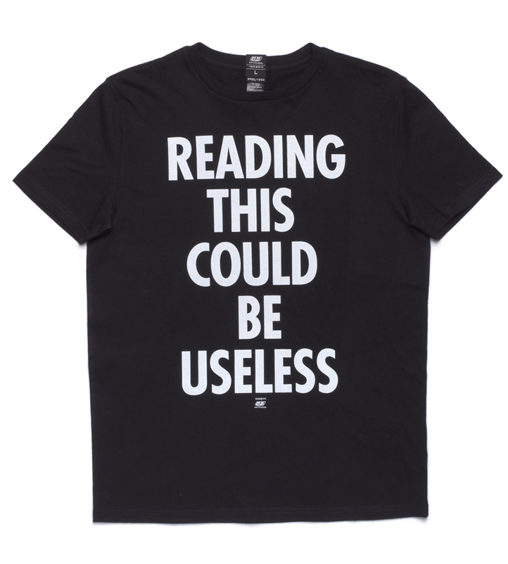
The T-shirt designed for 55DSL‘s FW 2013 collection, has its roots in our continuous production of T-shirts. We envision this piece of clothing as a communication tool, a sort of a one-sentence manifesto, often used by young generations as a medium of personal expression (especially in the pre-internet era). Exactly in the same way as ‘you are what you eat’, a T-shirt represents ‘you are what you wear, and what you declare by it’. “Reading This Could Be Useless” T-shirt is born out of this paradigmatic idea: a contextual use of a medium in a historical period when the young generation doesn’t believe in strong credos or statements, but is at the same time constantly exposed to a multitude of messages, emptied of any political value.
We have been following Circuito Off’s visual image for quite a while and have always tried to create campaigns which would illustrate the festival’s themes and rich contents. For the year 2012, the festival had undergone substantial changes, but the short films presented were carefully selected and thus deserved to be treated with proper attention. In fact, since the festival had moved from its famously known location the previous year, we felt the need to concentrate on its contents.
Hence, we have created the image which quite literally represented the projects presented. The materials we have designed were created by making a list of all the participants of the 13th Circuito Off festival. To create a bold image we have decided to use black lettering on a strong green background. We have decided to use a sans-serif typeface characterized by narrow letters in order to create a visually tense composition. Besides a 70 × 100 cm poster, affixed on the walls of the city, we have also created a 10 × 15 cm postcard and a program brochure with the same graphics.

For years, if we were to write our own manifesto, one of the most prominent points would have been: “Logos are useless, the typography is enough”. And as a suffix to this point we would have added: “Logos shouldn’t be created if they are not utterly needed, otherwise we are augmenting the visual pollution that surrounds us”. As an obvious conclusion, we used to believe that a graphic design studio shouldn’t have its own logo.
Despite this, following the fascinating concept offered by Ettore Sottsass who says that being inconsistent is great, at a certain point, we have decided to design our own logo. We felt the need to have a logo which would be a visual statement representing the dialectic at work in our studio: two symmetrical but contrary personalities, which meet at the centre of a single sign. Obviously, this logo has its root in the archetype of crossed hammers, symbol strongly related to the heavy industry of the last century, which subsequently became symbol of work (on street signs it represents the workdays) of the working class and its culture, from English football teams to hard-core music bands. Last summer, for example, while visiting the historical Zollverein factory/mine owned by Krupp family in Essen, we have found a series of materials describing the use of hammers as symbols of the plant. An example: Aral Logo 1917

![]()
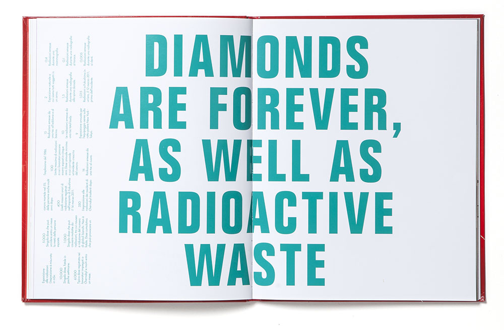
In 2012, Gianni Sinni invited us to contribute to a project discussing the impact of nuclear energy named “L’Imbroglio Energetico” (The Energy Con).” L’imbroglio energetico” is a book that analyzes the current energy system with the intent of providing the reader with critical information about present situation in Italy.
Through “infographic” tables the reader will have access to all information necessary to form an opinion or take further considerations. As far as our project is concerned, we are not quite capable of producing an “infographics” model of representation, so we have decided to concentrate our attention on one thing that can influence people’s thoughts on nuclear waste in a more direct and bold way.
Atlanti Civili, L’imbroglio Energetico
Cristiano Lucchi and Gianni Sinni
Edited by Nuovi Mondi, Italy
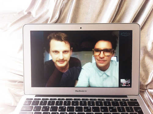
On the silver couch is a series of interviews, that greek artist Angelo Plessas holds on his website. This week Angelo invited us for this small chat. As we were not able to be phisically in Athens, on his silver couch, he organized a skype call and took a photo of us, virtually lounging on his sofa.
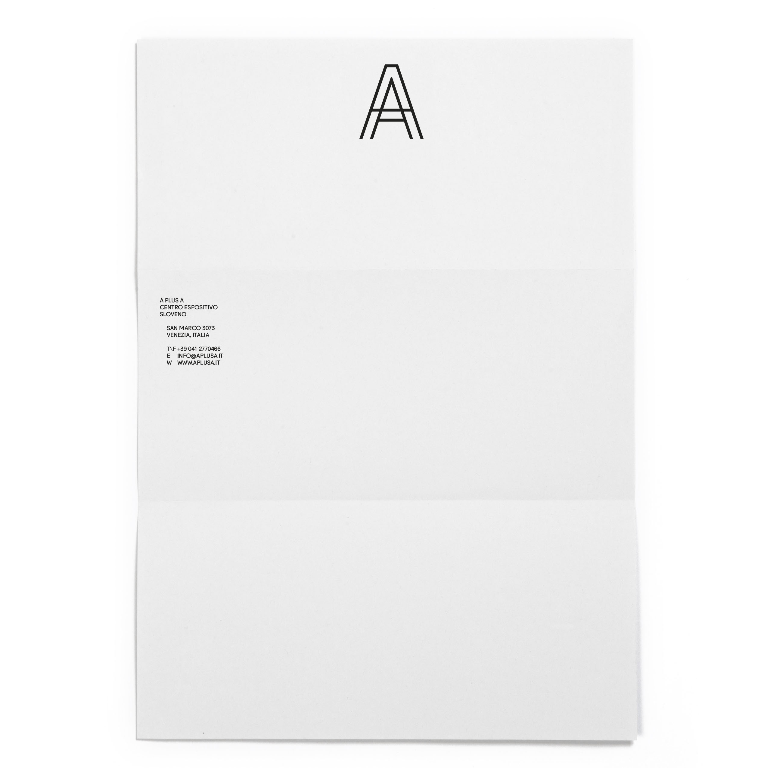
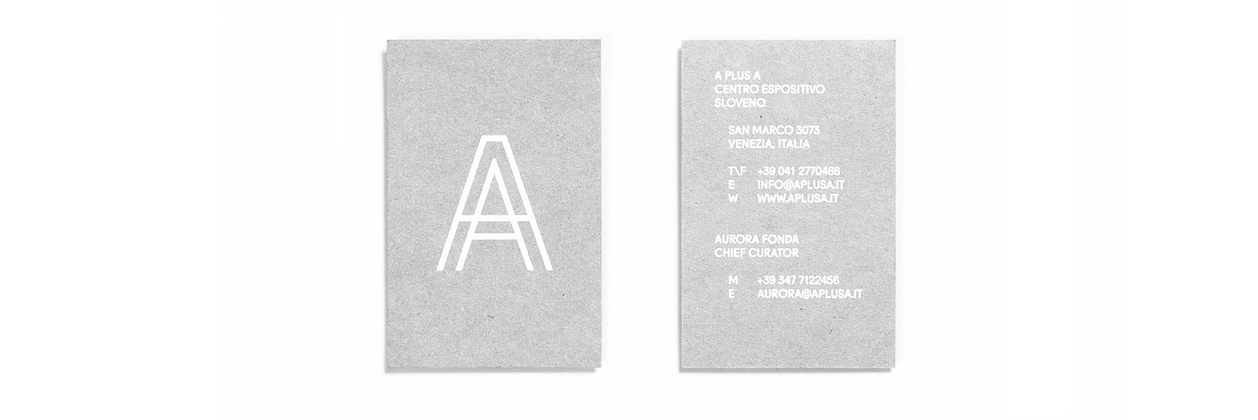
Since the very first brief in which the chief curator of A Plus A Slovenian exhibition centre has asked us to re-design the symbol of the gallery, the final result seemed obvious: two letters A, merged together by a single horizontal trait. As often happens, though, translating the initial concept in the final design, something turned out wrong: the symbol seemed weak, illustrative and didn’t pair well with the chosen typeface (Fugue designed by Radim Pesko). At this point, we have decided to trace the two letters A from a third, single letter transformed in an outline. In this way, the two letters merge together producing a single, big A symbol.


Talented designer and type designer Benjamin Critton showed us this book where he applied Recta, our new typeface. Benjamin Critton (b. 1983) is an American designer, typographer, art director, publisher, writer, editor and curator. He lives in New Haven, Connecticut, where he studies graphic design at Yale School of Art.
Description will soon be available, please return.


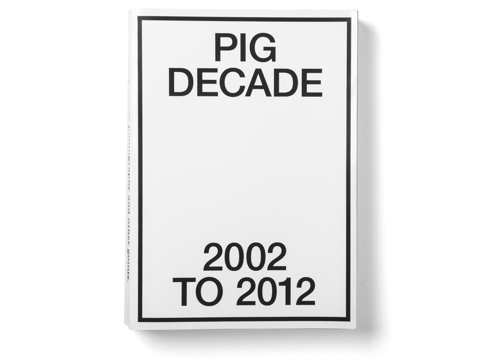
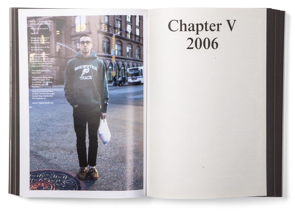
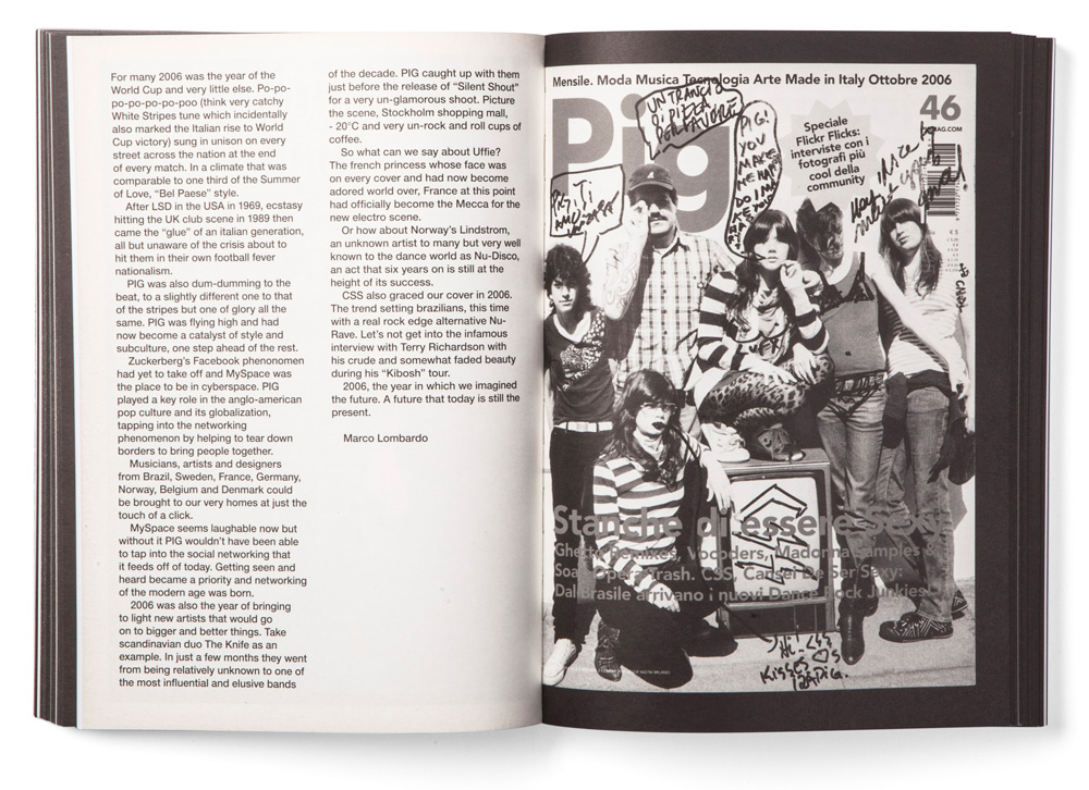
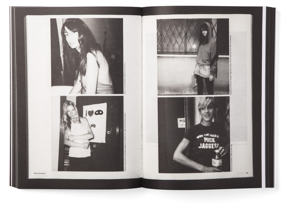
To celebrate its ten long years of activity, PIG Magazine, a monthly Italian publication, has decided to publish a celebratory issue gathering all of its best articles and moments. We were invited to work as art directors of the project and have decided, together with PIG’s editorial team, to scan all the old issues of the magazine and re-print them in a new tome. Hence, after long long days of work spent scanning all the chosen articles from the previous issues of the magazine, PIG Decade was born. The issue was almost entirely printed in black and white, with the exception of a few inserts throughout the tome, featuring a selection photographs by young talented creatives published on the pages of the magazine. The graphic design of the volume was left minimal, leaving space to the contents of the magazine. The cover is in black and white, with only the name of the book and the years printed in black.

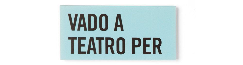
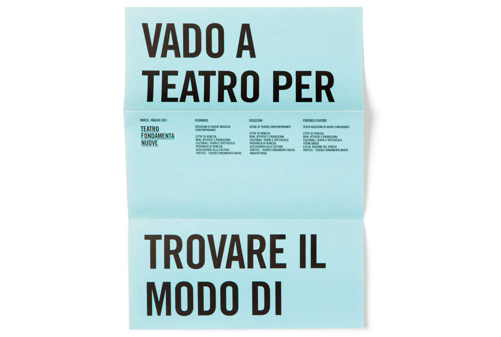
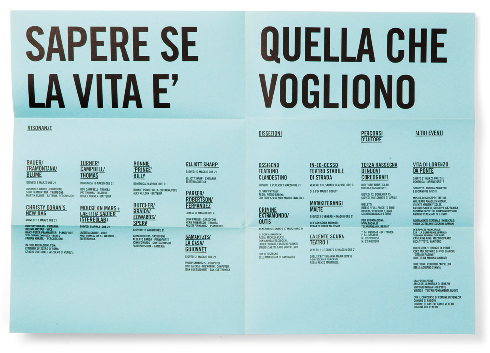
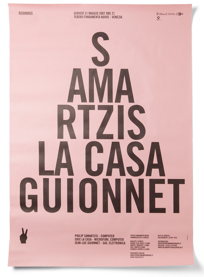
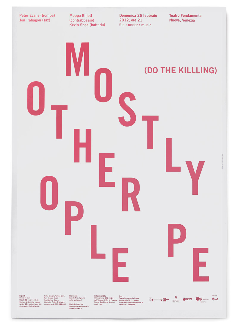
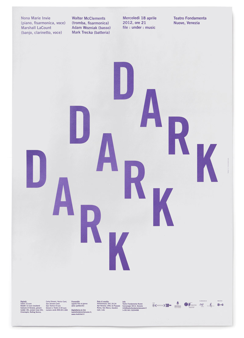
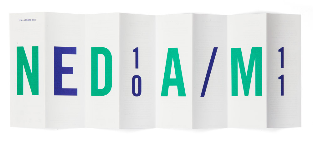
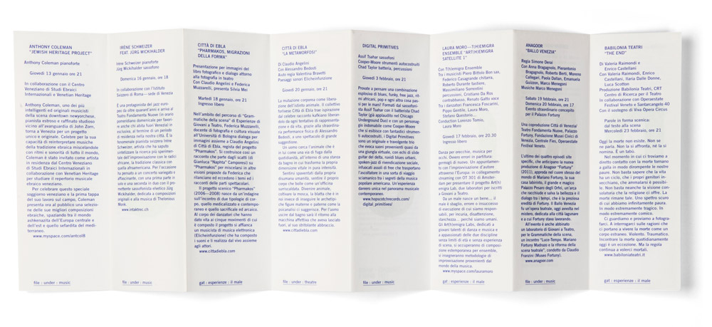
A couple of months later than usual, Teatro Fondamenta Nuove poster campaign for the year 2012 has finally started. As every year, we designed a series of 70 × 100 cm posters that passers-by in Venice may have noticed hung up on the walls. We have been working with TNF for six years now and, even if we consider interesting the design process leading to the final results, we noticed that can be even more interesting to look at the out-of-hand results generated by public’s interaction with our work.
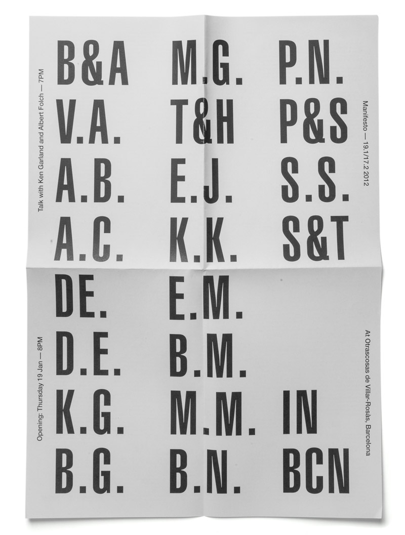
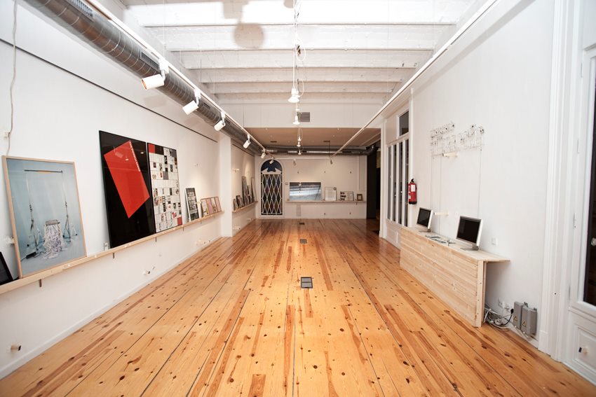
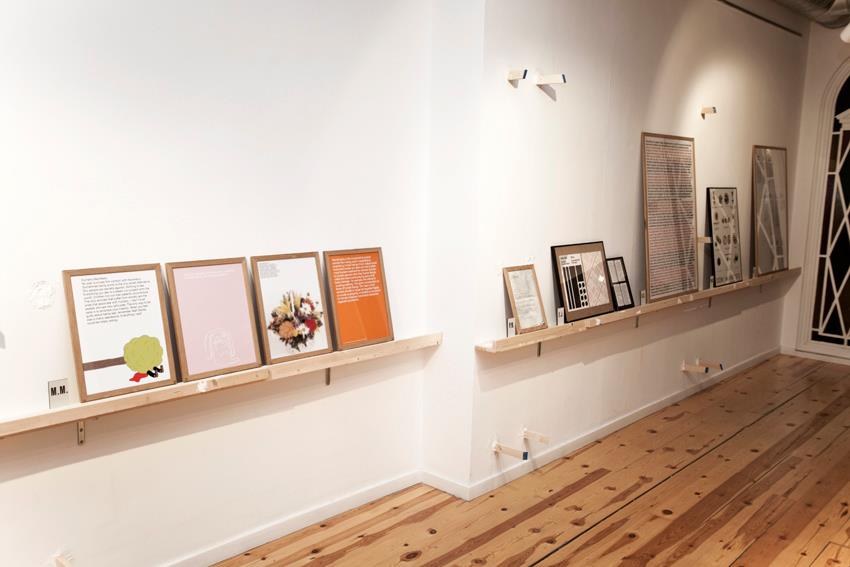
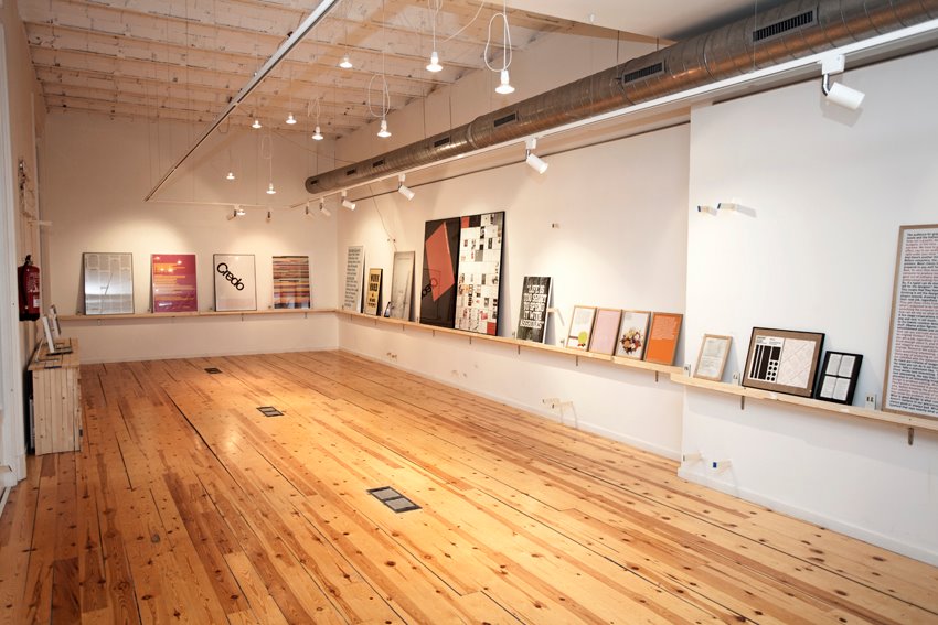
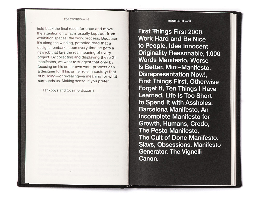
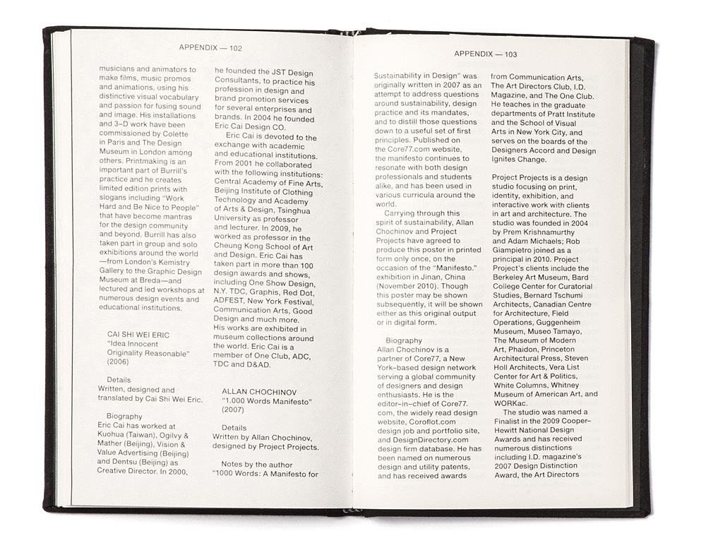
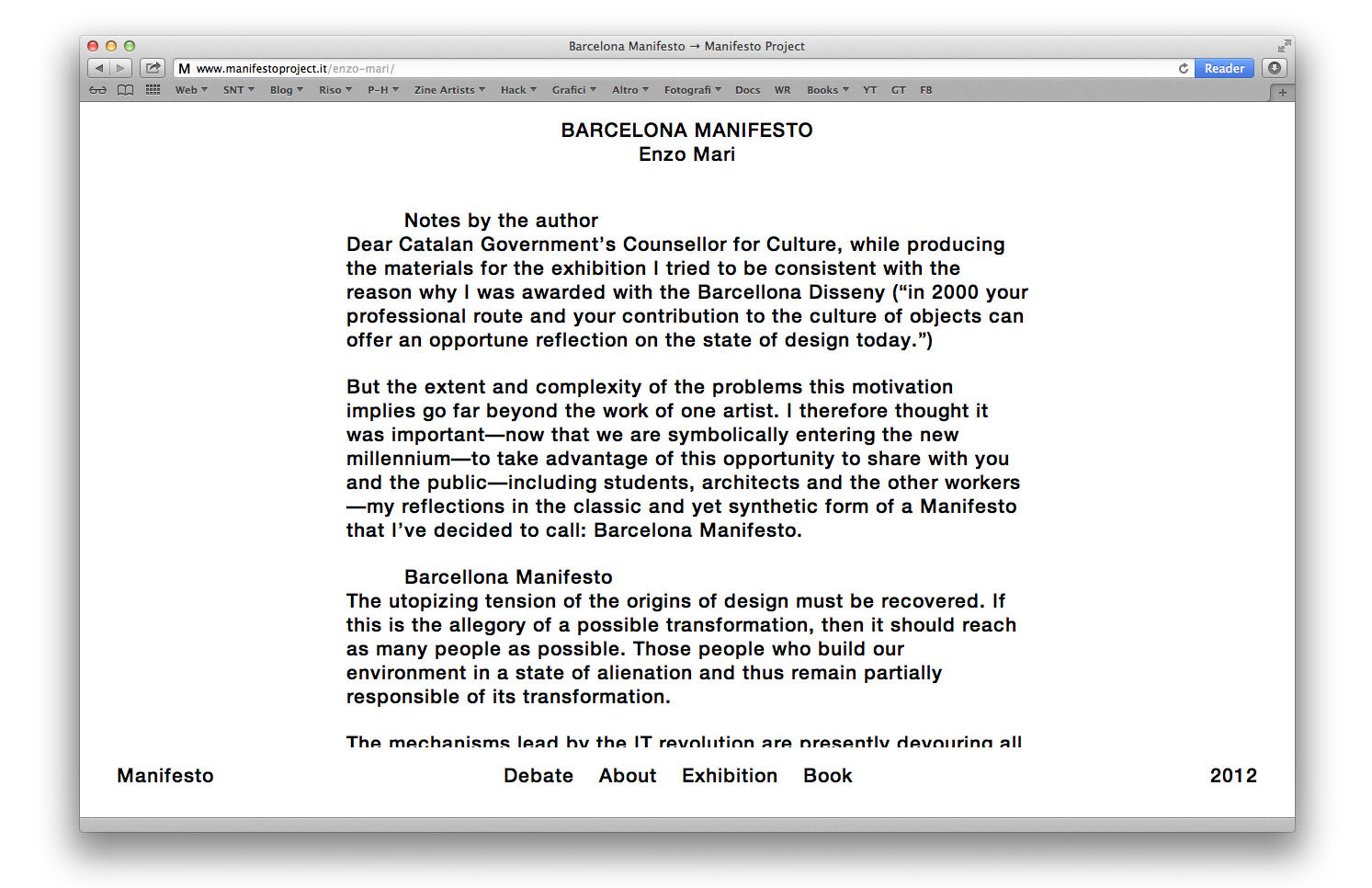
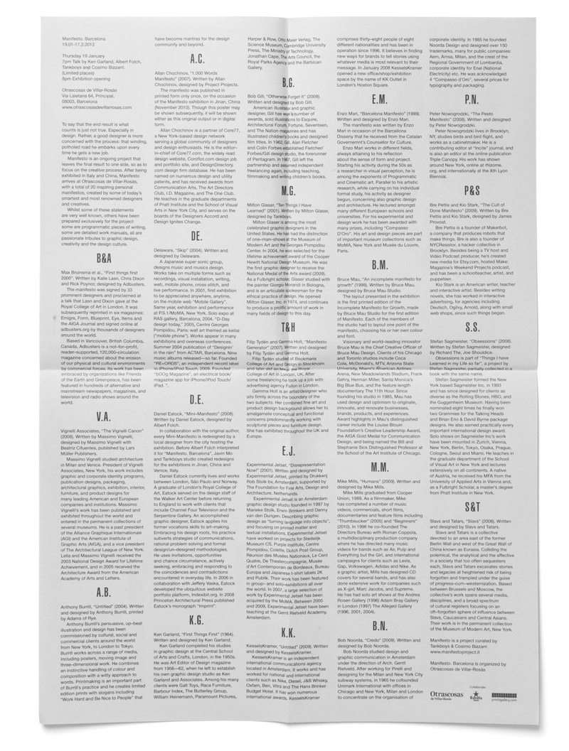
At the beginning of 2012 we have launched the third edition of Manifesto, an exhibition born in 2009, curated by Cosimo Bizzarri and us. The exhibition was hosted by Otrascosas de Villar-Rosàs in Barcelona from 19th of January until 17th of February 2012. Besides having the honor to start our ‘debates series’ adventure (a series of conferences that will accompany each future exhibition) with Mr. Ken Garland, we have been truly struck by the pleasant reception in the gallery. Fundamental for the successful opening has been the work done by Marc Morro, the gallery manager. Here you can find some images of the exhibition set up.
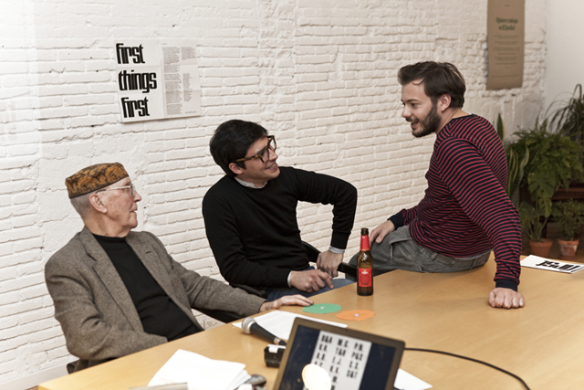

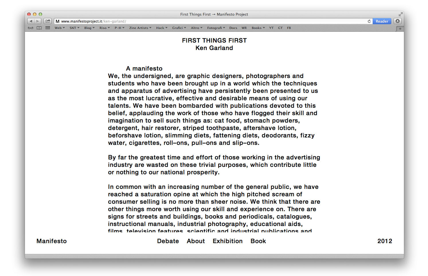
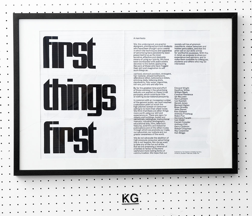
Last year we had the opportunity to meet an old guy at his apartment in Camden Town, London. At first we were quite shy trying to ring the bell, as the house we were in front of didn’t actually seem like a design studio where we were supposed to meet the famous designer. Finally we managed to gather a bit of courage and ring the bell of the house with the black gate. After a few minutes the door opened and we were blandly greeted by a man with a strange hat. We were accommodated in his studio, that actually seemed more like a museum than a working space. The walls were completely covered with projects that were the man’s daily bread for the last fifty years. As we sat down, eager to start the conversation, he told us he would have very short time for us, as we haven’t fixed an exact time for the appointment.
In the end, Ken Garland has shared more than a coffee with us, as we ran through his life in a three hour chat. Having the opportunity to wander around his home was an incredible experience. A year later, we flew to Barcelona for the opening of the third edition of Manifesto. We had the pleasure to meet once again this master of design that in 1964 by accident and boredom wrote “First Things First” manifesto, that still kindles curiosity, consent, disapproval and new interpretations.

Back in 2011 we were invited to participate in “Graphic Design Worlds”, an exhibition exploring different ways of interpreting graphic design profession. The exhibition was curated by Giorgio Camuffo and held at Triennale di Milano Over 30 graphic designers were invited to provide insights into how they perceive and approach design by way of presenting their work across a variety of languages, attitudes and media. Our contribution to the project was a book and a three-dimensional installation, exploring the cultural, theoretical, historical references that have guided our work through the years.
Graphic Design Worlds
26 January – 27 March 2011
www.triennaledesignmuseum.it

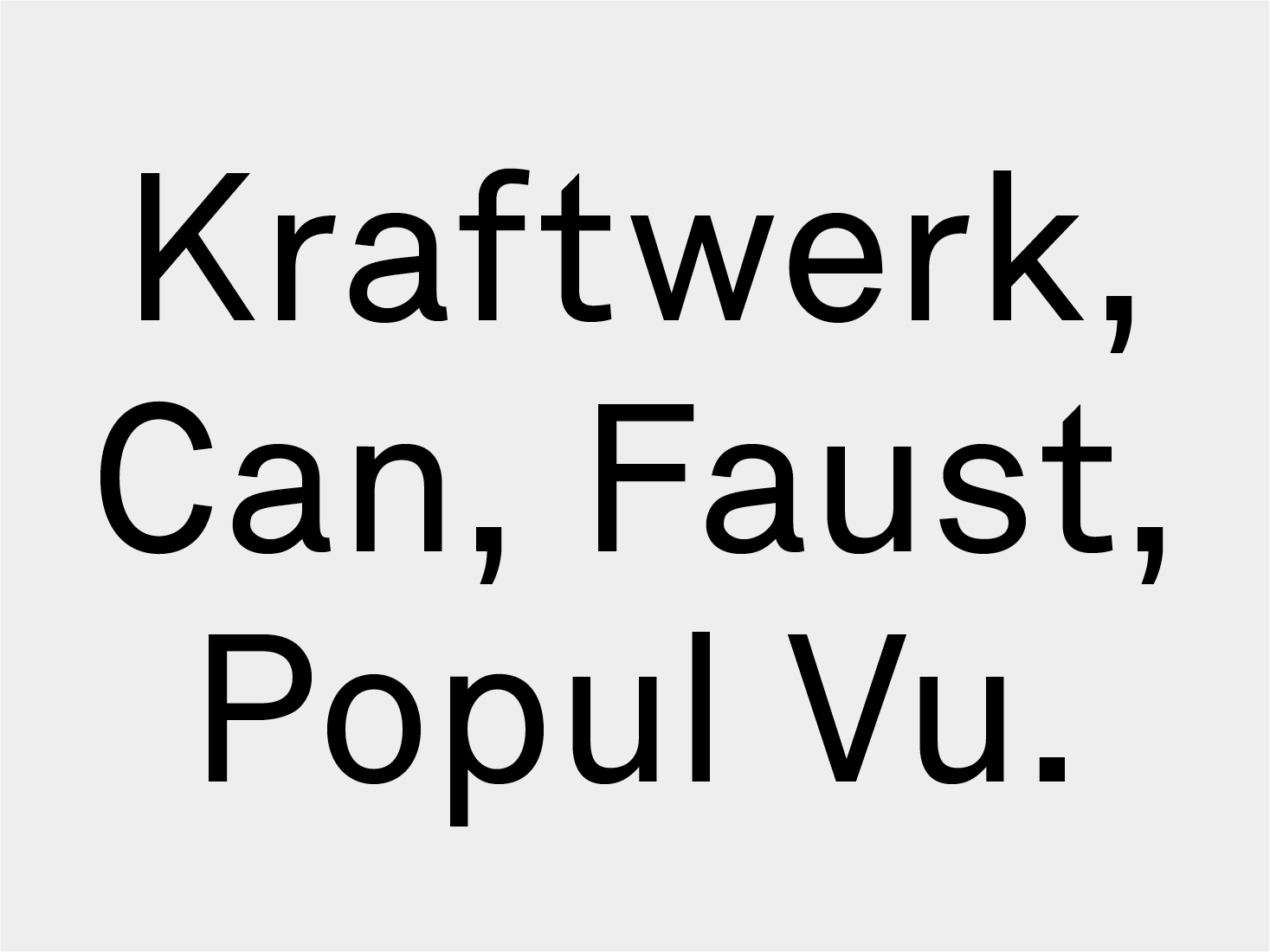
Graphic design and electronic music seem to have many aspects in common. As we are good observers (and consumers) of both, we’ve noticed that the final results in both disciplines have radically changed after the systematic introduction of personal computers. It may seem a cliché statement, but it appears that endless possibilities offered by digital tools are not as stimulating as the old and limited ones. While current tools often lead to banal and standardised outcomes, the old and rusty ones, not relying solely on the technical possibilities of a tool, force us to use our mind.
By analogy, as much as graphic designers are turning back to paper and pencils, music producers are going back to old analog synthesizers.
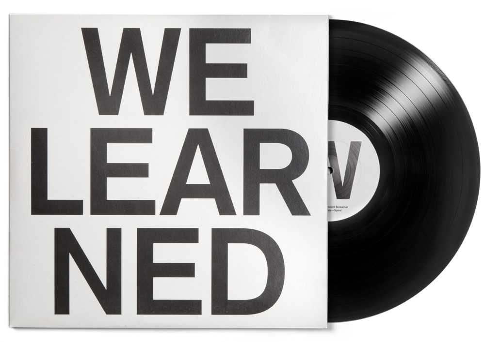
One of those musicians is our friend Rabih Beaini, also known as Morphosis. Rabih is a master of composition, performed electronic music and improvisation. In 2011, Rabih has released an LP which, according to Resident Advisor, was the third best album of the year. For this reason, we are very happy to have designed the cover of this record. The project is based on the title of the record — What Have We Learned — divided into two different phrases, ‘What Have’ on one side, and ‘We Learned’ on the other. In this way, the complete title is split in order to create two different meanings, while at the same time resulting in a bold visual artwork. The typography was intentionally very simple, and the lack of colour emphasises the strong statement of the title.

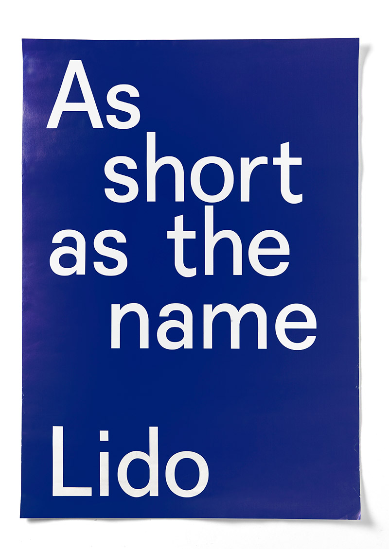
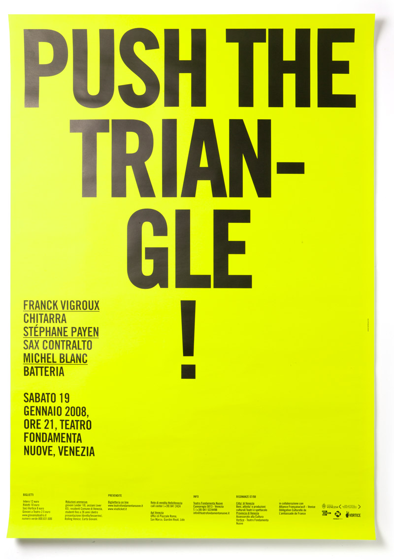
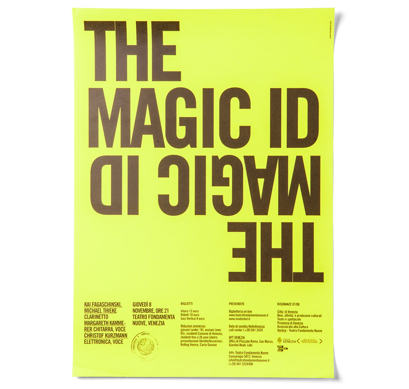
In 2011, Circuito Off Venice International Short Film festival has changed its location from the beautiful San Servolo island to the near Lido island, the famous setting of “Mostra del Cinema”. After years of hosting the festival at San Servolo island, changing its location seemed to be a though change to pass on to the festival’s usual public. For this reason, it seemed obvious we had to create an artwork that would clearly communicate the change of location.
Hence, in our usual way of approaching projects, we have decided to develop the campaign starting from a phrase that would communicate in a clear and concise way the change of location. We have come up with the phrase “as short as the name Lido”, both referencing the new location as well as the fact that the festival only showcases short films. In this way, through the use of a simple string, we have fused together the main characteristic of the festival with its significant change of location.
The artwork we have designed was, obviously, typographical and rendered in our interpretation of Aldo Novarese’s font Recta. The phrase was written in white on a blu-ish background and we have designed a 70 × 100 cm poster, a 10 × 15 cm postcard and a brochure containing the program of the festival.
The Book Affair is a two days of independent art publishing fair that will took place in Venice on June 2nd and 3rd 2011, in the occasion of opening days of the 54th Venice Art Biennal.
The Book Affair gathers some of today’s most interesting independent publishing projects, with the aim to open a new public discussion on the book as a means of research and artistic production. In the last years, we have witnessed the flourishing of independent publishing projects, and seen a network of new editors develop, followed by new types of libraries specialized in this market niche and subsequently by a specialized network of distributors. For this reason, The Book Affair includes a series of public lectures and conferences whose aim is to investigate the reasons why this new editorial nouvelle vague has exploded and which scenarios we ought to expect for its future development.


Our friend Mario Piazza invited us to participate in an exhibition in the occasion of 150th anniversary of Italian Republic. Instead of celebrating our country, we chose to make a critical poster about the present situation in Italy. Unfortunately, we were able to find just one image that shows the poster we have designed (and you have to find it in this messy set up).

Giorgio Camuffo invited us, along with our friends studio Temp, to hold a workshop at Free University of Bozen. The theme of the workshop were “Limits”. In order to gage the physical and intellectual ability of the students, we have set ten exercises. It was very funny and strange to see the students trying to draw self portraits using their feet or trying to draw perfect fifty centimeters large circles without the aid of a compass. It was a wonderful experience to work with the students and test our own limits, in the context of an institution that apparently has no limits.
We have designed a poster with the purpose of showing our interpretation of Recta font in action. As designers, strongly fascinated by language and typography, we have always been interested in Concrete Poetry, which first appeared in the same period when Aldo Novarese designed Recta and is usually composed with sans-serif typefaces. We designed something that can be seen both as a type specimen and as a concrete poem, where more attention is given to the shape of each letter and its sound than to the meaning it carries. This poster was printed in the occasion of Nike workshop held in Rome, organized together with Nero Magazine. We have used a two-colour Risograph machine to print it, which was also the basic tool of our workshop.

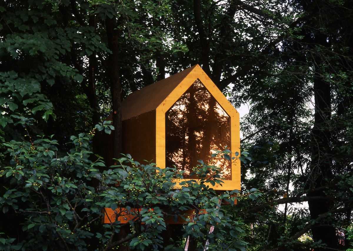
In 2011, we designed a threehouse (produced by Ivano Campardo) for Renzo di Renzo. An article about the project was written by Cosimo Bizzarri for Apartamento Magazine.
And one day you understand with startling clarity that, no matter how skilful you might become, he will always be the one dictating measures and materials, until the day you build his coffin. Apart from the people who either built it or live in it, this house is a terrestrial outpost in the no man’s land that is the sky. Anchored to the ground by the tree roots and stretching out towards the universe at the same time, it’s a wooden symbol of the eternal conflict between what we are – and give us security – and what we would like to be – and give us no peace. Perhaps due to this precarious condition, or to the nature that cradles and protects it, this house has a phenomenal effect on the people who get in it. Up here the perception of the world changes: thoughts sharpen, feelings purify, dreams become more vivid. If you have never entered a treehouse, then you should try. It feels good.
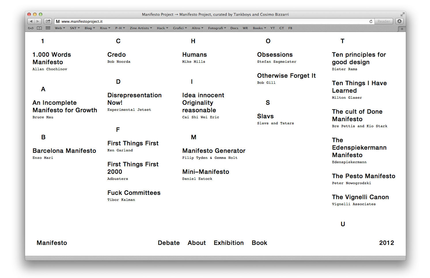
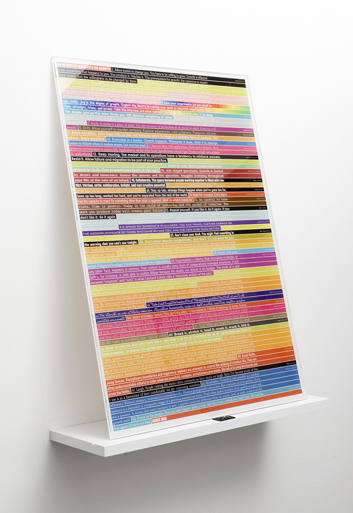
In 2009 we were collaborating with a gallery and a project space in Treviso, Italy. As graphic designers we had the task of organizing a graphic design exhibition in the gallery and we thought about an exhibition we would really have loved to see. Even though we enjoy seeing exhibitions which showcase the work of our beloved graphic designers, but more than that, we enjoy getting to know what was the process that lead those very designers to design those projects. This is why we have invited our dear friend Cosimo Bizzarri to collaborate on an exhibition about designers’ credos. Titled “Manifesto”, the exhibition grew to become an ongoing project that leaves the final result to one side so as to focus on the creative process. It brings together under one roof the personal manifestos of some of today’s smartest and most renowned international designers.
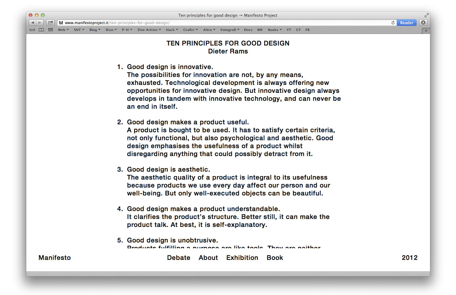
Manifesto was first held in Treviso, Italy in 2009, while the following two editions were held in Jinan, China in 2010 and in Barcelona, Spain in 2011. In the occasion of the exhibition in China, organized with the support of Icograda, we have published a catalogue comprising the credos of some of the world’s most interesting designers. Among famous manifestos such as Bruce Mau’s Manifesto for Growth, you can find credos written exclusively for our exhibition, such as late Bob Noorda’s manifesto. Hence, since the words of such personalities seem to be more relevant than the actual visual aspect, we have decided to create a small book, entirely printed in black and white, and designed using only Helvetica typeface, which would be visually simple, essential and direct. We have chosen an un-coated paper and a hard-copy binding with silkscreened artwork on the cover. The book was printed in 500 copies and was sold in a matter of weeks.


Description will soon be available, please return.

“Skill to do comes from doing” said Ralph Waldo Emerson, an American philosopher and poet, in the middle of the industrial revolution. In the same period William Morris, a pioneer in the concept of design, expressed his rejection for industrialization and mass production and his love for practice and craftsmanship.
In the following 150 years, industrial processes evolved critically. Today, the majority of the activities which involve a designer from a chair project to the layout of a book begin with digital planning and end in an assembly line, leaving out manual intervention from the productive process. Nonetheless a niche of tenaciuos designers remains, people who, despite replacing Morris’ press with a photocopier, keep working with the same spirit of their master: they rediscover manual skills, they experiment unusual techniques, they look for new materials, everything to give life, sensibility and uniqueness to their products.
They are young designers-craftsmen who have been asked to exhibit their handmade objects in our gallery. The result is a temporary shop which shows (and sells) a phantasmagoria of chairs, books, shoes, knives, bicycles, suspender trousers and many other incredible things. “Skill to do comes from doing” is an incomparable collection of design objects and an enthusiastic praise to the cult of doing.
Skill To Do Comes Of Doing
Curated by Tankboys
December 2010
XYZ Gallery, Via Inferiore 31 Treviso

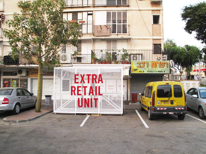
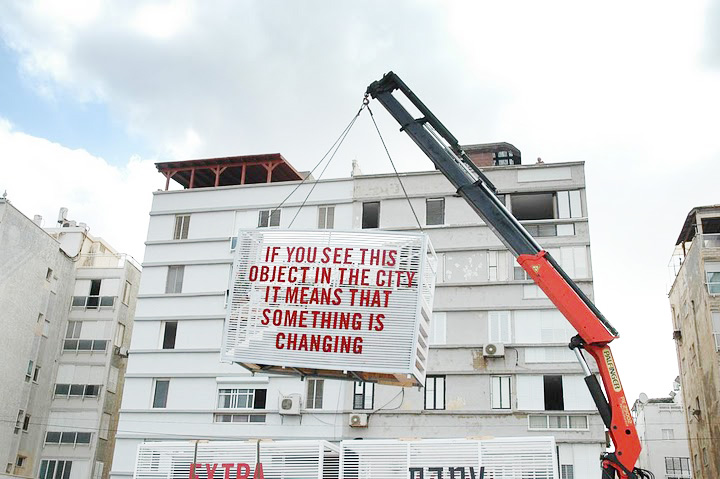
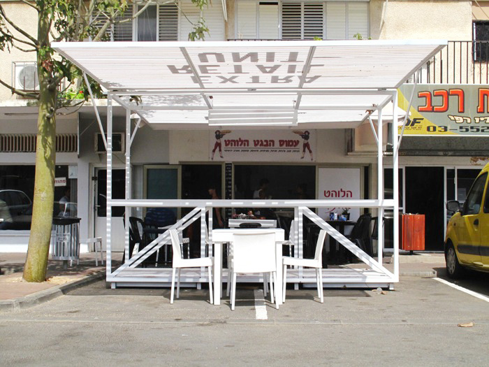
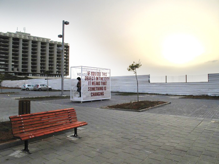
During the set up of Italian Pavilion at Architecture Biennale a couple of brilliant architects, Francesco Librizzi and Matilde Cassani, asked us to join them in this project for the Bat Yam Biennale of Landscape Urbanism in Tel Aviv.
Their proposal addresses its interest to the small commercial centres trough out the city. The retail centres, as suggested, are simply the ground floors of adjacent residential buildings, usually the porch part. The single shops are usually small and disorganized, the signs are not properly visible from the road and the small windows do not allow to exhibit the products. The aim is to create smart connections between the low density network of small retail shops and the public space. Some smart objects can create additional volume within the city, thus activating non used portions of the road, where everyday paths and trajectories cross the commercial activities. Thus giving rise to an extra-time use of this areas, trough extended commercial functions and unexpected public facilities. Within this project we have created the graphics applied to each unit. You can see other images of the project here.
Manifesto, the exhibition about designers’ credos we curated with Cosimo Bizzarri, moved to China in 2010. The second edition, featuring 21 works (about art and design), was exhibited at Shandong University of Art and Design, Jinan, China, in the context of Icograda Design Education Manifesto Anniversary. The exhibition was organized with the precious help of Rujana Rebernjak.
Manifesto. Second Edition
Tue, 19 Oct 2010
Tuesday 2nd November
Shandong University of Art and Design
Jinan, China
www.manifestoproject.it

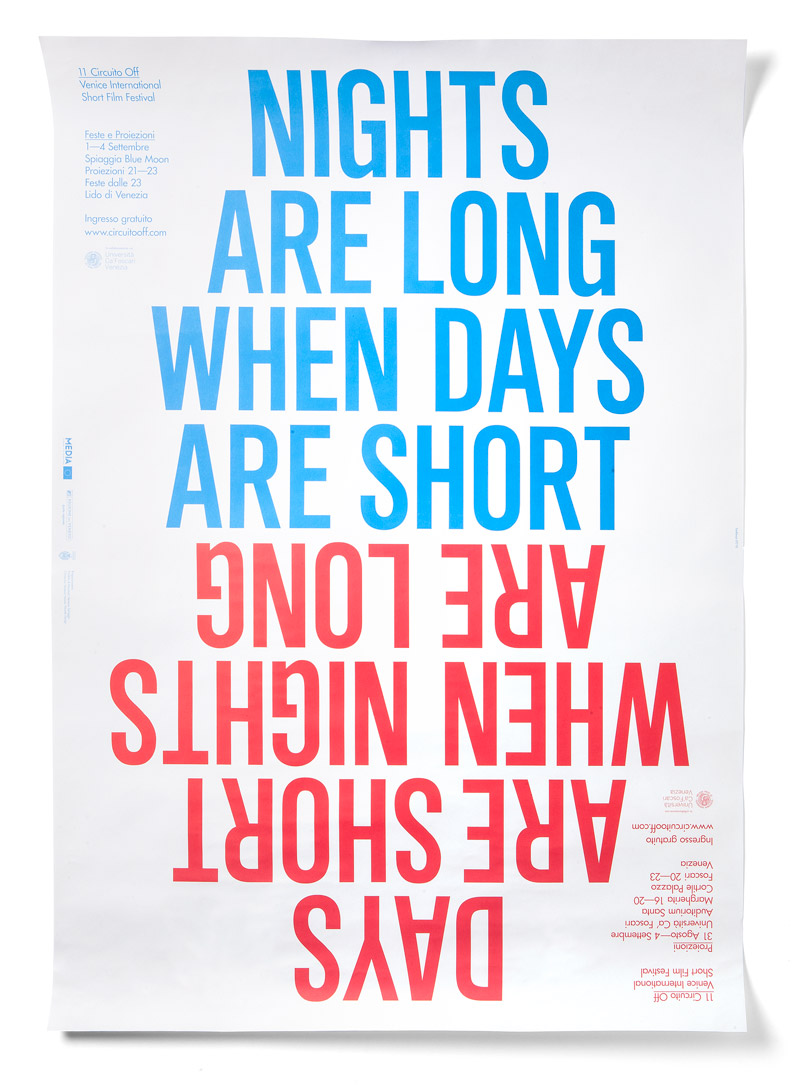
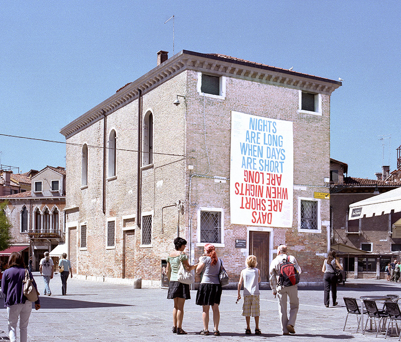
In 2010, Circuito Off Venice Short Film Festival, had changed its location after being held for several years at the beautiful San Servolo island. The program of the festival was divided between screenings held in the centre of the city and evening events held at Lido island. Discussing the changed structure of the festival, we have decided to emphasise this fact, both in order to help visitors grasp the new organization, as well as to create an appealing concept for our project.
After testing several approaches and wording, we came up with a catchphrase that seemed to sum-up the festival’s structure: “Days are short when nights are long, nights are long when days are short”. By stating ‘days are short’ we were speaking about the short films presented at the festival, while declaring ‘nights are long’ we were inviting the public to join us at evening parties at Lido. Additionally, the inversion of the phrase and its apparent redundancy lent itself for an interesting visual interpretation. We have chosen two colours for the artwork, dividing it in two phrases, one in blue and one in red, mirrored vertically.


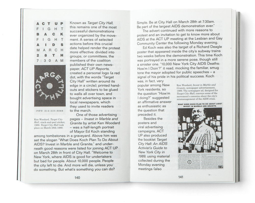
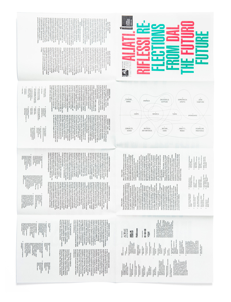
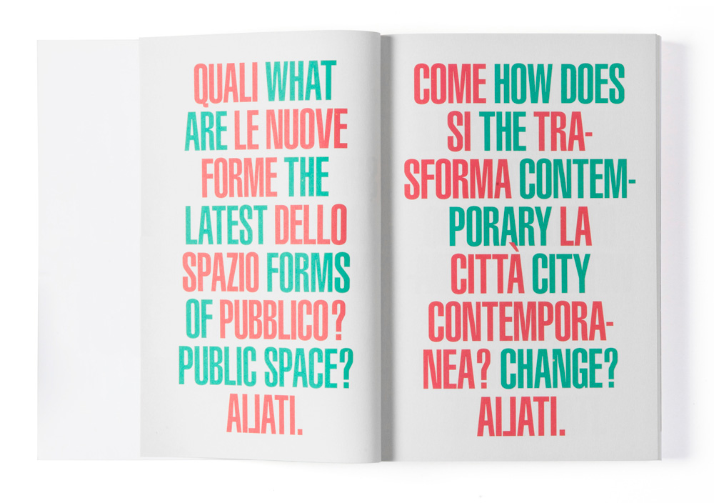
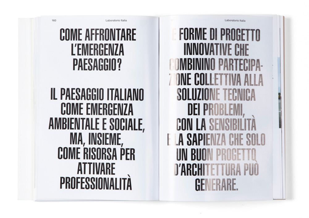
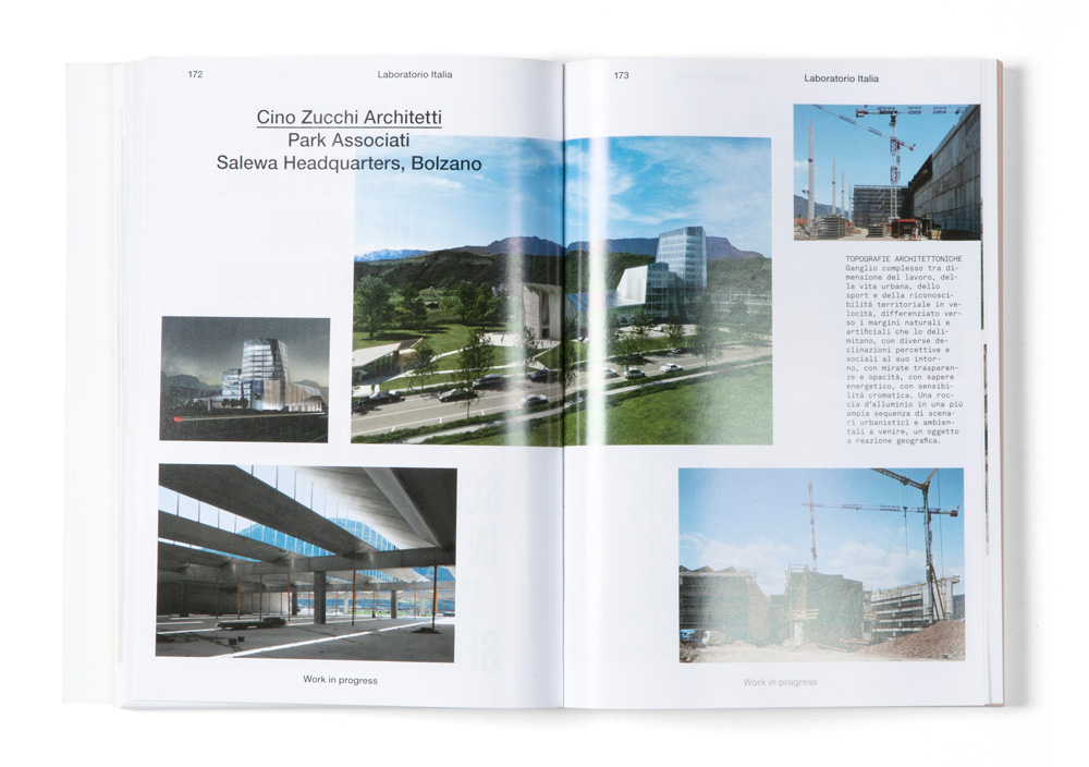
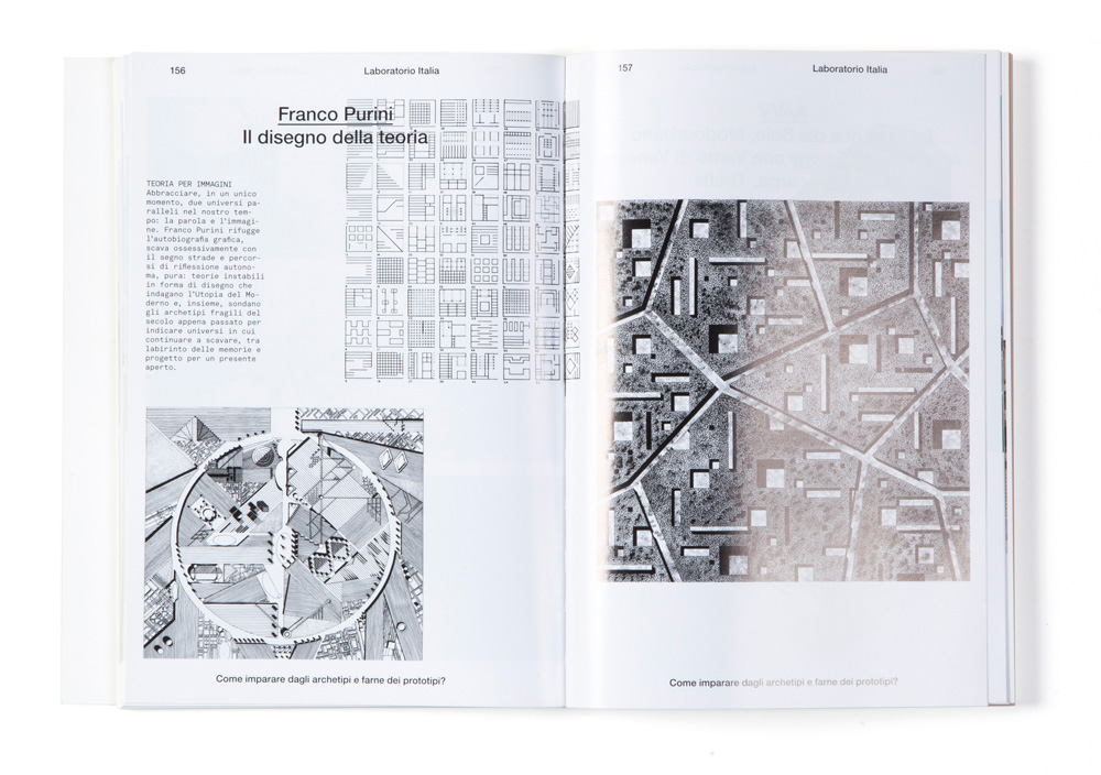
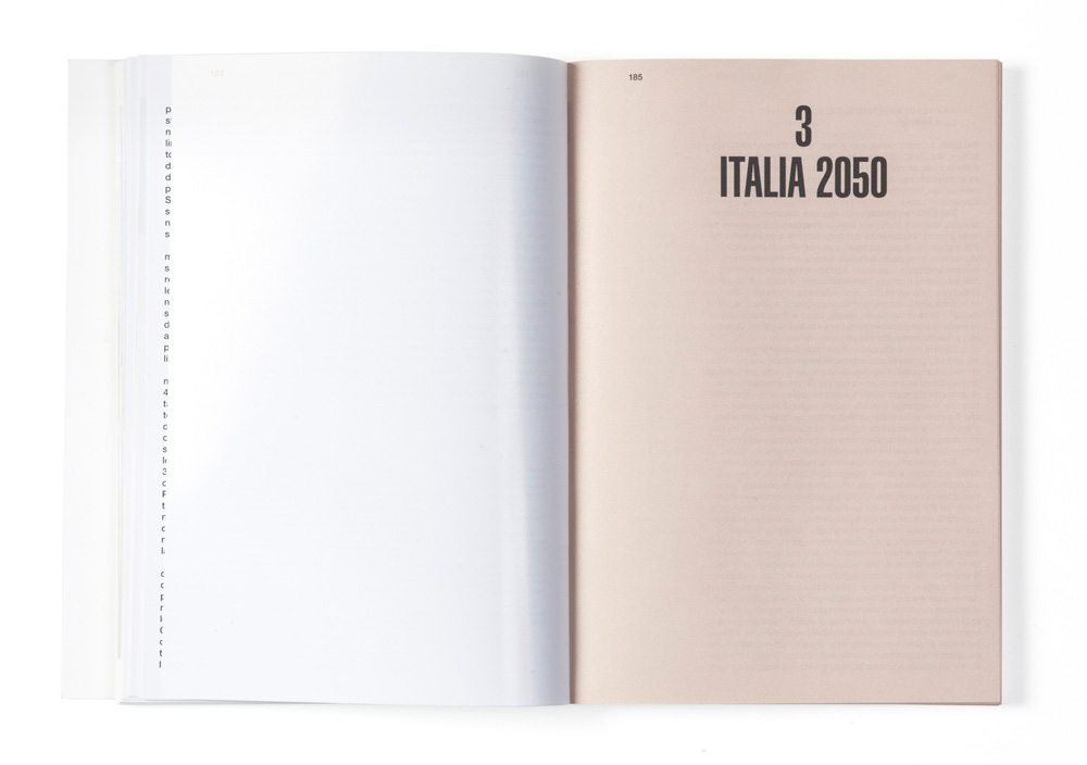
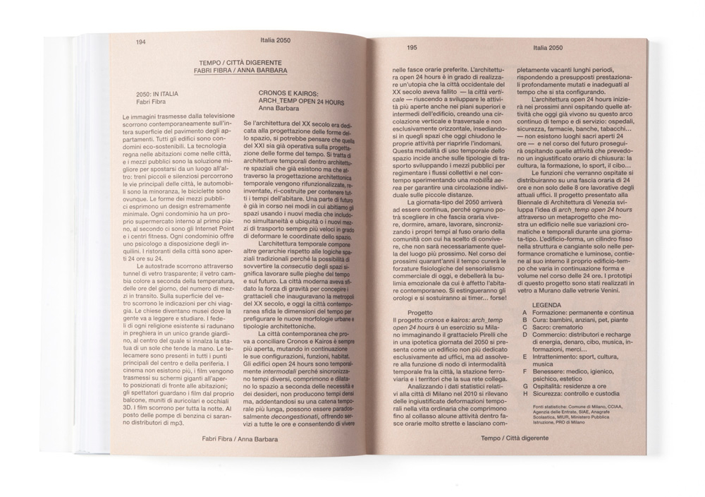
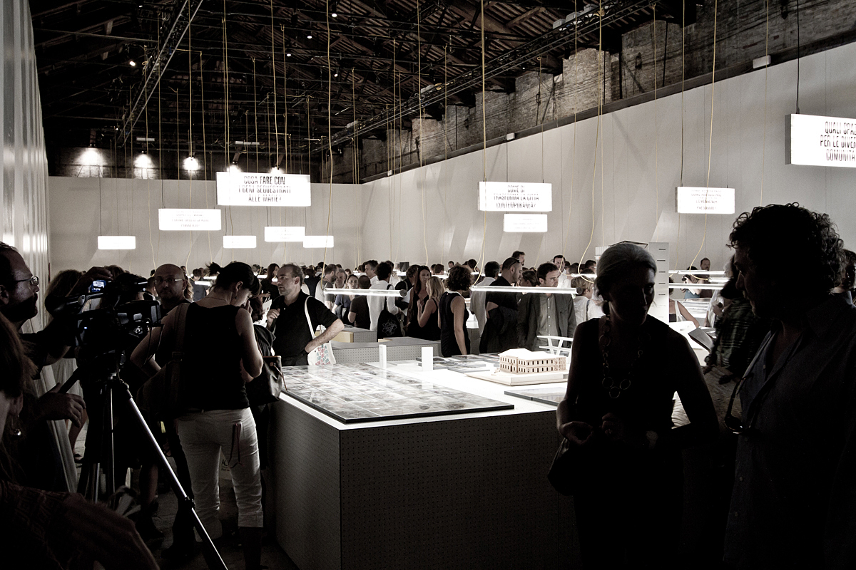
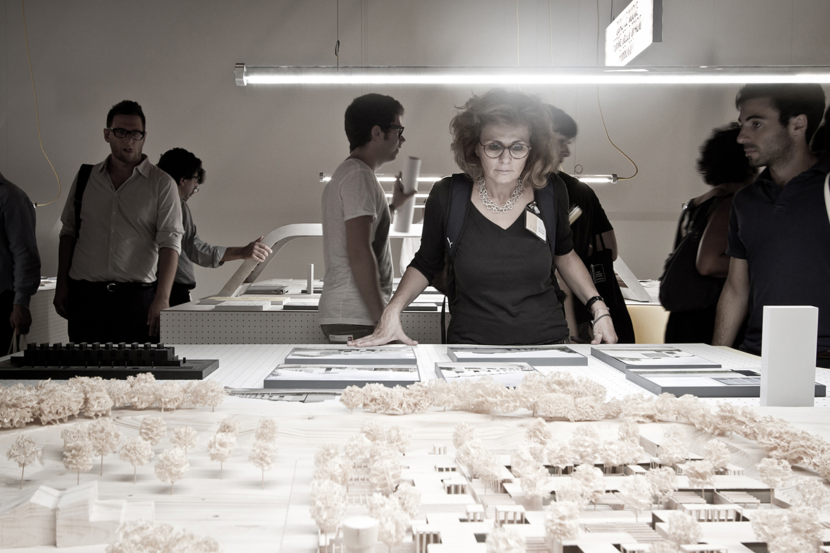
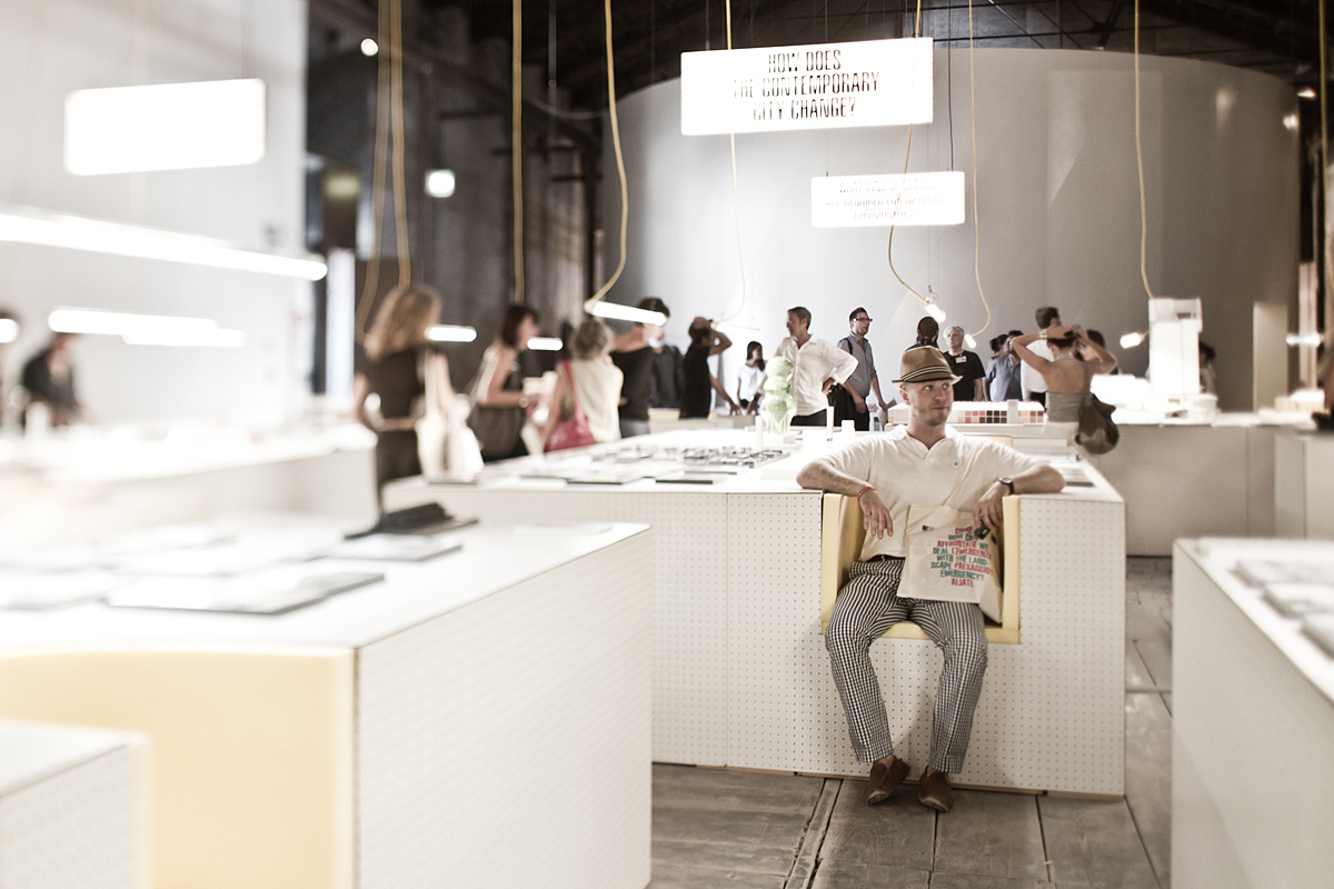
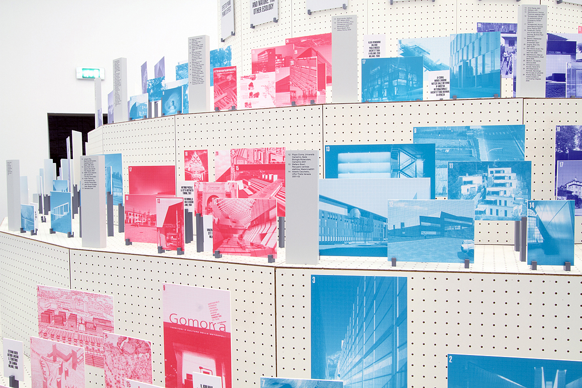
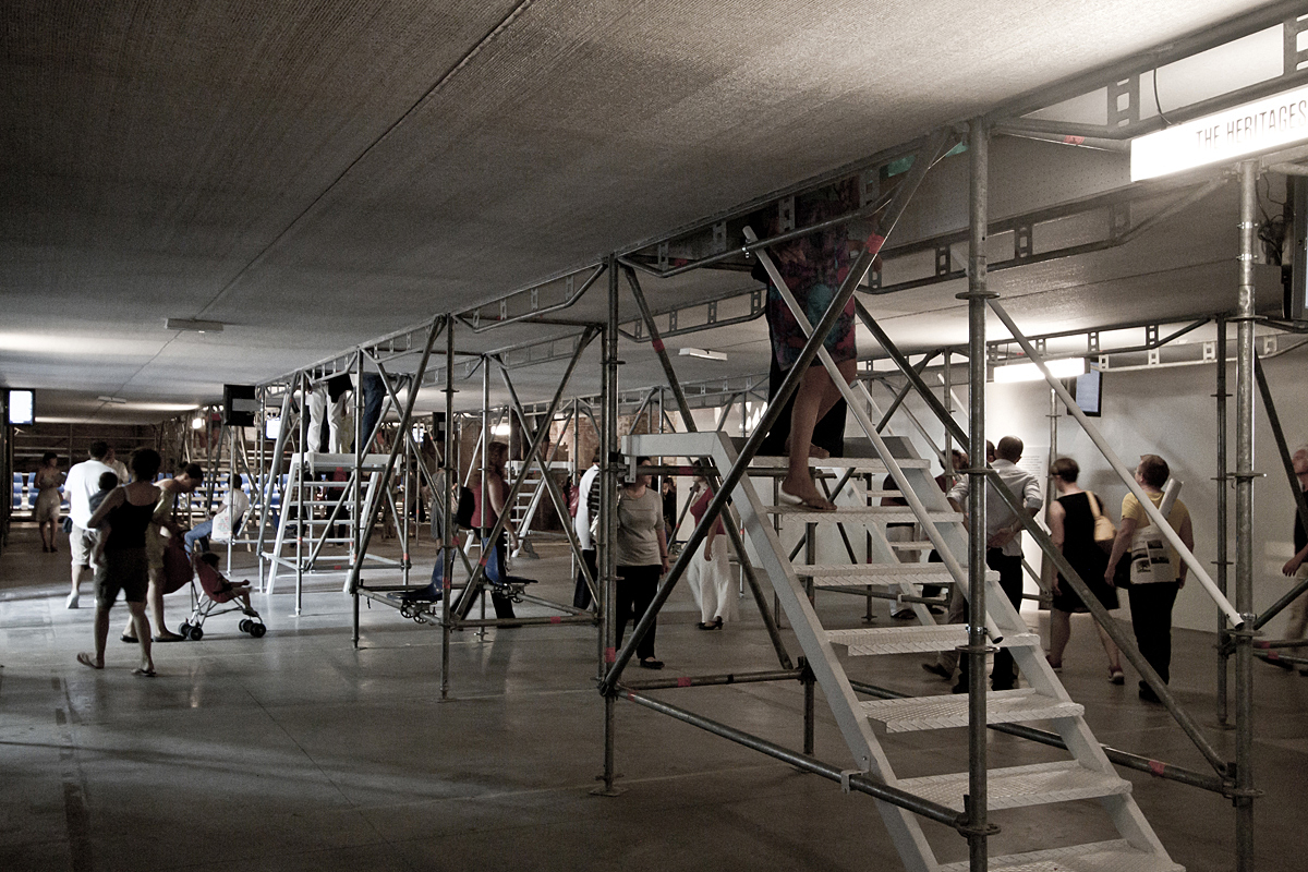
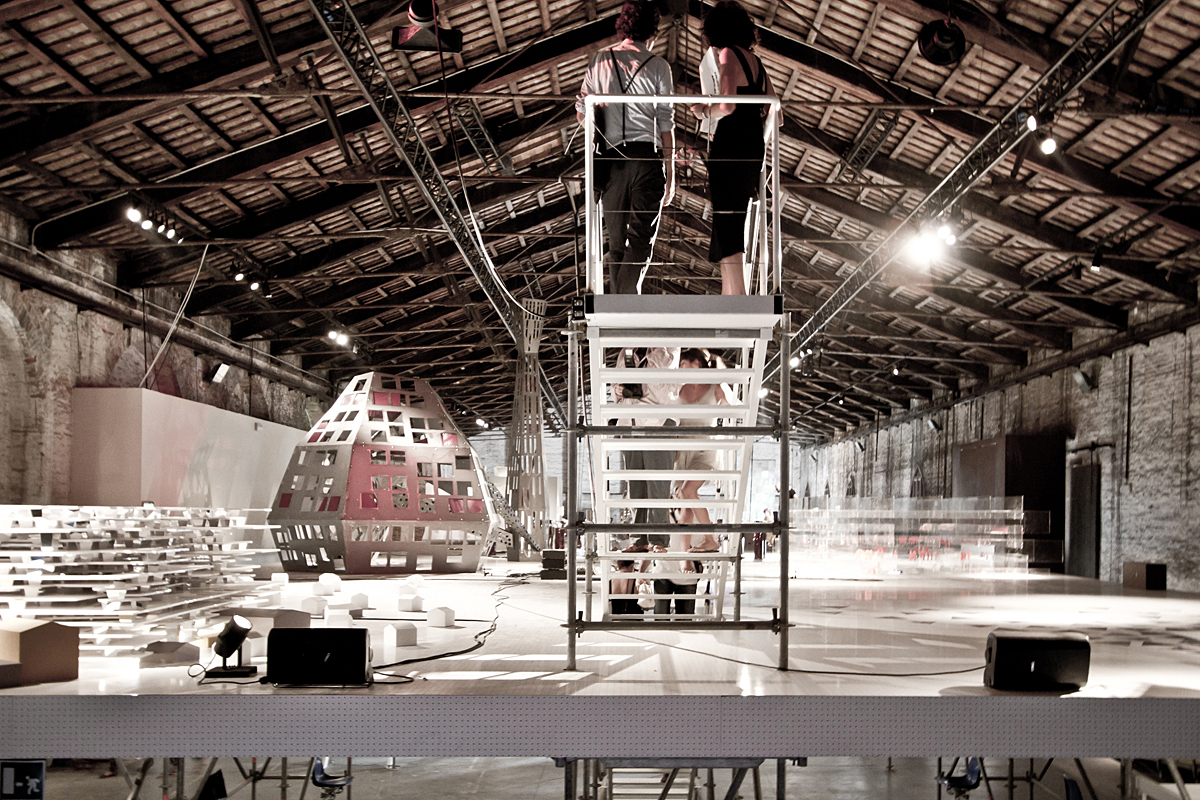
“Ailati – Riflessi dal futuro” was the title of the Italian Pavilion for the 12th Venice Architecture Biennale. Curated by Luca Molinari, the Pavilion opened up a new reading of contemporary architecture in Italy through an original and sideways glance at objects, reality and designs. AILATI. Reflections from the future was divided into three sections: “Amnesia nel presente. Italia 1990-2010” was an initial and timely overview of Italian architecture during the last 20 years, fostering a sharper and more aware understanding of Italy now; “Laboratorio Italia” was the central portion of this exhibition focused on the present day, where works built in recent years provided a tangible look at high-quality new buildings in Italy, and the types of research undertaken during this time; and “Italia 2050” where fourteen scientists, thinkers and filmmakers who in their way are building the future shared their priorities and bywords for Italy over the next few decades, while fourteen designers offered exclusive visions through their interpretations of the theme.
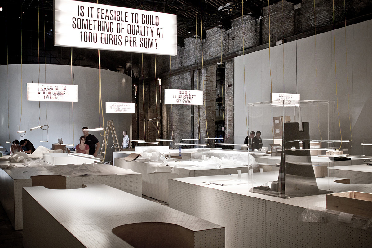
Each section of the exhibition presented different materials, from photographs and sketches to scale models and technical drawings, from site-specific installations and videos to reproductions and books. For this reason, in collaboration with exhibition designers Francesco Librizzi and Salottobuono, we had to develop very specific material for each section. The starting point for our projects were the main topics explored in the Pavilion – from socially aware design and reuse of assets seized from organized crime, to new public areas and landscape emergency.
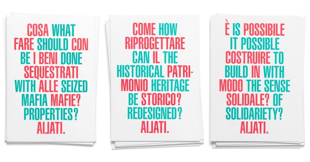
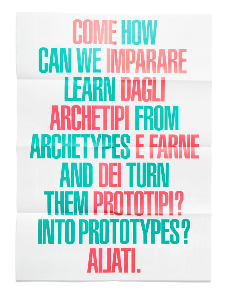
We have decided to translate the topics into a series of ten questions, which were both aimed at the public, seeking their active engagement, both to the discipline’s professionals, with the aim of building a visual representation for the main issues explored by the exhibition. By deciding to turn the topics into questions, we have both gave a visual introduction into the topics of the show, as well as made the visitors active participants in finding the answers.
Visually rendered in a red and green – the official colours of Italy – and intersecting in a bold typographic artwork, these questions formed the basis of the identity. Printed on posters, brochures, totes and flyers, these artworks spoke about the content of the show, while at the same time raising curiosity and acting as a strong visual statement, a sort of a logo which perpetually changes it content.
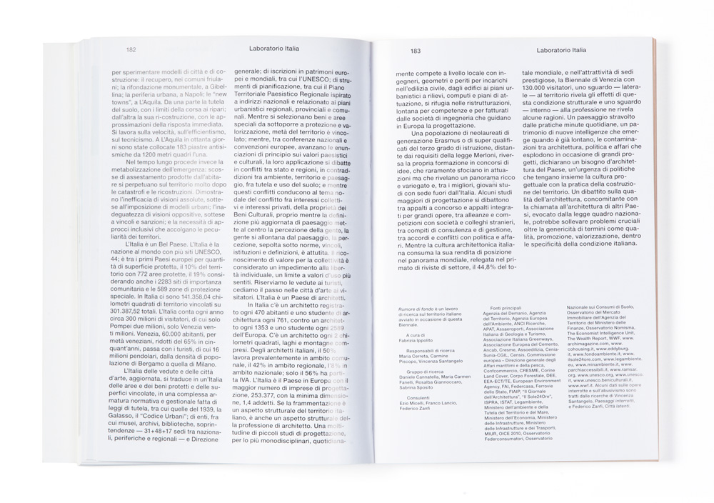
Besides the printed matter and the exhibition design, we have also designed the catalogue of the show, published by Skira. The catalogue followed the structure of the show, opening with 10 questions that characterized the Pavilion. Subsequently, each section, with its fairly different material, was designed in a different way and printed on different types of paper., thus resulting in a complex and rich publications, as were the projects displayed in the show itself.
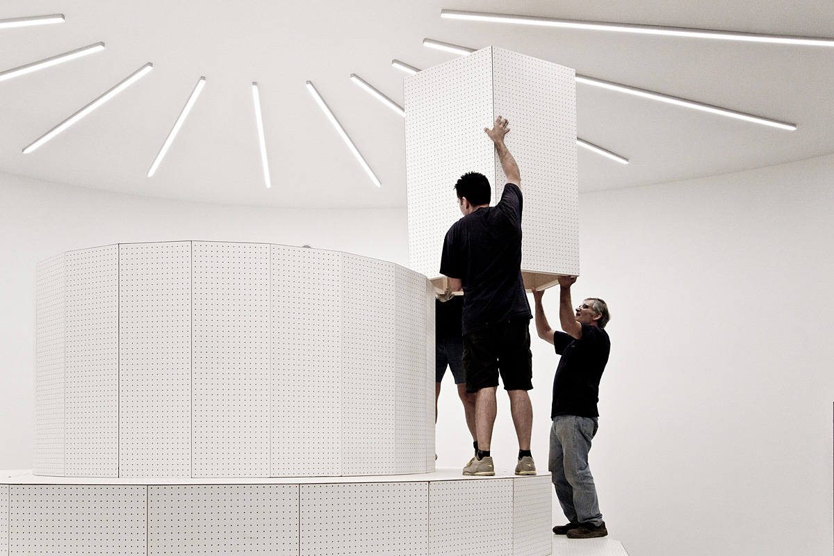
For the exhibition design, we have created different elements of signage and captions. For the first section, the captions were printed on grey wooden blocks and displayed around a round, cake-like structure. The images showcasing the projects were all printed in three different colours, based on their chronological order, and displayed around the structure on wooden blocks, thus forming a three-dimensional album of sorts.
For the central part of the Pavilion, we have designed ten luminous displays, showcasing the central questions, under each of which the viewer could find appropriate answers given by projects selected by curators. For some of the projects, we have designed a series of visual devices, such as booklets and publications giving further information about the project.
The final part of the show, was staged on a ‘floating’ structure, raised 2 meters above the ground, where each visitor had to climb a set of stairs to see the site-specific installations, while on the ground level, you could see the videos displaying the topics explored by the project.
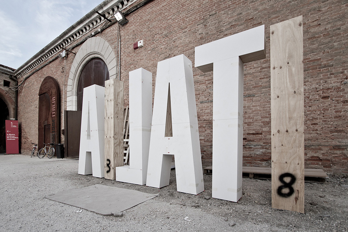
On the outside of the Pavilion, both coming from Corderie dell’Arsenale, as well as from the garde, the visitors were greeted by a giant “Ailati” three-dimensional structure, thus reinforcing the word-play of the exhibition’s title.


Description will soon be available, please return.
width=”1000″ height=”459″ />
Banana Camouflage is a project we developed with Cosimo Bizzarri for a pop-up store organized by Design Marketo during the “Salone del Mobile” fair in Milano.
Banana Camouflage is a fruit that was classified for the first time by Hungarian botanist Franktof Burnsteins in 1979. According to Burnsteins’ records, it started to grow spontaneously in the fields of Nicaragua in 1975 and since then has been expanding as far as Guatemala, Colombia, Venezuela, Ecuador, Suriname and Brasil. Banana Camouflage comes in a variety of sizes and colors, depending on the environment it is found in. This fact has brought many scientists to describe it as a case of mimicry in nature. Burnsteins in particular put forward the hypothesis that the fact that certain bananas were mutating size and color had to be attributed to a “natural choice” to rebel against the human attitude towards its species. In his notebook of the time, Burnsteins wrote the sentence: “She’s a master of disguise”, to describe the unusual behaviour of this banana variety [...].


In the spring of 2012, XYZ Galley in Treviso became the place for a free exchange of knowledge. For three days a used book market took place inside the gallery, with books donated by friends, collaborators and gallery staff. A strange collection of publications appeared inside XYZ, with topics ranging from architecture, semiotics, photography, graphic design, literature. It was the perfect occasion to exchange those dusty books we never opened with something fairly more interesting.
Spring Cleaning Book Sale
Curated by Tankboys
April 2011
XYZ Gallery, Via Inferiore 31 Treviso
We have been invited to participate at the third edition of Triennale Design Museum titled “Quali cose siamo”. Curated by Alessandro Mendini and Silvana Annicchiarico the exhibition comprised a section dedicated to young designers and architects who had to reflect on the topic of living and designing a utopia, responding to the question “Quali cose siamo”.
The brief we have been given, together with other participants, was to create a tower with the same square plant and the same height for each designer involved. This system of towers, characterized by multiple languages made of signs, materials, cultures and objects, was to be understood as a totemic symbol as well as the spirit of a city, where the facades and the volumes of each tower would express the aesthetic and ethical tensions of the city’s inhabitants, their poetry and social responsibility. If the museum’s question is “What things are we”, the towers’ question is “what are the places we live in”. Other participants involved are: Antonio Cos, Matteo Bazzicalupo, Lorenzo Damiani, Esterni, Diego Grandi, Giulio Iacchetti, Interaction Design Lab, Alessandro Loschiavo, Raffaella Mangiarotti, Miriam Mirri, Nucleo, Lorenzo Palmeri, Daniele Papuli, Gabriele Pezzini, Matteo Ragni, Temp, Marco Zito.

Description will soon be available, please return.

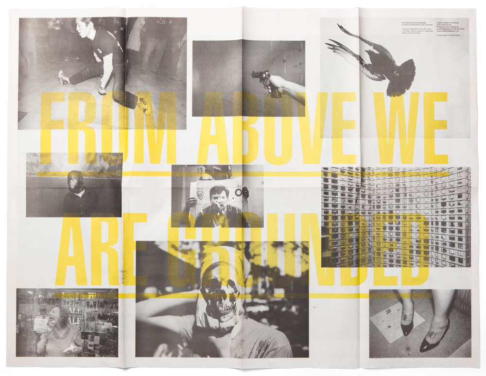
Alessandro Simonetti is an Italian photographer based in New York, with whom we have been collaborating for quite a few years. His photography is characterized by a particular approach and a willingness to unveil, discover and communicate the aspects of our society and culture that often pass unnoticed. With a raw, often lo-fi approach, Alessandro has created some of the most beautiful photographs of urban subcultures, while at the same time capturing delicate moments of our everyday reality.
After working with him on a Circuito Off campaign and a small zine published by Automatic Books, Alessandro has asked us to design two different projects showcasing his work. One is a small foldable poster with his photographs printed in black-and-white and our typographic intervention set in yellow. The other, in Chinese, was printed in red and black on a background of black-and-white photographs. Both projects were printed on a broadsheet paper, giving it a classic low-profile work that characterizes Alessandro’s approach.


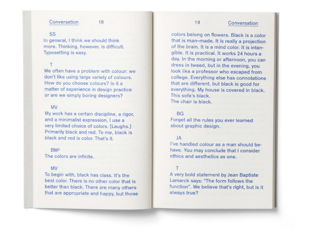
Manifesto is an ongoing project that leaves the final result to one side so as to focus on the creative process. It brings together under one roof the personal manifestos of some of today’s smartest and most renowned international designers. The first edition of Manifesto, an exhibition curated by us together with Cosimo Bizzarri, was held at XYZ Gallery in Treviso in 2009. The first edition showcased only 13 manifestos, among which Bruce Mau‘s manifesto was designed and printed for the first time, while Bob Gill and Bob Noorda have written their manifestos exclusively for our exhibition.

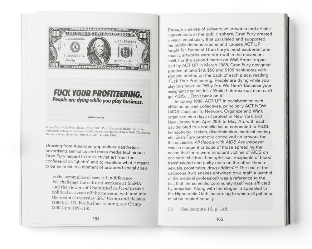
We took part in the “Biografie di oggetti, Storie di cose” conference, with Åbäke, Martino Gamper, Gilberto Penzo and Joe Velluto. Each designer was asked to present the biography of an object that was significant for his own life and we chose to show a book written by Bob Gill: “Forget all the rules you ever learned about graphic design” . The conference was organized by Claudio Buziol Foundation in the occasion of the presentation of the book “Biografie di oggetti, Storie di cose“.

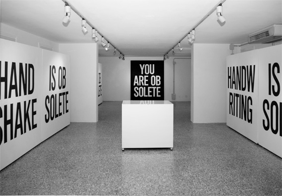
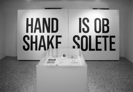
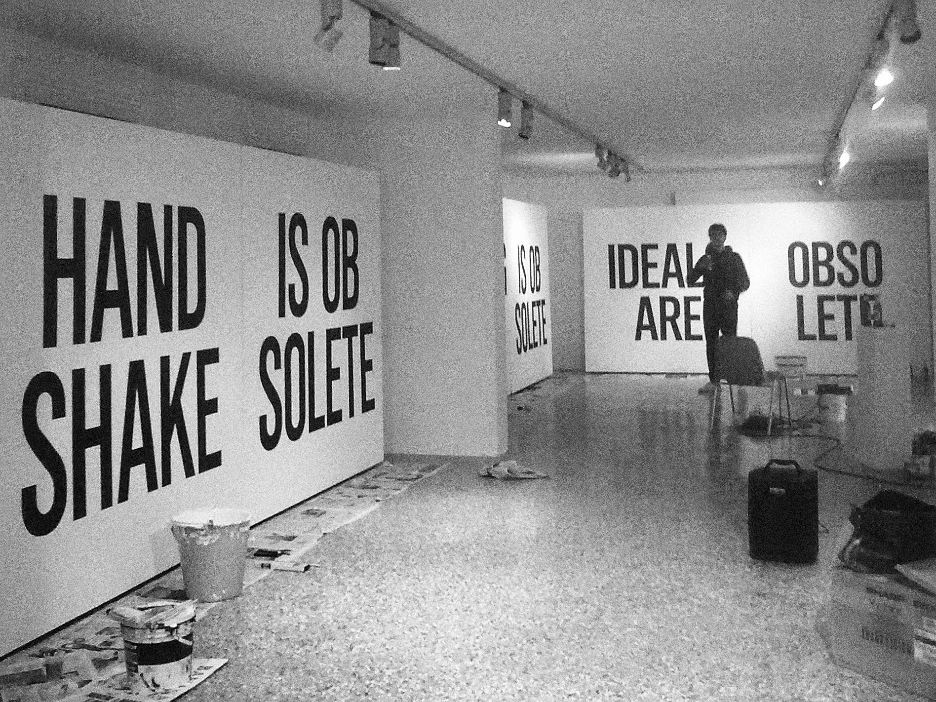
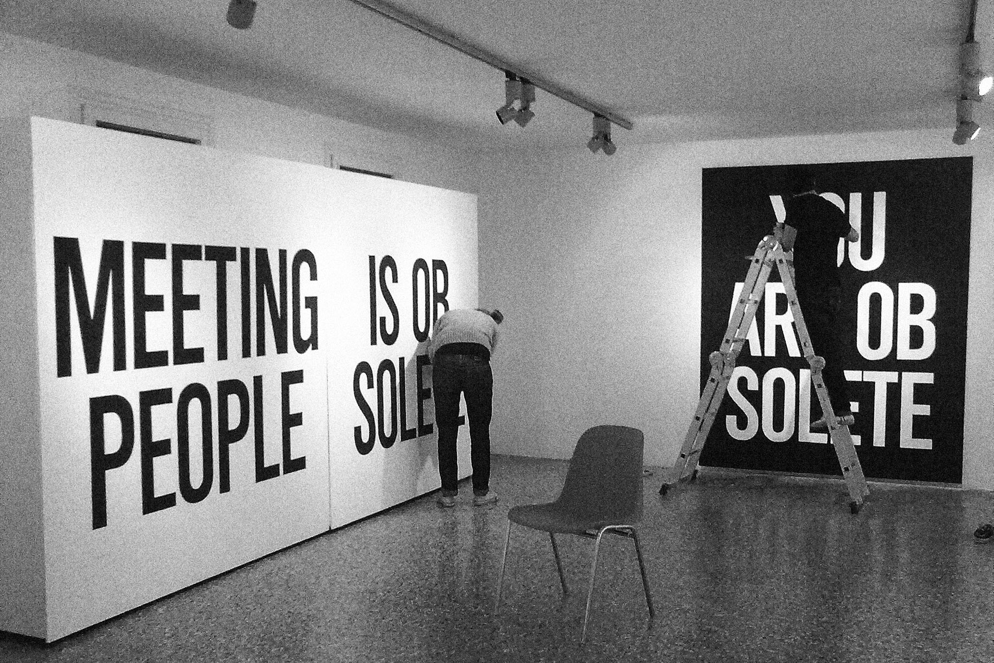
Obsolescenza is an exhibition conceived in 2008 together with our dear friends from studio Temp. The goal of the exhibition, set by ourselves, was to explore objects, customs, appearances and ideas that have become obsolete over time, ranging from a telephone calls to shaking hands. We have decided to create a series of billboard-sized phrases which we made by projecting a phrase on the wall and tracing it first with our pens and then with our brushes. The result was a series of visual statements about things we wish hadn’t gone out of style.

Description will soon be available, please return.


Love mail is a collective project. We ran it in 2008, copying and pasting emails that got our attention. Unlike other spam messages, these ones were extremely simple: a few words of text linked to a website, with such an interesting two-way illusions trick that we didn’t like to delete them. After a year of copy and paste, we’ve decided to make a selection to realize a publication. We wanted to create something from what is usually thrown away, ignored, and refused. We’ve decontextualized the messages, printing them on coloured paper, without referring to the computer world, so that everybody was free to interpret them personally.


Description will soon be available, please return.


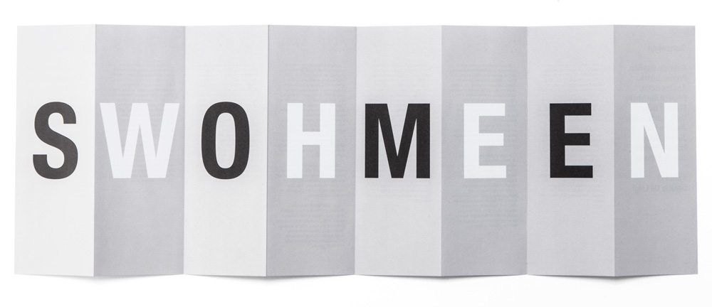
Somewhen is a combination of the words somewhere and sometime, and can mean either or sometimes both. “Somewhen” is also a title of the exhibition held at Jarach Gallery in Venice, showcasing the work of 10 photographers. Given the title’s composite word, we have decided to create an artwork that would reflect its structure.
Thus, we created a foldable leaflet with eight flaps, where, on one side, you can find a text describing the exhibition, names of the artists, and other relevant information. On the other, when opened flat, you can find a series of apparently senseless letters in black and white on a grey background. But when slightly folded and displayed vertically, you can read the word ‘some’, writ black, on one side, and the word ‘when’, writ white, on the other, thus recreating the title of the show and turning an apparently boring piece of printed matter into an almost sculptural, three-dimensional object.

Description will soon be available, please return.


Description will soon be available, please return.
In 2007 we did a two-day workshop at the Design department of San Marino University. Giorgio Camuffo, a lecturer of the Design department, asked us to approach the students as if they were part of a young indipendent graphic design studio. Have a look here for more information.

Description will soon be available, please return.

Description will soon be available, please return.
Description will soon be available, please return.